In the last issue of AccessWorld, we reintroduced the AFB Small Visual Display (SVD) Project based in the AFB Tech Optics Lab. One of the main research goals of that project is to better understand the needs of the human visual system regarding contrast in SVDs. While contrast (the difference between the light and the dark parts of an image) is a good starting point, it alone does not fully describe the relationship between the emitter (a display) and the receptor (the user) because a single contrast measurement does not account for all of the information within an image. A more complete measurement of this relationship is an image quality metric that factors in the display ability of a display to produce contrast at different spatial frequencies, and an individual's ability to perceive those frequencies in the image.
Contrast sensitivity, or the level of contrast required for a person to perceive a change in an image, is an issue that affects everyone with any vision. As we age, our contrast sensitivity degrades significantly even if there is no specifically diagnosed pathology. Aggravating the problem is that most vision care specialists focus on visual acuity, rather than contrast sensitivity. While visual acuity is a good metric for image clarity, it leaves out important information about contrast. This can lead to the scenario of an optometrist insisting that a person should be able to read a particular size font based only on that person's visual acuity number while, in actuality, the individual's contrast sensitivity is too low for reading to be possible.
In this article, we will discuss possible solutions to the problems described above. We will explain the Contrast Sensitivity Function and how it can be used in conjunction with display measurements to produce an image quality metric, which can be used to predict the usability of a device by an individual.
The Contrast Sensitivity Function
Just as the visual acuity number doesn't fully describe a person's visual capability, a single contrast measurement doesn't fully describe a display's capabilities. A complete representation of vision includes contrast sensitivity at multiple spatial frequencies. A spatial frequency can be thought of as the width of a series of repeating black and white bars. Wide bars are low frequencies because there are fewer bars in a given amount of space, and thin bars are high frequencies because there are more of them in the same amount of space. An image is actually composed of a combination of hundreds of frequencies multiplied together.
The Contrast Sensitivity Function (CSF) describes how much contrast (the darkness of the black and lightness of the white) is required for a person to see objects, text, and images. Someone with higher contrast sensitivity at a particular frequency can perceive the bars at that frequency at lower contrast levels. In other words, the bars could be different shades of gray, and the person could still see them. CSF is usually measured at six different spatial frequencies (or six different bar widths), ranging from high to low. This provides us with much more information about the individual's actual visual capabilities rather than one number alone. Humans typically are able to see mid-range frequencies more easily than higher or lower frequencies. However, not all people see different frequencies the same, so each individual needs to be mapped to his or her own contrast sensitivity function.
CSF Simulator
Because the concepts we've been discussing can be difficult to understand, AFB Tech built a CSF simulator that takes an image or video feed and applies a filter that shows what the image would look like to a person with a reduced CSF. The CSF simulator is an educational tool that serves different purposes for different audiences. The simulator can be a compelling tool to demonstrate the effect of a reduced CSF on an individual's ability to see and use everyday items, which is helpful to family members or caretakers. It's also highly effective to place a company's product under the CSF simulator to demonstrate display performance as part of a presentation to that company.
The following series of images are examples of how CSF affects the appearance of an image.
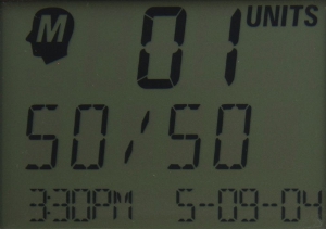
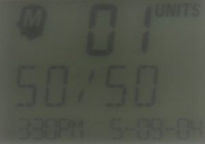
Caption: The display of a blood glucose monitor.
This image, a blood glucose monitor displaying a reading, is straight from a camera with ideal lighting and focus. For a fully sighted person, the image is sharp, and the letters are easy enough to read. We will use this image as a reference. The following images demonstrate the effects of removing various frequencies.
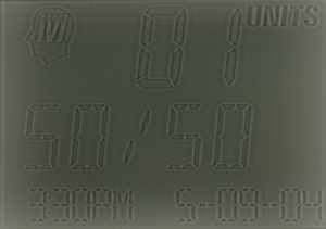
Caption: Reference image as above with high frequencies only.
In this example, we've filtered the image to show only high spatial frequencies so that we can see what information these frequencies contain. High frequencies, or narrow line widths, are responsible for the fine detail in an image. High frequencies define the sharpness of edges. In the example image, we see the outline of all of the sharp-edged shapes in the image, but the larger characters are not filled in. This is because the majority of the large characters (excluding the sharp edges) are made up of a lower frequency. If these large characters had fuzzy edges in the original image, they would not show up here at all.
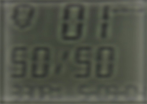
Caption: Reference image with mid-range frequencies only.
This image has been filtered so that only spatial frequencies in the middle-range of human contrast sensitivity are present. This image looks blurry, but we can see all of the letters with the exception of the bottom row of small characters. The bottom row doesn't show up well because the character strokes are too high frequency (or narrow) for the mid-range frequencies that are isolated.
Unlike the last image with only high frequencies, the characters in this image have fuzzy edges but are totally filled. This illustrates what these two ranges of frequencies do: high frequencies define edges and mid-range frequencies fill in larger sections (like character strokes) that change more gradually. For large text like the characters on this display, these mid-range frequencies provide most of the contrast that we use to read. High frequencies only fill in details.
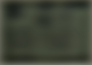
Caption: Reference image with low frequencies only.
This example doesn't look like much, but there is information in it. It's difficult to see, but there are black smudges in this image where characters are in the reference image. Low frequencies contain details about the background of the text and also contribute some to the contrast of characters. The background on this image looks most like the background on the reference image.
Caption: Reference image with a realistic reduced CSF applied.
The last example using the CSF is a realistic CSF for an individual in his or her 80s. As we age, our contrast sensitivity degrades naturally, especially at higher frequencies. This example was created using data from a study of CSFs based on age. All of the frequencies have been reduced in this image with higher frequencies being reduced the most. The image appears a little grayer overall, which is caused by the low frequency reduction, and the high frequency reduction causes the edges to be fuzzier.
Application of the CSF
Contrast Sensitivity provides a more complete description of what a person is able to perceive based on many spatial frequencies, and is an important concept for understanding how vision works. We believe that CSF is not being used in mainstream vision care to its fullest potential.
While CSF is an extremely useful tool for characterizing a person's vision, it's also an important measurement for the display work being done in the AFB Tech Optics Lab. There is a similar measurement to the CSF for displays called the Modulation Transfer Function (MTF), which we can measure to characterize how well a display works, much like a vision care specialist can use CSF to characterize a person's vision. The MTF simply measures how well a display produces contrast at different spatial frequencies. Displays achieve a maximum level of contrast at low spatial frequencies with a gradual decline leading to a sharp drop-off in contrast as frequency increases.
We can use the CSF and MTF together to calculate how visible an image is for an individual. This is called an image quality metric, and we believe we can use this number to make a prediction as to how well a person will be able to use a display. Though CSF is not widely measured at this time, it's conceivable that someday people will be able to receive personalized display recommendations from their vision care specialists based on this measurement.
In the meantime, AFB Tech is working to develop a rating scale system that takes into consideration all of the data we measure from the displays we test. This rating scale won't be perfect, but it will give users a better idea of how a display will perform than contrast alone. Look for an article in the November issue of AccessWorld for more information about this rating scale and an announcement about the SVD database!
If you would like more information on the CSF simulator, contact William Reuschel at AFB Tech.
