Digital inclusion is the enterprising goal of providing equivalent access to a digital interface to all users, regardless of disability. This takes the concept of "accessibility" a step further by considering efficiency and usability as part of the user experience. Digital inclusion is more than meeting a requirement. It is the hallmark of a business dedicated to its customers.
How Do People with Disabilities Use Technology?
Access Technology or AT is a peripheral hardware or software alternative method of accessing an interface.
- A screen reader transforms content into speech output usable by someone who can't see the screen and is typically controlled by a keyboard or gestures on a touchscreen.
- A braille display redirects output from the screen reader and can be read tactilely if a person is blind or deafblind.
- Customized keyboards or switch controls can be used to control a device if a person has limited dexterity.
- A screen magnifier enlarges the contents of a screen for a person with low vision.
AT is a bridge between the user and their device. It addresses a wide range of needs and is deeply personal to the user.
Inside an Accessibility Service
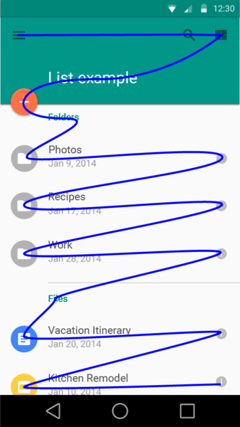
Access Technology (AT) integrates with the accessibility services that are built into a platform. This creates a virtual focus layer on top of the interface. Through the AT, a user controls the focus layer, which allows for navigation through and interaction with the content on the screen.
Markup, such as headings and lists, allow greater control and navigational efficiency for a user. The image shows an example focus order that a screen reader might take through an interface.
Digital Inclusion: The Developer's Responsibility
- Understand the inclusive design principles
- Implement the accessibility features of your platform
- Perform some simple testing
Inclusive Principles
1. Perceivable. Information and user interface components must be presented to users in ways they can perceive, such as providing alternative text for images or sufficient visual contrast.
2. Operable. Users can interact with the interface in a manner that suits their needs. All features are keyboard or gesture operable, and all important elements are in the focus order.
3. Understandable. Interfaces should be intuitive, predictable, and provide guidance to users — for example, use consistent navigation, help users avoid and correct mistakes, and provide sufficient context to all controls.
4. Robust. Content must fully implement platform accessibility services and conventions, which maximizes compatibility with access technology.
Adapted from the Web Content Accessibility Guidelines 2.0 w3.org/TR/WCAG20/
Accessibility on Your Platform
All of the major platforms support accessibility, and most of the work is already done for you! When possible, use or extend existing platform controls to take advantage of built-in features.
Learn more from the source:
- Android: google.com/accessibility
- iOS: developer.apple.com/accessibility/iOS
Web: w3.org/WAI
A Basic Test Checklist
Keeping in mind the inclusive principles, use the basic screen reader gestures and ask these questions as you move through your interface:
- Did each important on-screen element get focus?
- Was anything focused that was purely decorative or intentionally obscured?
- Did each element convey something meaningful?
- Did the focus follow a predictable path?
- Can you interact with all of the controls using only the screen reader?
These simple tests solve common issues, and allow accessibility specialists to spend their time enhancing usability.


