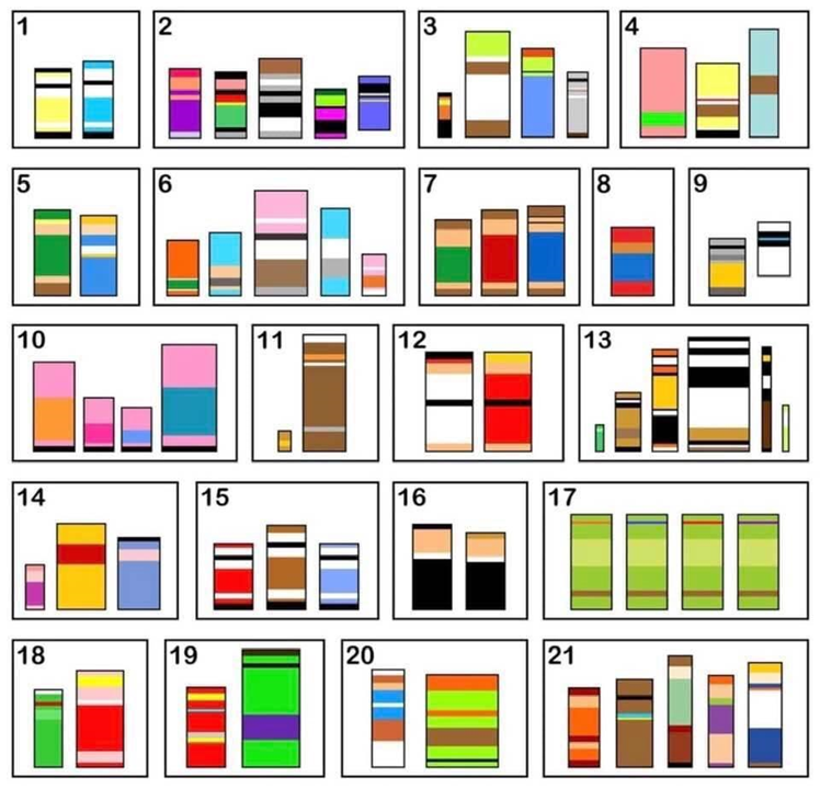
There’s a game which has recently been gaining popularity called Block Quiz. It is a trivia/association game where characters from all sorts of media are transformed into simplified color blocks. There’s also a variation for brands. The goal is to see how many characters or brands you can identify in a set amount of time based solely on their blocked colors. It became so popular, in fact, that it was turned into an Instagram Filter. Needless to say, as someone who is colorblind, I didn’t partake in the trend. I did watch, impressed, to see how recognizable things are just by color alone to most people, and I reflected on how often we’re not even aware of it and of how subconsciously exclusionary that can end up being.
Taking a step back from my own perspective, I tried to think about what sort of associations I take for granted. I thought about sounds: how different apps have personalized notifications, and how I’m able to identify which app the notification came from instantly, based solely on that quick sound. A person who is deaf, for example, wouldn’t be able to do that. No one is exempt from partaking in subconsciously exclusionary activities.
But, as people, we should always strive for inclusion. And as designers and developers, we must ensure everyone can access, use, and enjoy our apps and websites.
When it comes to navigating the web, one might not realize how much is based on implied meaning. We internally translate a magnifying glass icon to mean “search.” We infer that at the end of a form, a check mark means “submit” and an “X” means “cancel.” Just from glancing at an article divided in two columns, we intuit what order it is supposed to be read in. This association, the implied meaning, is not something you necessarily think about. It just is. But what about people who can’t see the magnifying glass, or the check mark, or the formatting of the article?
There are accessibility best practices to ensure that this association can be expressed to people who, for instance, are colorblind, have low-vision, are blind, and/or rely on screen readers and keyboard navigation. That goes from not using color alone to convey meaning to making sure elements have the correct name, role, and value. There are many comprehensive resources out there on how to implement these practices, and I’m excited for the imminent launch of the AFB Talent Lab where we will be bringing people together to learn from each other and help create a clear path for anyone that wants to learn more.
When creating something, it is our responsibility to do it right. Assuming something is good because it works for you or for some is never good practice. Everyone wants to do the right thing, but for that, we must always be aware of associations we take for granted, and of those who end up being excluded because of that. The goal should be to create environments in the real and digital world where inclusion is the status quo.
About AFB Talent Lab
The AFB Talent Lab aims to meet the accessibility needs of the tech industry – and millions of people living with disabilities – through a unique combination of hands-on training, mentorship, and consulting services, created and developed by our own digital inclusion experts. To learn more about our internship and apprenticeship programs or our client services, please visit our website at www.afb.org/talentlab.