Full Issue: AccessWorld July 2012

AccessWorld News

WebAIM Releases Results of Survey of Preferences of Screen Reader Users

This past May, WebAIM (Web Accessibility in Mind) conducted a survey of preferences of screen reader users. 1,782 valid responses were received for this survey, which was a follow-up survey to the original WebAIM Screen Reader User Survey of January 2009 and its follow-up surveys from October 2009 and December 2010.

According to this most recent survey:

While JAWS is still the most popular screen reader, it has seen a significant decline in primary usage - down to 49% from 66.4% in October 2009 and 59.2% in December 2010. Window-Eyes and ZoomText saw small increases in primary screen reader usage while VoiceOver saw a small decrease in usage. NVDA saw continued increase in usage, up to 13.7% from 2.9% in 2009 and 8.6% in 2010 (a nearly 500% increase in just 2.5 years). Perhaps most surprising is the significant increase in usage of System Access or System Access to Go, jumping to 10.4% from only 4.7% in December 2010.

You can read the entire report at the WebAIM website.

Walmart Offers ScripTalk Talking Prescription Program on a Pilot Basis

Walmart has announced it is going to offer ScriptTalk Talking Prescription Program on a pilot basis to its mail order customers with visual impairments and to Walmart pharmacy customers in three stores. Please read the full press release for complete details.

This is the first time in the United States a national retailer has offered talking prescription labels to the vision loss community on a national basis. Walmart is working with the ACB, AFB, and CCB through the Structured Negotiations process on this important health, safety, and privacy initiative.

Inquirers about talking pill bottles or accessible prescription information in connection with Walmart or any other retailer or prescription provider should e-mail Scott Grimes at Goldstein, Demchak, Baller, Borgen & Dardarian or dial toll-free: 1-800-822-5000.

Walmart mail order customers or customers at the three pilot stores (listed in press release) may contact En-Vision America at 1-800-890-1180 for a free ScripTalk Talking prescription reader.

Walmart mail order pharmacy can be reached online or by calling toll free: 1-800-2REFILL (1-800-273-3455).

Free ZoomText 10 Update is Now Available

The next free update in the ZoomText 10 cycle is now available. ZoomText now fully supports Internet Explorer 9! Along with that, Ai Squared has incorporated reading support in the Thunderbird e-mail client, improved performance when running ZoomText with JAWS, added Portuguese language support, fixed several bugs, and more.

If you already own version 10, this is a free update for you. If you've got ZoomText set to download updates automatically, you're good to go. The next time you launch ZoomText, it will install the update for you. Otherwise, go to the Help menu and choose "Check for Program Updates."

To contact Ai Squared with questions, call 1-800-859-0270 or 1-802-362-3612.

New Website Offers Information and Support for Adults with Vision Loss

The American Foundation for the Blind (AFB) and Reader's Digest Partners for Sight Foundation have launched VisionAware.org, an easy-to-use informational website for adults with vision loss, their families, caregivers, healthcare providers, and social service professionals.

The new VisionAware combines two stand-alone resources from AFB and Partners for Sight (Senior Site and the former VisionAware, respectively) into a single, comprehensive website offering dynamic social networking and customized guidance for adults of all ages with rich content and practical tips on living with vision loss.

Visitors to the new VisionAware will find:

  • Free, practical tips and resources for adults with vision loss, their families, friends, caregivers, and related professionals.
  • Information on eye diseases and disorders.
  • Different ways to connect, including message boards and social media channels like Twitter and Facebook.
  • Breaking news on the latest developments in vision loss treatment via the VisionAware blog.
  • Directories of helpful services, products, and resources.

For more information, visit: http://www.visionaware.org

AccessNote: AFB's New Note Taker for Your iOS Device

The AFB Tech lab is excited to announce that AFB will soon be releasing AccessNote, a note taker for your iPhone or other iOS device. AFB Tech, in conjunction with FloCo Apps, LLC, has designed what is expected to be a groundbreaking productivity tool for people with vision loss, and developers plan for its launch at the App Store later this summer.

AccessNote is a powerful and efficient note taker that takes advantage of the tremendous built-in accessibility of your iPhone, iPod Touch, or iPad. To allow for much greater typing speed, increase accuracy, and permit keyboard commands, AccessNote is designed to be used with the Apple Wireless Keyboard (QWERTY) as well as wireless braille keyboards and displays. AccessNote will be completely compatible with VoiceOver and the iOS screen reader. It can be used without a keyboard, but a keyboard adds efficiency.

Description of AccessNote

Although there is not yet a final price point, AccessNote will be priced under $30, and it will have many of the features found in traditional note takers and accessible PDAs. AccessNote creates notes in the .TXT file format, and it can also import .TXT files from e-mail or Dropbox accounts. It is designed with a clean, simple interface that uses standard iOS design techniques, so its layout will be familiar to iOS device users.

The home screen is titled All Notes, which is the heading at the top of the screen. The next element is the "Add" button (for adding a new note) followed by the Search field. Next is the user's list of files and notes, which includes a table index for quickly scrolling through notes. Finally, there are three buttons at the bottom of the home screen: "Settings," "Favorites," and "Help." Once the user is in a note, the screen includes a "Back" button to go back to the All Notes screen as well as a "Review" button for going into a read-only mode.

Some of the features designed into AccessNote include:

  • Compatibility with the Apple Wireless Keyboard and wireless braille displays.
  • Fast and efficient navigation.
  • Powerful search features.
  • Automatic saving and syncing with Dropbox files.
  • Customized keyboard commands.
  • A review feature.
  • Options for larger text.
Compatibility with the Apple Wireless Keyboard

Although typing on an iOS touchscreen is certainly accessible, it is not nearly as efficient as using a traditional QWERTY keyboard, a primary reason for designing AccessNote for use with the Apple Wireless Keyboard (available from Apple for $69). Another reason is due to how well the Apple Wireless Keyboard works with VoiceOver to control an iOS device. There are keyboard commands for nearly all of VoiceOver's gestures, including swiping/flicking, using the rotor, and reading text. AccessNote will also be compatible with wireless refreshable braille displays. So far, AccessNote has been tested with the BraillePen12 from Aroga, which also has many commands for controlling an iOS device.

Fast and Efficient Navigation

Using the Apple Wireless Keyboard, users have several options for navigating a note. These options include navigating and reading by character, word, line, paragraph, page, or note. Users can also jump to a particular word or phrase with the Find feature, and users can also quickly jump to the top or bottom of a note. These navigation features also work on the device itself using standard and custom VoiceOver gestures, and most of the commands are available on wireless braille displays.

Powerful Search Features

AccessNote has two powerful features for searching notes: Search and Find. Search (found on the All Notes screen) is a global search tool used for searching for text throughout all of the user's files, and it can also search for file names. Find is used to search for text within the current note that is open. To activate the Find feature, users can use the Option + F command for the keyboard or a "double-tap and hold" gesture for use on the iOS device itself.

Automatic Saving and Syncing with Dropbox Files

To avoid any data loss, all edits are automatically saved when typing in a note. AccessNote also syncs automatically with the user's Dropbox account, so you have all your files all of the time.

Customized Keyboard Commands

The AFB Tech lab was able to create a handful of customized keyboard commands for the Apple Wireless Keyboard. These commands include:

  • Option + C to create a new note.
  • Option + R to rename a note.
  • Option + F to search for text within a note.
  • Option + P to search for a previous note.
  • Option + O to move to the next note.
  • Option + M to mark a note as a favorite.

Although these custom commands have not yet been added for the wireless braille displays, this could come in a future update.

The Review Feature

In case users simply want to read their notes (for example, when studying for an exam), there is a convenient "Review" button at the top of each note. When using the Review feature, AccessNote is in a read-only mode, and thus, users don't have to worry about making any unwanted edits. There are also "tilt" gestures available when using the Review feature. Simply tilt the iOS device to the right to quickly switch to the next note or tilt it to the left to switch to the previous note.

Options for Larger Text

In Settings there is an option to choose the default text size. The available sizes are 14 point, 18 point, and 22 point font. AccessNote will also work with the Zoom feature built into iOS, but Zoom cannot be used at the same time as VoiceOver.

Your Feedback Matters

AFB Tech is very excited about AccessNote and has high hopes for its release. Because Apple's iOS devices are very powerful, AFB Tech wants to take advantage of that to allow students and professionals to use the same mainstream device that their sighted peers are using. The developers, of course, will be looking for feedback from those who purchase and use AccessNote, and they are anxious to hear your reactions to the new note taker.

This of course turns the tables on the AFB Tech lab rats. For years, those in the AFB Tech product evaluation lab have been evaluating products designed by others and have never been known to pull any punches, so please let the lab have it if it has missed the mark. It is ready for the good, the bad, and the ugly.

The AFB Tech lab appreciates the feedback received from readers using the AccessWorld app, which was the first iOS app AFB Tech developed in conjunction with FloCo Apps, LLC. The developers added several ideas provided by the readers to the AccessWorld app and hope to do the same for AccessNote upon its highly anticipated release.

Stay tuned to AccessWorld and the AFB Blog for announcements of AccessNote's official release date.

Comment on this article.

Reader Comments on AccessWorld's Series on iOS

Dear AccessWorld Editor,

I am writing to congratulate Larry Lewis on his extremely helpful series on Voiceover and iOS. I have an iPad, and I am stumbling through the learning process. His informative articles have helped me avoid errors and wasted time. Larry, keep up the good work. In fact, I think a regular series on this topic would be very helpful for many AccessWorld readers.

Best regards,

Larry C.

Dear AccessWorld Editor,

One of our teachers was browsing AccessWorld and brought Janet Ingber's June 2012 article, "Learning to Play a Musical Instrument: Resources for People who are Blind or Visually Impaired," to my attention. Perhaps you may not be aware the Music School of Lighthouse International is a wonderful resource to those with vision loss. We are the only community music school in the United States dedicated to individuals with vision loss, serving approximately 150 students on site each year. I'm proud to say that we are all enthusiastically preparing to celebrate our Centennial in 2013!

Please direct anyone or everyone to the Lighthouse International's website.

If you or AccessWorld readers need further information, we are happy to share and assist.

Best regards,

Leslie Jones, DMA, Executive Director
The Filomen M. D'Agostino Greenberg Music School
Lighthouse International
111 East 59th Street
New York, NY 10022-1202
Tel: 212-821-9663
E-mail: ljones@lighthouse.org

Back to School

Lee Huffman

Dear AccessWorld readers,

The American Foundation for the Blind (AFB) and AccessWorld are excited to announce a new product developed by AFB Tech's lab in conjunction with FloCo Apps, LLC. The new product, AccessNote, is a powerful and efficient note taking app that takes advantage of the tremendous built-in accessibility of your iPhone, iPod Touch, or iPad.

To allow for much greater typing speed, increase accuracy, and permit keyboard commands, AccessNote is designed to be used with the Apple Wireless Keyboard (QWERTY) as well as wireless braille keyboards and displays. AccessNote will be completely compatible with VoiceOver and the iOS screen reader. Priced under $30, plans are in place for its launch at the App Store later this summer, just in time for those students heading back to school. Stay tuned to AccessWorld and the AFB Blog for updates.

Yes, that's right…I said back to school. It's almost here again. I know the students out there don't want to hear these words, but it's time to get back to school.

New classes, new instructors, class projects, oral presentations, tests, meeting new people, and even the possibility of changing schools or moving away to college bring about uncertainty and new challenges. Uncertainty is not necessarily a bad thing. This time of year can be exciting, too, especially if you plan ahead and prepare in advance.

Pursuing a good education can be difficult under the best of circumstances, and doing so as a person with vision loss can increase the challenge. Just as we have done for the past two years in the July issue, the AccessWorld team will once again focus on providing valuable information and resources for students, parents, teachers, and professionals in the vision loss field to help make educational pursuits less stressful and more enjoyable.

I have said it before, and I will say it again:

For the students in our readership: You must take personal responsibility for your education. Ultimately, you must be your own advocate. Prepare in advance, speak to instructors, and tell those you'll be working with exactly what types of accommodations will best meet your needs. Your education will have a tremendous impact on every aspect of the rest of your life, so it's crucial that you do everything you can to get the most out of your studies.

Good planning prevents poor performance. It's never too early to begin planning for the next school term, whether you're in elementary school or graduate school. Acquiring and learning to use the mainstream and access technology that best suits your situation, registering as early as possible for classes, obtaining reading lists, and searching out alternative formats should be done as soon as you can. Waiting until the last minute is a recipe for disaster.

The AccessWorld team is excited to bring you the information in this issue, and we sincerely hope you or a student you know will find it useful. In this issue Darren Burton and Ricky Kirkendall of FloCo Apps, LLC bring you an article detailing AccessNote, Larry Lewis continues his series Success with iOS with his article "iOS and E-books, An Alternative Means of Reading," and Tara Annis highlights another STEM (Science, Technology, Engineering, and Math) initiative in her article, "What You See Is What You Feel: Getting in Touch with Haptic Technology from eTouchSciences."

If you are looking for information about cell phone accessibility as you start the new school term, you will want to read Tara Annis's second article in this issue, "An Evaluation of Two Cell Phone Accessibility Websites: Access Wireless and FCC Clearinghouse." Additionally, the staff at Baruch College highlights its method of linking technology and service to people with vision loss, and on the employment front, Dr. Jaclyn Packer and Morgan Blubaugh discuss research into the use of all-in-one multifunctional document centers by people who are blind or who have low vision.

If you happen to be looking for an accessible HD radio for your dorm room or new apartment or want access to digital television programming, Deborah Kendrick just may have viable solutions for you in her articles. To round out the issue, Janet Ingber looks at substitutes for the popular Siri feature on the iPhone 4S.

I encourage you to read every article, along with the articles from the July 2010 and July 2011 issues of AccessWorld, as the ideas and resources we've covered will certainly help improve, enrich, and broaden your educational experience. Please use these articles and resources to your best advantage. We on the AccessWorld team wish you good luck and good planning as you head back to school!

Sincerely,

Lee Huffman

Editor-in-Chief

Hands-On Access at Baruch College: A Model for Linking Technology and Service

Since 1978, the Computer Center for Visually Impaired People (CCVIP) at Baruch College has been in the business of empowering men, women, and young people with vision loss through the teaching of digital and access technology. From the teaching of FORTRAN and COBOL in its earliest days through the evolution from DOS to Windows and, now, to Apple products, the organization has striven to improve the lives of people with vision loss. In 2010, CCVIP began work on a model to formalize the relationship between technology and service by creating the Assistive Technology Demo Center.

Service Context

In New York state, adults who are legally blind are typically introduced to access technology in one of two ways: either they enroll for services with the State Agency Commission for the Blind and Visually Handicapped (CBVH), or they have access to a store that specializes in access products. CBVH estimates that it provides services to approximately 15,000 individuals per year. By its own estimates, however, the number of legally blind people in the state is well over 100,000. The service gap is hardly unique to New York. According to a report by the Pew Research Center, seven percent of Americans report either being legally blind or having enough trouble seeing even when wearing glasses that it interferes with daily functioning. Although it's difficult to estimate the total number of people receiving services through the educational system, the rehabilitation system, and the Veterans Administration, it's safe to say that the blindness system in the United States does not serve 21,000,000 people in a given year.

A number of dealers show and sell access technology. However, their primary purpose is, typically, to sell products rather than to refer individuals to available services. Even though some mainstream products, such as Apple iOS devices, have accessibility features built in, the majority of personnel who sell these products are not well-versed in these features.

It appeared to CCVIP that there was a need to create a kind of hybrid center that could focus both on technology and service as a way to begin to bring more people to a place where they could receive an up-close and personal view of products and services that might be available to them. It needed to be a place where this could happen without the need for multiple layers of intake procedures to be completed before they could experience the possibility of help.

Demo Center Model

CCVIP is a program within the Division of Continuing and Professional Studies at Bernard M. Baruch College, the City University of New York. Its vision is to help anyone move from where they are to the next step with the support of accessible technology. Someone new to vision loss will clearly need far more than technology to restore him- or herself to a full life. Becoming part of the service delivery system takes time, and this is something that newly blinded or visually impaired people do not have.

The overall objectives for the Demo Center are the following:

  1. Invite people in.
    CCVIP has the advantage of being a community resource within a college setting. The organization suspects that it might sometimes be less threatening for new people to visit in its environment rather than to reach out to an agency for the blind. People come to the bimonthly workshop presentations or make individual appointments with the Demo Center Coordinator.
  2. Introduce them to simple solutions, either high or low tech.
    During the workshop presentations, various categories of accessible technology are demonstrated to groups, which run anywhere from 20 to 60 people each time. Presentations in the past have ranged from "Accessible Cell Phones" to "Accessible Products costing under $200." When the appointment is individual, the Coordinator conducts a task-based interview that explores the areas where the visitor is having trouble and then demonstrates one or more technology-based strategies or possible solutions.
  3. Invite them to consider getting services.
    CCVIP introduces possibilities for services. Following the demo(s), the Coordinator speaks with the individual about the types of services available from various organizations and offers to help with referrals. For example, the Coordinator has found that a number of people who have declining vision have not seen a low vision specialist.

Individual Initial Consultations

Of the 41 clients who entered the Demo Center through a one-on-one consultation in 2011, 36 came because of personal interest or need, and 5 came because of professional interest. Of the 36 who came for personal reasons, 19 were referred for basic services. They were either referred to CBVH (11) or for low vision evaluation (8).

Sixteen clients were new to vision loss, and 20 were not. Even among these 20 individuals, however, the consultations uncovered gaps in knowledge of and participation in basic services.

For example, one of the oldest clients served by the Demo Center, an 85-year-old woman, reported that she had never been referred for a low vision evaluation by her optometrist. A man who was facing a rapid decline in his vision had never been informed about the New Jersey Commission for the Blind (in his home state) even though he was in frequent contact with his optometrist and other medical professionals.

Of the 16 clients new to vision loss, 5 expressed interest in learning to use mainstream products, such as iPads and Kindles. One client requested ZoomText (a product specific to vision loss). The remaining 10 clients who were new to vision loss wanted tools for reading, communicating, and organizing information. The most requested functions were reading and communicating via a cell phone.

Although people often came in with one request, it was discovered that they had multiple needs for service. For example, when one client new to vision loss asked about the Kindle for reading, he received a demonstration for the Kindle but also for ZoomText. In addition, CCVIP gave referrals for the Commission for the Blind and a low vision exam. Many new clients requesting the same information also receive demonstrations for other technologies, such as Book Sense and Victor Reader Stream, as well as for various screen readers and magnifiers.

Workshop Presentations

During most of 2010, presentations focused on various classes of equipment, such as cell phones and scan-and-read systems. In the fall, the organization decided to include presentations that focused on particular aspects of service. To date, these have included "What One Learns from a Rehab Teacher," "What is a Low Vision Evaluation?," and, most recently, "Meet the Commission," a session where three representatives from CBVH gave an overview of what services are available through the agency and how to begin the process of accessing them. A total of 280 individuals attended these presentations during 2011.

The product demonstrations include a vast variety of household, office, and entertainment devices. The subject area that drew the most interest among these workshops was Apple iOS products, particularly the presentation "Ins and Outs of the iPhone 4S" which had 77 attendees. After this presentation, several attendees followed up by requesting one-on-one consultations on this topic.

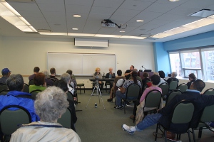
Photo of a workshop at the CCVIP Demo Center.

Caption: Workshop at CCVIP Demo Center

All presentations were videoed, and CCVIP is in the process of uploading them to the CCVIP YouTube channel. These longer presentations are in addition to the more than 18 short videos that offer descriptions of individual devices, which are available to those who are unable to attend the workshops or need additional information and instruction. To date, the channel has received well over 9,000 views.

Sample Quotes from Workshop Participants

Following various Demo Center workshops, participants were interviewed about their experiences and thoughts toward the presentations. The attendees who were interviewed ranged from those who had been coming to the workshops for years to some who were first-time attenders. However, the common theme from all of the attendees was the focus on the audience's needs and wants. One attendee, who has been coming to the Demo Center for two years, claimed that he owned several of the products that were just demoed, and he continues to come since "I learn more each year because new stuff comes out year after year." The presentations remain relevant.

Those interviewed mentioned that, because the Demo Center continues to present new products, they are able to remain technologically current, with one attendee saying that he made a product purchase "just from the fact that I learned about it from here." Additionally, many attendees found that one of the most helpful parts of the demonstration was the practical information, such as where to purchase an item and how much it costs. Then, "They open it up for us and show us how it works," said one seasoned attendee. "A lot of other companies don't do that."

The Demo Center Can Supplement Commission Information and Services

Since the Commission for the Blind and Visually Handicapped (CBVH) is the largest service provider for legally blind individuals in the state of New York, it seemed important to gather its input. In the past six months, CCVIP saw a significant uptick in the numbers of CBVH counselors who attend the workshop presentations, but it wanted to get a sense from them as to the usefulness of the Demo Center for their clients. A researcher from the project interviewed the CBVH regional manager to gain the Commission's perspective. The interviewer was not known to the manager prior to this conversation. The interviewer reported the following:

  • Technology training for CBVH clients usually isn't the first priority. The Demo Center can fill this immediate gap for the client.
  • Generally, initial focus is on the CBVH client's need for safety in the home and mobility training.
  • A client's vocational goal may not entail technology training, but they may require it for their personal life. The Demo Center is a good place to get information.
  • CBVH said the Demo Center is a good place for clients to get information independently. CBVH counselors and clients have an interactive relationship. Clients go to CBVH counselors to get information, but it is empowering for them to get new information, come back, and tell the counselor, "This is what I learned."

Moving Forward

Looking to the future, the biggest challenge is to extend the reach of this project. The Demo Center has received some press, which led to a story on New York City's NY1 news channel as well as articles featuring CCVIP staff. This indicates the CCVIP is out there and starting to be known, but it recognizes many people experiencing declining vision are not reaching out to any agency at all. The organization plans to increase its use of Facebook, Twitter, and other social media to announce its events and availability.

The staff and organization leaders at the Demo Center continue to wonder whether other programs are using technology to build a bridge to service and whether others might view it as an intriguing strategy to be tried. The CCVIP welcomes information on what models are being used and how they can best share thoughts on engaging this underserved population and the communities that surround it, and on getting the word out about what's possible through technology and rehabilitation services.

If you would like to have more information about Baruch College and the CCVIP, contact Karen Gourgey.

Comment on this article.

All for One and One for All: The Use of “All-in-One” Multifunctional Document Centers by People Who are Blind or Have Low Vision

As most AccessWorld readers are well aware, unemployment is a major issue for the blind and visually impaired population. According to estimates from the Bureau of Labor Statistics, the unemployment rate for people with moderate to severe vision loss can be upwards of 70 percent. This is several times the national average. While there are many reasons for this alarmingly high figure, it stands to reason that a large part of the blame belongs to work environments that use office equipment and tools that are either completely inaccessible or overly difficult for a person who is blind or visually impaired to use. This is certainly the case with high-end Multifunctional Document Centers (MDCs), which can be found in nearly any office.

MDCs, also sometimes referred to as "All-in-One Printers," are devices that perform many different tasks, such as printing, copying, scanning, and faxing, as opposed to older office devices that perform only single tasks. Modern MDCs provide more features and functions than ever before, but this added functionality has made many of these products more complex and difficult to use. In the past, accessibility to basic copiers for people with visual impairments was not as significant an issue. Typically, copiers had simpler user interfaces with tactile keypads for selecting the number of copies along with "Start," "Clear," and "Stop" buttons. As technology has advanced, the user interface was redesigned and has become more complex, often requiring the use of non-tactile controls and/or a touchscreen display. These changes to the user interface created accessibility barriers for people with visual impairments that previously did not exist.

Back in 2006, Darren Burton and Lee Huffman authored a series of articles in AccessWorld ("Can You Make Me Some Copies, Please," "Man versus Machine: A Review of Multifunctional Desktop Copiers," and "Accessing the Machine: Two Solutions for Using Large Multifunctional Copy Machines") in which they evaluated the accessibility of many of the MDCs that were available at the time. They found that, while there were some accessibility solutions offered (notably by Canon and Xerox), by and large, these products were simply inaccessible for people with vision loss. Even the products that did offer accessibility solutions only offered limited access and were not always easy to use. Since then, MDCs have become even more complex and reliant on touchscreen displays. However, in recent years, a number of additional companies, including Lexmark and Ricoh, have developed accessibility solutions that promise to offer improved access.

The American Foundation for the Blind has partnered with Mississippi State University on a grant from the National Institute for Disability and Rehabilitation Research (NIDRR) to revisit the issue of MDC accessibility and determine whether the newer devices are currently accessible to blind and visually impaired users. This project is divided into three major activities: a survey of MDC users, an expert analysis of major MDCs, and a user study to determine the usability of MDCs. The results of each activity will be summarized and published in AccessWorld.

Survey of MDC Users

The first step in this project was to conduct a survey of MDC users who are blind or visually impaired. The purpose of this survey was to gather information on the types of experiences that users have with MDCs. This will allow us to identify the major accessibility barriers, if any, that prevent users from accessing the device, as well as determine the features and functions that are the most and least in demand by this population. We will use this information, along with the results of our expert analysis and user study, to work with MDC manufacturers to improve their products.

A survey was developed by AFB that was designed to collect information in a number of different areas, including the following: the demographics of the participants; the types and functions of MDCs that participants have experience with; the frequency with which they use the various functions of the MDC; any accessibility barriers they encounter; and their preferred methods for interacting with MDCs. The survey was launched in October 2011 and remained open for a period of six months. It was promoted through an announcement that was posted in AccessWorld and sent to a number of blindness organizations, asking for visually impaired people with MDC experience to fill out an online survey.

Who Completed the Survey

The survey was completed by 26 blind and 34 low-vision users of MDCs whose median age range was 45 to 54 years old. Over half of those who answered the survey were women, and most were white. Most participants were college graduates, and more than a third had attended graduate school. Two-thirds of the participants were currently employed. The median household income was $40,000 to $60,000, which is similar to the entire U.S. population.

About two-thirds of the participants were visually impaired from birth. The vast majority had received some formal training to assist them in living with vision loss.

Use of MDCs

The largest number of participants had an MDC that they used at home for personal use, with almost as many participants using an MDC for work. The most common MDC brand was Hewlett-Packard followed by Canon. Other brands mentioned (but used by only a small number of participants) included Lexmark, Brother, Epson, Xerox, Dell, Kyocera, and Toshiba.

All participants reported they have used MDCs that are able to make copies. In addition, most MDCs are able to scan, print, and fax. The most important MDC function for survey participants was printing, followed by scanning, then copying. A majority of participants selected these three functions as being very or somewhat important to their specific needs. Although almost half thought faxing was very or somewhat important, it was the least important function overall. The vast majority of individuals used the MDC for printing more than once a week, followed by copying and scanning, both of which were used more than once a week by about half the participants. Faxing was used more than once a week by only one-quarter of participants.

More than half the participants used assistive technology to make their MDCs usable. However, few had assistive technology training specific to the MDC.

Preferred Techniques for Access

The survey listed a number of techniques individuals might prefer to have available in order to make MDC controls and displays more accessible to them. Visual techniques were listed for those with low vision, and non-visual techniques were presented to blind participants.

Controls

Almost all participants with low vision preferred larger letters and numbers on control labels. High contrast between background and labeling and between background and controls was preferred by a large majority. Speech output software and tactile controls were preferred by almost all blind participants. More than half of blind individuals wanted tactile bumps for identification.

Displays

For displays, more than three-quarters of individuals with low vision preferred high contrast between the background and characters on the display screen and larger characters on the display. About two-thirds of those with low vision responded that they preferred to have low glare, and two-thirds wanted to have a built-in screen magnifier. Less than half said they would prefer a brighter screen. Participants who are blind overwhelmingly preferred speech output for displays, and less than half preferred support for braille displays.

Although individuals with low vision were not specifically asked about their preferences for non-visual techniques, a number of participants in this group wrote comments that they would prefer speech output for both controls and displays. In future AFB surveys, we plan to include non-visual techniques as well as visual techniques for those with low vision.

Comparing Participants with Low Vision to those who are Blind

Responses were compared between participants with low vision and those who are blind. The only important difference found was that those with low vision used the MDC copy function more often than those who are blind.

Summary and Conclusion

Most blind and low vision participants used an MDC at home for personal use, and about two-thirds used it for work. Hewlett Packard was the MDC brand most often used by the survey respondents. Of the MDC's functions, printing is the most important to participants, followed by scanning and copying. Printing is used most often, followed by copying and scanning. Faxing is not used as often and is not considered as important as the other three functions. The copying function is likely to be used more often by those with low vision than those who are blind. There are a number of techniques that participants would prefer MDCs to have available in order to make controls and displays more accessible. The most important are higher contrast, larger characters, speech output, and tactile controls.

There is a clear demand among these participants for improved accessibility features for MDCs. It should also be noted that only 60 completed surveys were collected over a period of six months despite our offering a stipend and promoting the survey in AccessWorld and through a number of blindness organizations. This relatively small figure reflects how few people who are blind or visually impaired have experience using MDCs.

This survey is the first part of a larger project to gather information on the accessibility of MDCs that can be used to make these systems more accessible and available for users who are blind or visually impaired. The next steps for this project are to identify the currently available MDCs that offer accessibility solutions and to evaluate their accessibility and functionality through expert analysis and a user study. The results from those evaluations will be included as part of a future article in AccessWorld.

Acknowledgements

This survey was paid for through a subaward received from Mississippi State University as part of the Rehabilitation Research and Training Center (RRTC) on Employment Outcomes for Individuals Who are Blind or Visually Impaired.

Comment on this article.

An Evaluation of Two Cell Phone Accessibility Websites: Access Wireless and FCC Clearinghouse

AccessWorld regularly features articles about mobile phones and service providers but only a few articles that showcase websites about cell phone accessibility. A wealth is out there that devote some of their content to the topic, but only a few focus primarily in this area. I chose two of the most well-known websites, which were created by large organizations that serve a broad spectrum of people with various disabilities. Read on to see the analysis of Access Wireless and FCC Clearinghouse.

Access Wireless

Access Wireless addresses cell phone accessibility through articles and videos with the goal of assisting seniors and people with disabilities to find a phone and service plan that will meet their needs. This website was designed by CTIA: The Wireless Association, a non-profit organization whose members range from manufacturers to service providers. This article focuses on the website's homepage, its section on vision loss, and its database. Upon visiting the homepage, I immediately noticed it has been formatted with access in mind, having options to change size of text and the popular "Skip to Main Content" link. Also, appropriate HTML is used to mark headings, lists, and tables, so the quick navigation key commands can be used with screen readers.

The section about vision disabilities is short, basically giving a list of features to look for and questions consumers should ask service providers and sales staff in retail stores. Some of these are logical, such as asking for bills and manuals in alternate formats, a description of text-to-speech, an overview of voice commands, a tactile keypad, screen magnification, and a discussion of third party accessibility software. One suggestion seems bizarre, though, recommending that standard ringtones be changed to a distinctive sound that is at a frequency people with vision loss can hear more easily.

Additional items should be added to make the recommendations more comprehensive. For example, an electronic version of texts (bills, manuals, etc.) is not listed in the type of alternate formats to ask for. Only braille, large print, and audiocassette are listed. Since a large percentage of the visually impaired use electronic text, it is crucial that it be featured. Its listing will have the added benefit of alerting manufacturers and service providers to its importance, and they will, then, ensure all materials are produced in this format. Another item that needs to be refined is the description of voice output. It says to use speech to check battery level, Wi-Fi and cellular network signal levels, incoming calls, messages, and contacts, but it does not mention that some phones offer text-to-speech for every feature. Lastly, there must be an added recommendation to ask service providers about free 411 directory assistance.

The bulk of the site content is found in the accessible cell phone database called Global Access Reporting Initiative (GARI), which was created from a partnership between CTIA and the Mobile Manufacturers Forum (MMF) and is advertised as "the most complete database of cell phones available." Let's see if it holds up to this statement.

There are two steps before the phones are displayed in which you have options to filter your results. Step one allows you to choose the type of device to search for (clamshell, candy bar, touchscreen) and the type of disability or disabilities of the user. I was pleased that they offer a multiple disability search for those who are deaf/blind or have other dual impairments, taking notice of these frequently under-recognized groups. Unfortunately, on this webpage, several statements come off patronizing, eluding to a stereotypical view of sight loss, such as the statement, "For people with limited or low vision or who are blind, a phone that flips open and answers automatically may be useful." It continues on to discuss slide-style models, "Like a flip phone, this style of phone may be useful for people with limited or low vision or who are blind, as they will answer automatically upon sliding open." I know of zero people who have had trouble answering a phone in the typical manner used by the general public.

Step two allows you to customize your search using a checklist of 28 features. Most of the selections seem reasonable, like adjustable font size, high contrast options, and a tactile mark on the "5" button. Others are probably not important to most consumers, such as the choice of having a standard key layout with the "1," "2," and "3" buttons located on the top row of the alphanumeric keypad, and automatic call answering. Another is the feature in which the number keys have a different audible sound than the function keys, so they are easier to tell apart. I understand having every key making an audible sound when pressed, but question the need for each type to sound different.

Three items relating to text-to-speech are questionable: voice output to read text messages (What about composing them?), talking caller ID for stored contacts (What about all the other incoming calls?), and voice output for menus (What kind? Just the main one or all of the submenus?). Two changes need to occur. First, keep these three items, but clear up their vagueness. Second, add another checklist item that indicates voice output for 100 percent of the phone's features, a crucial feature that most visually impaired people would select.

Ending on a positive note, all of the checklist items related to low vision are accurate and cover features the majority would use. ??Upon finishing step two, you reach the results display page that is clearly laid out with concise information. Phones are listed according to level of accessibility (highest to lowest), stating the percentage of features that match those in your search criteria. Also found on this page is a useful item: the "Compare Phones" link allows you to choose up to three models to analyze their features side-by-side. Every phone in the list has a link leading to a webpage that gives a breakdown of the 28 accessible features as well as additional content, including manufacturer contact information, the date the product was added to the database, the weight of the phone, and its standby time/talk time. Even more content is found here that deals with accessibility, items not found in the search steps (such as if "Battery" is tactilely marked for easy placement into the device), key center point distance (distance from the center of one alphanumeric key to another), the size of the main display, the resolution of the main display, and manuals in alternate formats.

I was impressed at the scope of content covered by the results page and believed I had found the ultimate site, a one-stop source for accessibility information. Until I delved further into the results. ??After I selected visual impairment as my sole disability, chose every type of device, and selected all of the 28 features, my search yielded 242 results, the majority being Motorola models, with a scattering of Apple, Nokia, BlackBerry, and Samsung devices. The top result listings, tying with scores of 82 percent, are the Apple iPhone 4 GSM model, Motorola Mobility RAZR, Motorola Mobility TITANIUM, Motorola Mobility DROID RAZR, and Mobility DROID BIONIC. I was disappointed that the Jitterbug and Snapfon were not listed. Also, the accessible Samsung Haven with its advanced text-to-speech and magnification settings did not appear, yet other Samsung models that lack these features were included. I expected the iPhone score to be a higher percentage, and upon further analysis, I discovered that five features keep it from having a perfect score. The possibility for adjustable font style lists as a "No" while auto answer, key tactile feedback, and tactile key markers located on the "5," "f," and "j" buttons are "Not Applicable." Because "Not Applicable" counts the same as a "No," this drastically skews results, especially against touchscreen devices. One solution is to filter results down by the type of device in step one and/or choose only some of the features in step two to increase accuracy.

I discovered a surprising issue with the comparison of iPhone models. The 4S has a lower score (78 percent) than the 4 GSM (82 percent), even though the particular features compared should result in identical scoring. The difference is due to GARI stating that the 4S lacks one feature found in the 4 GSM: an audible indication when volume is being changed. This is absolutely a false statement. Both phones should have the same answer, but that answer can vary depending on your perspective. Both could count as a "No" since this feature is not present. Yet, when voice over is running, it will announce volume change with speech output, so it may be considered accessible to the blind but not for those people with low vision who opt for magnification instead of speech. It's all up to whether you feel actual spoken words and numbers are similar enough to audible cues to be listed as one and the same.

Other inaccuracies found may be due to human error, because adding submissions is voluntary. It's up to service providers and manufacturers, not CTIA, to enter phone information. Most CTIA employees are probably not familiar with cell phone accessibility. Even if one company does pick an expert to make submissions, its models may appear more frequently on the list, making it appear to offer more accessible devices while, in reality, it may have the same amount or even fewer than others who devoted less time to work on this task. Since GARI funds the project, it should take more responsibility to keep the database updated.

While this database has entries for new phones, it also contains entries for older models that are no longer sold in stores, so it would be useful if GARI added content on its website to explain this issue and provide ways to locate mobile phones that fall into this category. For example, the site could recommend that consumers contact the manufacturer and/or service provider to discover if older models are kept in storage at any of their locations or are possibly available through purchase from an online store. A second suggestion is to recommend that consumers buy from companies that sell used products. It would be practical for GARI to state on every product page the date when each model first appeared on the market and when consumers could buy it in stores.

FCC Clearinghouse

The website created by the Federal Communications Commission (FCC) also provides data on accessible cell phones, but it covers other communication devices, such as radios and televisions, as well. Like Access Wireless, this site has implemented accessibility features, such as text size adjustment, and you can skip to its elements by using screen reader quick navigation commands. ?The vision loss section on this website is a single paragraph that tells about the 25 million Americans who have trouble seeing even with the help of glasses or who cannot see at all. It also states that current technological advancements have created many options for accessible cell phones. Under this paragraph is the "Mobile Devices" link that leads to its database.

The FCC obtains its data from GARI, the database used by Access Wireless. Even so, there are differences, like how a search is performed, ways to filter results, and, surprisingly, even how phones are scored. The search on FCC takes a different approach than GARI because there are no steps to complete. Instead, you just activate the "Mobile Devices" link and are taken directly to the results page. Once on this page, you can narrow your search by features, the region where the phones are offered, and/or the service provider. The filtering system is not as extensive as the one offered through GARI, since you aren't able to select more than one disability. Like GARI, phones are listed based on how many accessibility features they have (highest to lowest), but instead of using a percentage, the FCC site displays how many of the 28 features each phone has. The FCC does not have the convenient feature to compare up to three phones, but it does have a useful one which displays regions of the world where each phone can be used, covering the areas of North America, Middle East, Africa, Latin America, Europe, and Asia Pacific. So, it appears the FCC caters to consumers across the globe whereas GARI is more for people living in North America.

Even though they share a database and I used the same search criteria of "Visual Impairment" as the disability with all 28 features selected, fewer results are displayed here. The total is 235 instead of GARI's 242. The FCC lists three top results instead of five, citing only the Apple iPhone 4 GSM model, Motorola Mobility RAZR, and Motorola Mobility TITANIUM. Like GARI, no phone achieves a perfect score. The top ones contain 23 out of 28 features for blind or visually impaired people. Each phone has a link that leads to its own webpage, but the product page does not feature the myriad of data found in GARI. It only shows a table depicting whether it has or lacks the 28 features. The problem with the comparison of iPhones occurs here as well, with the 4S model having one less feature than the 4 GSM. Reasons for inaccuracy of the FCC database are basically the same as GARI: unclear descriptions that lead to problems determining if features are present and also human error.

Conclusion

After reviewing all of the facts, I do feel that both Access Wireless and the FCC have made improvements over the years, continuously adding items to the database and other portions of the website. A strong point can be made about Access Wireless and the FCC: both give a great general overview that highlights access for people with vision loss, so one can get a basic idea of what is out there and a general understanding that there are phones with speech output, that one can get a bill in large print or braille, and that there are ways to adjust font size and contrast.

However, work still needs to be done to ensure consumers are satisfied. One question to ponder is whether it's best to continue to offer two websites, each striving to keep up with ever changing information. What is the point of having two sites that contain very similar information? The FCC just borrows information from GARI and adds a few other details. If the decision is made to keep both, then I would like to see both borrow aspects of each other's content to make information-rich webpages. For example, GARI should list the regions of use like the FCC currently does, the FCC should have the hardware feature list that GARI does, and the FCC should allow users to compare phones. Their weaknesses of both sites are the same. Neither can be used for an objective comparison. If you want every detail about a phone and want to compare it to other models to perform a scientific analysis, this is definitely not possible with either the GARI or the FCC site. There is too much inaccurate information. Currently, you can use information obtained from these sites as a starting point, but then you must visit a search engine and/or contact service providers and manufacturers directly to ensure you choose an accessible mobile phone. These databases are not ready to stand alone as the sole provider of accessibility information.

The great news is that, at least in theory, it's possible to correct issues highlighted in this article. One logical solution is to have CTIA and the FCC use their funding to hire an expert on accessibility who can update and maintain the database, re-write the feature description, and create more accurate scoring. If the FCC and CTIA hold true to their mission of advocating for people with disabilities, they will fix these issues. The next step is for AccessWorld readers to discuss the contents of this article and your own ideas and opinions about both organizations. Spread the word. Your voices can make a difference.

Comment on this article.

Siri Substitutes: If You Don't Have Siri, There Are Other Options

When the iPhone 4S was released, it contained a revolutionary app called Siri (Speech Interpretation and Recognition Interface). The user just has to press and hold the Home button and tell Siri what to do. The app can accomplish many tasks, including sending text messages and e-mails, setting reminders, answering questions, giving directions, playing music, and making phone calls.

If you own an iOS device other than the iPhone 4S, there are apps similar to Siri, but you will need several apps to accomplish the same things. Although many apps offer voice control, the ones in this article are accessible with VoiceOver. All the apps in this article are mainstream and not specifically designed for people with visual impairments. Be aware that since apps may be updated at any time, accessibility can change. Occasionally, an app will be removed from the App Store.

Vokul

Vokul, an inexpensive ($2.99) yet powerful app, allows the user to make phone calls, send text messages and e-mails, update Facebook status, post tweets, play music, and more. Once the app is set up, all of Vokul's functions can be controlled by voice commands.

The first time the app is opened a brief tutorial starts playing. After that, when the app is opened, Vokul will announce that it is updating your contacts and media library. This can take about 20 seconds. By default, saying "Hey Vokul" will tell the app to listen. Two quick dings will sound, indicating that the app is ready to accept a command. VoiceOver pronounces the app as "Vakul."

The bottom of the screen contains five buttons: "Home," "Contacts," "Media," "Social," and "More." The "Home" button brings up the app's home screen. The "Contacts" and "Media " buttons will bring up a list of contacts and media, respectively. The "Social" button brings up options for interacting with Facebook and Twitter. Vokul allows updating status by voice with both Facebook and Twitter. In addition, Vokul will read what others have posted to your pages.

The "More" button brings up the Settings dialogue and Help section. In the Settings dialogue, various parameters can be determined, including how Vokul responds to commands and to different events. The Help section is clearly labeled and has options on how to perform various tasks, including e-mailing and controlling media such as music and podcasts. There is an option to replay the tutorial. The "What Can I Say?" option brings up a list of commands that Vokul understands. Reviewing the various Help sections for specific tasks will explain the exact sequence of how Vokul will respond to a given command. (Author's note: When dictating information, such as an e-mail or Facebook status update, I have found that Vokul is more accurate with VoiceOver turned off. Since Vokul gives verbal prompts, VoiceOver is not necessary.)

Vokul will verify the name of recipients for phone calls, e-mails, and messages. If there are multiple listings for the same person or artist, Vokul will list them and ask you to choose. When the user dictates information, Vokul will speak what has been said and then present options to "Add More," "Try Again" (which deletes the last spoken information), or "Send Message."

In a noisy environment, Vokul may interpret background sounds as commands. There is a "Touch to Talk" mode for noisy situations. To enter this mode, use the Home tab to get to the main screen. Then, activate the "Ear" button located at the upper left corner of the screen. Next, swipe right two times to reach the "Vokul Logo" button, and activate it. There is no need to say "Hey Vokul" when in this mode. Each time, just double tap the "Vokul Logo" button and say a command. Between the "Ear" and "Vokul Logo" buttons is a button labeled "Fitness." This lets you choose music and have it play faster or slower.

Voice Dictation

The inexpensive Voice Dictation app ($0.99) lets the user dictate text and then send it as an e-mail or text message, or update to Facebook or Twitter. When the app loads, there are three buttons on the screen. The one in the top left corner is for choosing a language. The button on the upper right corner says "Pref," and it brings up the Settings menu, which is basic and includes options for sounds and for social networks. There's also an option for Voice Dictation to detect end of speech, which causes the app to stop recording when it thinks dictation is done. For me, the app frequently stopped recording too soon when this feature was enabled. The Help section has a list of how to indicate various punctuation symbols. The "Start/Stop" recording button is the final control on the home screen.

To dictate text, double tap the record button and wait until VoiceOver stops speaking. When done, double tap again. When dictation is completed, a new page will load with options to edit the message or send the message as a text or iMessage, an e-mail, a Facebook status update, or a Tweet. The "Cancel" button is the last option. In the Edit option is a button to add to the message.

When a "Send To" option is selected, the appropriate form will open, and the dictated message will be in the correct place for the specific application. However, the user must manually type in the recipient's name or your social network site login information. These tasks cannot be accomplished by voice.

Voice Assistant+

Voice Assistant+ is another inexpensive dictation app ($0.99). When it loads, the home screen has an unlabeled "Settings" button which provides several options, including language choice and whether a sound should occur when the "Record" button is pressed. Next is a text field for editing the message, followed by the "Record" button.

To dictate a message, activate the "Record" button and begin speaking. If the Sound option is on, wait for the sound. When finished, activate the button again. Voice Assistant+ will say, "Processing," and when completed, a sound will be played. The message will appear at the top of the screen where it can be edited. The "Action" button brings up "Send" options. For a text message, the "To" edit box is in the editing mode. For e-mail messages, the "To" field must be double tapped prior to adding a recipient. The app, in addition to e-mailing, texting, sending Facebook updates, and tweeting, also allows for sending to other applications such as Dropbox.

Evi

Evi also only costs $0.99. She can answer questions, send text messages, send e-mails, and make phone calls.

When Evi loads, the first control is a button that says "About and Options." By activating this button, new choices are presented, including About Me, Settings, and Tutorial. The Settings option presents a form to connect with Evi on Facebook although Evi can't post status updates. The Settings option also contains a button to clear the list of questions that have been asked. The tutorial option gives examples of how to ask Evi questions. There are times when, if Evi cannot find an answer, re-phrasing the question will have a better result.

In the bottom left corner is the "Listen" button. When it's double tapped, there will be a sound, and then you can ask Evi a question. Evi detects when speech has ended, and she will say, "Listen," indicating that she's searching. When Evi has an answer, she will speak the result. If Evi doesn't speak, flick right to hear results. Another option is to type the question into the edit box.

If Evi isn't sure of an answer, she may offer links to try. Link activation happens within the app, so there is no need to switch to Safari. Once done with the link, activate the "Back" button in the upper left, and the Evi home screen will appear.

When making a phone call, say the word "call," followed by the person's name as it appears in your Contacts list. Evi will say the name or names if there are multiple listings. Once you select a contact, Evi will make the phone call.

To send an e-mail, say the word "e-mail," followed by the person's name, and then the contents of the e-mail. To send a text, say the word "text," followed by the recipient's name, and the message. Evi will present the recipient's name, or if there are multiple listings, then all the names will appear. Double tap the intended recipient. When the next screen loads, the recipient's name will appear in the "To" field. The subject line will be blank, and the message will be in the correct edit box. Either add a subject, or just select "Send."

Speaktoit Assistant

Speaktoit Assistant ($0.99) can send messages, make phone calls, and find out information.

When the app is first installed, it will ask your name and several other questions. There is no need to press any buttons. One of the questions is whether the tutorial should be played. By default, the app uses a female English accent called Sam.

There are three buttons on the home screen. The first says "Button Share." When activated, it presents several options, including Conversation, Settings, and Skills. The Skills option gives a list of tasks that the app can accomplish. There's a Settings option, but it doesn't contain any useful information. However, if you have some vision, you can change the appearance of the avatar on the screen.

There is an unlabeled button that doesn't appear to do anything different than the third button labeled "Mic Button Round." Double tapping this button has the app listen for a command. Sometimes there's a brief sound after the button is activated, and sometimes there's not. There were occasions when the action had to be repeated twice before the app would listen.

When asked to look up information, Speaktoit will usually say something such as "Let's have a look here," or "Let's Google it." The search results will appear on the page, but they must be read with VoiceOver since the app doesn't announce them. If a link is activated on a search page, the new page will load within the app.

In order to text or e-mail, say the word "text" or "e-mail," followed by the recipient's name. Speaktoit then puts the recipient's name in the "To" box. Speaktoit then prompts for the text or message, and you speak it. Speaktoit reads it back and puts it in the correct edit box. If a recipient has several options, Speaktoit may have difficulty understanding commands to choose the correct recipient. When making phone calls, the app will present choices if there are similar listings.

Battle of the Apps

Siri, Evi, and Speaktoit are all friendly. They answer questions such as "Do you love me?" and "How are you?"

All the above apps, as well as Siri, take dictation. Vokul, Speaktoit, and Siri automatically read the text back while Evi, Voice Dictation, and Voice Assistant+ have the text on the screen. Speaktoit's dictation accuracy was not quite as good as the others'.

Siri, Vokul, and Speaktoit can play media. Speaktoit was not nearly as good at following directions as Siri and Vokul.

Questions and Answers

When Siri is asked a question, she repeats it. Evi and Speaktoit have the text on the screen but do not repeat it.

Question: Where is the nearest pizzeria?
Answer: Bennie's
Siri said she found eleven pizzerias, and nine were fairly close. VoiceOver was needed to read the results. The second result was the closest instead of the first.
Evi named the closest one and then said she had information on nine others. VoiceOver was needed to review all the results.
Speaktoit read the names and addresses of seven pizzerias, with the closest one being the first listing. VoiceOver was used to retrieve additional information.

Question: When was the last time the New York Mets won the World Series?
Answer: 1986
Siri did a Web search and found the answer. VoiceOver was used to read it.
Evi found the answer and said it.
Speaktoit did a Web search and found the answer. VoiceOver was used to read it.

Question: Convert 20 degrees Celcius to Fahrenheit.
Answer: 68 degrees
Both Siri and Evi said the answer.
Speaktoit did a Web search and found the answer, but VoiceOver was used to read it.

Question: How do you say "Good Morning" in Spanish?
Answer: Buenos días.
Siri did a Web search, but VoiceOver had to read it.
Evi said the answer.
Speaktoit said it had the answer, but VoiceOver was needed to read it.

Question: Who played Dr. Hoffman on the TV show Dark Shadows?
Answer: Grayson Hall
Siri did a Web search and found the answer, but VoiceOver was needed to read it.
Evi presented a link to the program's Wikipedia page and a button labeled "Would you like to see some more results?" Wikipedia didn't have the answer in the first few paragraphs, but when the "More Results" button was activated, several other links appeared, and the answer was present. VoiceOver was needed to read all results.
Speaktoit presented unlabelled images of Dark Shadows cast members.

Question: What is the capital of Kenya?
Answer: Nairobi
Siri and Evi both said the correct answer, and Siri provided additional information.
Speaktoit loaded Kenya's Wikipedia page, and VoiceOver was needed to read it.

iPhone Tasks

Can the app create reminders on my iPhone?
Answer: Siri can, but they can't be deleted or changed.
Evi and Speaktoit cannot.

Can the app set calendar events on my iPhone?
Answer: Siri can, and they can be modified.
Evi and Speaktoit do not have that capability.

Can the app set alarms on my iPhone?
Answer: Siri can, but Evi and Speaktoit cannot.

Can the apps be activated from anywhere on the phone?
Answer: Since Siri is activated through the "Home" button, it can be activated from anywhere on the iPhone, while Evi and Speaktoit can't be. If Vokul has its multi-task function turned on in the Settings menu, it too can be activated from anywhere on the phone.

The Bottom Line

For very little money, it's possible to get several apps which, combined, can execute many of Siri's functions. Each app has its own advantages and disadvantages. Read their entries in the iTunes store and the Help section of each app, if it's available. Since the apps are very inexpensive, I'd recommend trying several to determine which you like best. All the apps in this article are still on my phone, and I plan to keep them. However, if I were forced to recommend only two apps, I'd choose Evi and Vokul.

Comment on this article.

Series: Removing the Stress from iOS: A Blueprint for Incorporating Touchscreen Products Into the Classroom, Workplace, and Community

One of the most compelling trends that has played out over the past decade is the emergence of the e-book (electronic book) amongst sighted book readers. While there may still be a lingering fondness to shop for and access hard copy books, it seems that more and more authors, publishers, and readers are warming up to the idea of using electronic publications. Some of the reasons for this include:

  • Space. E-books can be delivered on devices that take up a miniscule fraction of the space of their hard copy counterparts thus allowing for libraries of countless books to be stored on a single device.
  • Rate of information. One can purchase and instantly receive the contents of an e-book.
  • Interaction. Many e-book applications allow the reader to bookmark and make notes within the e-book without altering the actual publication, which one does when taking notes within a hard copy book.
  • Book updates. Authors can easily make updates, addendums, etc. and release new editions to a previously released publication.

Ironically, those of us who are visually impaired have been accessing books via synthetic speech and refreshable braille for well over three decades. I can still recall my first exposure to an electronic book and using a Versa-Braille to access it. It's equally ironic that many of the same reasons listed above were reasons why we, as a vision impaired community, moved towards electronic book reading decades before our sighted counterparts caught onto the idea.

What is EPUB?

EPUB, or "electronic publication," is a free e-book standard developed and maintained by the International Digital Publishing Forum. The purpose of the EPUB standard is to provide authors, publishers of electronic text, and developers of e-book applications the ability to create and distribute content on a variety of desktop and portable devices. The EPUB standard enables developers to integrate a variety of features that allow readers to navigate and interact with the content of e-books.

Two Exceptional Book Reading Applications for iOS Devices

Without a doubt, Apple has taken full advantage of EPUB, and users have a variety of options when accessing e-books on their iOS devices. This article focuses on two of these options. I've selected these book reading applications, iBooks and Read2Go, not because they are the only two options but because they offer the most accessible features for users who are vision impaired. I describe these two applications as one being free but with costly content while the second option has a nominal cost but offers free content. Both options provide excellent access for those who are low vision as well as for speech and braille users. While it is not the intent of this article to serve as a tutorial for all of the features present within these two options, I'll try to give as comprehensive of an overview as succinctly as possible.

Understanding iBooks

iBooks is Apple's free book reading application present on all of its devices. iBooks enables you to utilize your iTunes account to browse its online bookstore to search and purchase books. Some iBooks content is free, but much of it has costs for acquiring and downloading publications. When a purchase is required, iBooks does allow you to download a sample of the publication that you are considering purchasing.

The iBooks application is organized into four tabs, which are located at the bottom of the application's screen. At the risk of redundancy, I access this and other book reading applications almost exclusively with a braille display, so I use my Braillekey command to move to the bottom of the application to navigate and select my desired tab. A Bookshelf tab allows me to access my downloaded books as well as PDF files, which I often wish to read using the iBooks application. As a side note, PDF access via iBooks is a quite seamless and efficient means of reviewing PDF content when compared to the often cumbersome alternative of using a third party screen reading application on a desktop PC. The other three tabs allow for organizing downloaded iBooks by title, author, or category. At the top of the iBooks screen are three buttons which allow the user to either open the iTunes Store to search for new books, access collections of publications (such as PDF files), or read books. You may either search for publications already downloaded on your device, search for content to download within the iBooks Store, or simply browse books by categories.

Downloading a new book is as simple as locating the desired publication, selecting it (either by double tapping the screen, pressing a routing cursor, or using a joystick on a braille display), selecting the "Buy" button, and waiting for the book to download. Once the book is downloaded, you may access it by selecting the Books option at the top of the iBooks screen.

Once you've selected a book to read, you are presented with the following:

  • "Library" button to access other books loaded on your virtual Bookshelf
  • The current book's Table of Contents
  • An "Appearance" button for adjusting screen brightness, font size, font type, and screen theme (excellent for low vision users)
  • A "Search" button to locate specific text or page numbers
  • An Add Bookmark option for establishing bookmarks throughout the text, which can be synchronized across devices
  • The current page's contents
  • A page selector to navigate to other pages within the book

It is typically recommended that iBooks with text be accessed using Voiceover and a braille display. iBooks also allows for the creation and distribution of multi-media, which are animated books that may or may not be accessible to the Voiceover application

iBooks Authoring Tool

One of the newer features that Apple provides is a free authoring tool for individuals to put their own content into an iBook format. People wishing to do this may download this free application to their Macintosh computer and place text, photos, animation, etc. into an iBook format. Apple describes the process as "dragging and dropping" content into the application, which automatically formats and creates an iBook. I have had limited to no experience using this tool and cannot offer an educated opinion as to whether or not this authoring tool is accessible to vision impaired individuals wishing to create their own iBooks. Apple does allow for aspiring authors or even service providers wishing to make syllabi or class content accessible in iBook format the ability to take advantage of all the built-in access features of Voiceover to release an accessible publication to its users.

There is one important truth to note about this authoring tool. If you take advantage of this functionality to make content available via the iBook format, Apple does own the rights and the creative process necessary to publish this work. Meaning, if you publish anything via the iBook Store and charge users a fee to download and access it, you will need to enter into an agreement with Apple whereby the revenues generated from these purchases are shared between you and Apple.

Read2Go for Reading on the Go

It's been well documented within AccessWorld the profound effect that Benetech's Bookshare.org initiative has had upon the lives of those of us with print disabilities. And, it is a safe assumption to assume that Bookshare.org has evolved the ways its users can access text since its inception over 10 years ago. Bookshare.org has released an app designed for iOS users to access all of its content. One may search for Read2Go within the App Store and purchase this intuitive, yet robust app for $19.99.

Once the app has been installed, you will need to get familiar with its four tabs located at the bottom of the app's screen. Much like iBooks, Read2Go has a Bookshelf tab for downloaded books as well as a Search tab to either search or browse for books on the Bookshare.org website. It also has Settings and Help tabs.

Initially, it is imperative that you access the Settings tab. Within Settings, you have the ability to change formatting, such as font size, the screen's foreground and background colors, and the color of the words and bookmarks. Additionally, you have the option to choose whether or not to show the book's images and if you would like to use Bookshare's built-in speech engine. If you do decide to use the speech engine, you can also choose whether to use its Heather or Ryan Acapela speech engine for listening to text. Most importantly, Settings allows you to sign in and out of your Bookshare.org account. You must sign in before accessing this application's content.

Searching for Bookshare.org publications is as easy as selecting the Search tab and searching by title, author, or ISBN number. You may also browse downloads by Latest, Most Popular, etc. Once you've located a book of interest, you simply select it, and then, you may read about book details or just download the publication. Once the download is complete, you have the option to begin reading the book, or you may choose to do so at a later time.

When you select the Bookshelf tab, you may organize your books by title, author, or by most recently downloaded. An "Edit" button provides you an efficient means of deleting books from your device. When you select a desired book, you are presented with its details and for the option to read the book.

When reading a book, you may access the "Navigation" button to navigate through the text by section, page, or by bookmark (which you may add throughout the book). You may also search for text within a specific portion of the text. It's worth noting that, when the Bookshare.org speech is active, neither the Voiceover speech engine nor the refreshable braille is present when navigating a book. I almost always stick with the Voiceover screen reader and braille display when accessing these publications on my iOS device. In short, Bookshare.org has done a fantastic job of bringing its e-book know-how to the iOS platform. I think highly of the work that their team has done with this application.

iOS Book Reading vs. Proprietary Book Reading

The most common questions that I get asked regarding book reading on iOS devices concern the advantages and disadvantages of reading e-books on iOS devices versus reading them on stand-alone book readers. To be sure, a few adaptive technology manufacturers have done a fantastic job of providing low cost book reading devices that are both portable and intuitive to use. In the interest of transparency, I read books on both of my iOS devices as well as a stand-alone book reader. So, when should you use a specific book reading option, and why? I've listed some of the advantages and disadvantages below.

Advantages of E-Books on iOS Devices
  • Especially when it comes to iPhones, these devices are with us everywhere we go. It's quite liberating to take out an iPhone with either a headset or braille display and read a book whenever we wish to do so.
  • It's equally liberating to have access to newly publicized works at the same moment as our sighted peers using iOS devices. I can still vividly recall having to wait three to six months for a publication to be made available in either audio or braille format while attending high school and college. It is mind boggling that we now have access to the iBooks Store in the same manner that our sighted friends and colleagues do.
  • Downloading books to our iOS devices is effortless compared to the steps required to place books on our stand-alone book readers. Just select the "Download" button, sign in with your iTunes password when necessary, and let your book reading app do the rest!
  • Such an approach to reading fosters a more inclusive means of communication between sighted users of these devices and vision impaired users. Reading can now be a much more interactive process with one's sighted friends, family members, classmates, and instructors when iOS book reading is in the mix.
The Disadvantages of Book Reading on iOS Devices
  • First, these iOS devices do not come close to rivaling the battery life on stand-alone book readers. I can use my stand-alone book reader for a good 30 hours before needing to recharge it. I need to recharge my iPhone at least four or five times to achieve the same result when reading books on this device.
  • Stand-alone book readers are simply more intuitive. The two afore-mentioned apps for iOS are quite accessible and usable, but the hardware buttons on these stand-alone book readers coupled with decades of book reading know-how their manufacturers possess make for a more intuitive book reading experience when using a stand-alone book reader.
  • And finally, at this stage, there is not an iOS app to access the ever-growing BARD website, which the National Library Service for the Blind and Visually Impaired has made available to us. So, many of us use this service with great ease when using a stand-alone book reader.

Conclusion

I do not prefer one method of book reading over the other. I simply base my book reading needs and wants based on my current situation, and so should you. This article is intended to give you an overview of the current scope of searching for, downloading, and reading books on your iOS device, and I trust that it has given you a bit of perspective as you incorporate iOS book reading into your iOS consumer experiences. The final article in this series will be dedicated to notetaking, word processing, and file sharing on iOS devices.

Comment on this article.

What You See Is What You Feel: Getting in Touch with Haptic Technology from eTouchSciences

Many AccessWorld readers are familiar with haptic technology, or haptics, but may not be aware of its advancements in the past few years and its now far-reaching benefits. Haptic technology manipulates a user's sense of touch by delivering forces, vibrations, movements, or any combination of those elements in order to simulate a virtual object's size, shape, texture, acceleration, tension, or other features. One example is found in video games. When a user is playing a racing game, some game controllers vibrate to depict the racecar's impact when it crashes.

Haptics technology has now branched to areas like employment and education. People training to become pilots experience haptics in flight simulators for a more lifelike experience of operating an aircraft, such as feeling acceleration during take-off and the jolting of the body during turbulence. Medical school students can perform virtual surgeries, manipulating veins, arteries, organs, and organ systems. Researchers have realized that people with vision loss are great candidates for accessing this technology since visual elements on the computer screen can now be experienced through tactile feedback.

One intriguing haptic project, developed through the creativity and expertise of Dr. Marjorie Darrah, deals with STEM (Science, Technology, Engineering, and Mathematics). Dr. Darrah received her PhD in mathematics from West Virginia State University and has over 13 years experience in teaching higher education. She received funding from the US Department of Education to increase STEM accessibility for people with vision loss through the use of haptics technology. She founded the company eTouchSciences where she and her research team created a series of applications, each one focusing on a science or math concept. The current software is appropriate for elementary and middle school students, but in the future, she would like to cover materials for high school and college students, like a graphing calculator that allows users to input equations and feel their shapes virtually.

For the haptic hardware, Dr. Darrah's team chose the Falcon controller from Novint technologies for its low price tag ($200) and its sturdiness (proven to not break after being used by multiple people for many hours). Within the next few months, these products will be available for sale on the eTouchSciences website. The company is also currently seeking out lesson developers (classroom teachers, professors, and professionals in the visual impairment field) and programmers to make more applications.

Description of the Falcon and How It Works

The Falcon was actually created as a video game controller but works exceptionally well as a classroom tool. It's a futuristic-looking device made of metal and plastic, consisting of a base and three arms connected to a spherical-shaped grip. These arms are positioned around the base at the 12 o'clock, 8 o'clock, and 4 o'clock positions. Thus, when you move the grip, the three arms move simultaneously. Each arm is paired with a motor that updates the arm's position every thousandth of a second, which leads to a high level of accuracy and creates realistic-feeling objects in a virtual environment. It weighs six pounds and is nine by nine by nine inches. It's compatible with Windows 95 or higher, connects to the computer via USB, and has a power supply to plug it into an outlet.

To feel virtual objects, you hold the spherical grip with your dominant hand by positioning all five fingers around its circumference, and then you can move the grip up/down, left/right, and in/out to sense all three dimensions of objects. It's like a Cartesian graph found in mathematics where you deal with the x, y, and z planes.

Feeling virtual objects with the Falcon differs from how you use your sense of touch in reality. With real-life touch, you have the entire surface area of your hand(s) placed on the object to discern texture, size, and shape. Yet, on the Falcon, you feel a small patch (less than a square inch in size) through the grip at once, so you have to move the grip around to piece these patches together to discern the whole object. One analogy is to picture extending two fingertips to explore the surface area of an apple, finding the top portion, moving to the bottom, and then going around the circumference.

The Falcon can depict virtual objects that are sizes of four by four by four inches or smaller. For reference, a virtual bowling ball is about four inches in circumference, and a virtual pea is about one-eighth inch in circumference. Two pounds is the maximum virtual weight of an object, so this amount is used when showing the weight of the heaviest items. Then, lighter ones are scaled to this number.

Select this link to view a short video showing how the Falcon is used with the learning applications.

Documentation and Installation of Software

Currently, no instruction manuals have been written for the applications, but they are very easy to operate, requiring you to memorize five to ten keystrokes that are familiar to users of Windows and assistive technology. There is an accessible tutorial application, though, that summarizes directions well. Since the Falcon is a mainstream device that is usually used in gaming, the packaged instructions with it are in regular size print. It would be wise for eTouchSciences to offer documentation for all its products in accessible formats.

Before working with the applications, you must install the drivers. The installation process is standard, requiring you to navigate through various dialog boxes with the "Back" and "Next" buttons. One or two installations do require the use of mouse cursors (like the one that requires you select the "Yes" checkbox after reading the license agreement), but anyone with an intermediate understanding of a screen reader will be fine. Obviously, the actual applications' installations are 100 percent accessible.

General Features of All Applications

While there is discussion of creating a version for the iPhone and other Apple devices, the software currently requires Windows 95 or higher and the use of a sound card. All applications have built-in speech using voices from Natural Reader. Many people (including myself) who have evaluated the applications would prefer using the screen reading software we are comfortable with, which would allow us to pause speech, read by character/word, read by sentence, spell words, and adjust voice rate/pitch. Currently, none of these features are present in the applications. Another recommendation is to have all spoken messages be displayed in text on the screen for those with usable vision or for sighted teachers to follow along easier. One positive aspect of each application is that they all contain high resolution graphics that use high-contrast color schemes. Every application starts with a home screen where an introduction to the lesson is given, and all the operation keystrokes are summarized. Successive screens cover the lesson content.

Three-Dimensional Shapes

The Three Dimensional Shape application is the only one that does not contain a lesson. Rather, it's an interactive tutorial that helps you practice feeling the shape, size, and texture of different objects so that you are able to utilize the Falcon to its fullest capacity. After going through the standard home screen with spoken instructions, you navigate through screen after screen, each one showing common objects (nine in total), including a soccer ball, a can of soup, and a block of wood. Each screen has a spoken message that says, "Examine this golf ball with the haptic device. Can you feel its shape? Can you feel its texture?" Three textures are covered: smooth, bumpy, and sandpaper. Cylinder, sphere, cube, and rectangular prism are geometric solids found throughout. Each object contains both elements, such as a bumpy golf ball. You can test your identification accuracy by pressing "Enter" on each screen for a quiz.

One potential improvement for this tutorial is for there to be a way users can access detailed information about each object, such as its orientation on the computer screen and its virtual size. Some of the testers at AFB found it difficult to determine this information because every screen has a single object in the center with a large amount of open space encompassing it. One obvious solution is to make every item bigger to fill up the unused areas. Also, spoken direction could be more detailed and say, for example,

"Pull the grip all the way out on the haptic device, so the arms are fully extended. Then, start pushing in until you reach the center of the screen where the front of the object, a block of wood, is located. Its virtual size is two inches in length, one inch in width, and one inch in height."

Surface Area and Volume of a Cube

This application is a good starting point for new users since it requires the most rudimentary skills in discerning objects using the Falcon. The speech output on the first screen gives the definitions of surface area and volume. The next set of screens discusses how their formulas are derived from the measurements of the length of a side of a cube. The last few screens present these figures in various sizes, and you are able to take quizzes in which you perform the actual calculations to ensure you grasp these concepts.

Gravity on Planets

The goal of this application is to have students understand the difference between weight and mass due to the amount of gravity present. The first screen's speech output gives definitions for these terms and shows a bowling ball of a set mass. Successive screens show this same bowling ball, but it is located in different celestial bodies' atmospheres, including Earth, Earth's moon, Jupiter, Mars, and Venus. The awesome thing is that you can pick up the bowling ball to compare differences in weights! This virtual sensation is caused by change in tension of the Falcon's arms. When you are touching the ball surface, there is no resistance coming through the arms to the grip, but when you press and hold down a button on the grip, you instantly feel tension increase in the arms. You can even change its location on the screen by picking it up and moving your hand on the Falcon's grip to go from the foreground to background.

Photo of the author using the Falcon and the Gravity on Planets application to explore the gravity on Mars.

Caption: Using the Falcon and the Gravity on Planets application to explore Mars's gravity

Exploring the Atom

This application utilizes the Falcon's push/pull or attraction/repulsion forces to discuss concepts of atomic particles. The speech output on the first screen gives definitions of the three kinds of atomic particles (proton, neutron, and electron), and they are shown as spheres lined up in a row for you to compare. So, when you move the grip toward the location of the neutron, which has no charge, there will be no resistance encountered to reach its surface. However, when you move near the positively charged proton, you must apply force to touch it because it repels, and when you move toward the electron, you are pulled towards it automatically. The grip moves on its own to get to its surface to mimic how electrons attract. Successive screens show diagrams of various elements, each with electrons orbiting in a ring around its nucleus of protons and neutrons. Each of these element screens has a quiz that tests concepts related to atomic weight, atomic number, and balancing of charges.

The Bottom Line

Readers may be pondering: Is using haptic technology more beneficial than using traditional tactile diagrams? The answer: yes. The Falcon is much less expensive than all the tactile graphics embossers currently on the market, which cost thousands of dollars. Many people with vision loss also have difficulty discerning 3D representations of objects that are drawn on a 2D surface as shading is used to represent shadow and position, and length of lines are used to show perspective. Because people are used to feeling how objects appear in reality, the Falcon can do just that, creating the most lifelike 3D replica. Additionally, haptic technology's virtual simulation allows students to experience much more of the world that was previously restricted to them for reasons like danger, microscopic size, or no realistic means of reaching the actual destination. It's easy to use haptics to visit the ocean floor, look inside a volcano, see the geography of Antarctica, feel parts of a cell, touch a virus, travel through the galaxy, or feel the anatomy of a poisonous snake.

The full potential of haptics related to education of people with vision loss has not yet been realized, so spread the word! Readers should explore the eTouchSciences website to learn more. Dr. Darrah encourages anyone interested in getting involved, whether it is through submitting a lesson plan to be made into an application or helping with software development, to contact her or eTouchSciences.

Product Information

Vendor: eTouchSciences
Science Applications Pricing: Please contact vendor for pricing details.
Falcon 3D Controller Price: $200.00
Contact: Dr. Marjorie Darrah
E-mail: mdarrah@inforesearchcorp.com

Falcon 3D Controller Manufacturer

Novint Technologies Inc.

Comment on this article.

Richard Oehm: Engineer, Entrepreneur, and Inventor of a DTV Radio for the Blind

A self-described workaholic, Richard Oehm is a blind engineer who says he's in the process of reinventing himself in a difficult economic and telecommunications climate. Twenty years ago, Oehm started his own business when he realized that, by reputation, word of mouth, and the consulting work he was doing, he already had a customer base.

Oehm talks about television and radio signals, cell phone towers, switches, and controllers as though he can see the signals zooming through the air that put a program on your TV screen, a license plate number on a security camera, or the repeated image up and down hills to get a broadcast into a rural area. His genius for controlling those signals (sending information to and from the point of transmission) was thriving until the transition from analog to digital television three years ago, but you can't exactly say that he has let the grass grow under his feet.

Each morning, Oehm leaves his San Jose, California home for the four-mile journey (two buses and a long enjoyable walk) to a second home, converted nearly 20 years ago to house the business of Oehm Electronics. Although his once six employees are now down to two, he still has customers nationwide and is branching into other arenas.

When he opened the doors of Oehm Electronics in 1993, Oehm's customers were television and radio stations across the country who purchased his controllers, switches, and fiber optic cables (along with a serious dose of expertise) to transmit broadcasts. With the conversion to digital TV, this business has been on a progressive decline although many smaller cable companies and broadcast facilities still depend on his services. Meanwhile, business has branched into other areas, often involving custom building projects to fill particular needs.

One such project was the security system for the city of Columbus, Ohio. The streets and highways in that city are equipped with cameras transmitting information regarding traffic patterns, violations, etc. Oehm's equipment is responsible for sending that information to the engineers who interpret it while, simultaneously, continuing to identify the information those engineers require.

Another custom project, developing a conversion system for transmitting television signals into rural areas for the Bext Corporation, inadvertently led to Oehm's invention of a DTV radio for the blind.

"I was testing a variety of chip sets for the project," he explained. "We needed to find the best chip set for converting, say, a television signal transmitted from the top of a hill that needed to go up and down other hills and into remote rural areas. In doing so, I noticed a unique quality of the Broadcom chip set: It was the only one that I didn't need a sighted assistant or Optacon to see what was going on." That didn't make it the best choice for the project at hand, but later, it found its way into the making of the DTV radio.

If It Still Works

Oehm's philosophy about technology is somewhat refreshing. While his arsenal of tools used daily includes state-of-the-art technology, it also includes equipment from the 1970s and 1980s. He has a Windows 7 HP computer, for instance, running the latest version of Window-Eyes. He also has, and uses daily, a DOS-based computer, "because it has programs on it I wrote in Dbase that I still use." On his desk is a Braille Lite that he uses for jotting notes as well as reading, and there is always an Optacon. The Optacon (Optical to Tactile Converter) is perhaps the first computer-age example of access technology for blind people. Developed in the 1970s, the Optacon allows the user to guide a small camera lens over a visual image (say, a page of printed text or schematic drawing) in one hand while "seeing" a tactile representation of that image on a small array of vibrating pins with the other. Oehm uses his Optacon daily to sort the mail and examine schematic drawings. "It's absolutely the fastest way for me to determine that a piece of mail is junk to be discarded," he said. "If I see with the Optacon that it is a piece I need to read in full, I then turn to the computer and OCR technology."

He occasionally uses a Smith-Corona typewriter equipped with a typewriter lens for the Optacon.

"An old computer or other piece of technology," he said, "will always do for you what it did well in the first place." To spend time learning new technology for tasks still accomplished by older products is a practice he considers inefficient.

Of course, the fact that Oehm himself is able to repair any piece of technology that is ailing is a tremendous advantage. That ability has spread far throughout the blind community grapevine, too.

Over the past few decades, Oehm has earned a reputation for being able to repair any piece of equipment a customer sends his way and has, consequently, carved a special niche for himself among blind and visually impaired users of older access technology. In his shop, along with the controlling hardware and software for broadcasters and major corporations, there is always the random Braille 'n Speak or Braille Lite needing his attention as well. The Optacon is another product for which his remedies are renowned. Although the Optacon has long been out of production, devotees of the product find it an essential tool to independence, and Oehm still has five to eight of them per month in his shop for repair.

In 2010, during a phone conversation with Catherine Thomas of New York, one of Oehm's Optacon customers, Thomas bemoaned her frustration with digital TV and encouraged Oehm to build a radio that would pick up the audio portion of digital TV broadcasts for blind users. He remembered the Broadcom chip's unique capabilities, and an idea was born.

Thomas loved her new radio and, eventually, asked if she could tell a friend. Oehm built another radio. That friend told two more, and suddenly, one morning in May of 2011, Oehm came to work to find 150 messages in his e-mail Inbox, all inquiring about his DTV radio for the blind.

Test Driving the Oehm DTV Radio

When you receive the Oehm Electronics Model ATSC-25 DTV radio, one fact is immediately clear: this is a product designed by a blind person for a blind person. Every connection point on the back of the radio bears a braille label, as does the AC adapter needed to power it up. In the box is the user's guide in the format specified when ordering: hardcopy braille, large print, or CD. Also in the box is a raised line drawing of the control pad, labeling each key.

The Oehm DTV radio is made of wood and plastic and measures 12 inches wide by 8 inches high by 4 inches deep. It is essentially a digital TV without a screen.

Approximately two-thirds of the radio's front surface is occupied by the radio's speaker, thus producing quality, booming sound. On the right hand side, set off by a plastic framework, is the control pad, essentially a permanently affixed remote control device which has been adapted for use with the radio.

The radio is equipped with a built-in telescoping whip antenna, and the user's guide provides detailed instructions for selecting and installing additional indoor or outdoor antenna for better reception.

As with any digital TV, the first step upon setting up the radio is to scan for channels in your given geographic location. Once scanned, these channels are stored in memory. At any time, you can either scan for additional channels (say, in the case of moving the radio from one room to another in the same building) or to start from scratch and build a new directory if moved to an entirely new geographic location.

The radio is capable of receiving digital broadcasts on channels 2 through 69, as well as all subchannels for each, but can't receive those channels offered by cable or satellite companies. To select channels, you either press in the desired number, such as 19, plus the dash key in the lower right of the control pad, or use the channel-up and channel-down keys to browse stations in your area.

Following the easy set-up instructions, I was listening to TV channels in my area within minutes of removing the radio from the box. Reception ranged from crystal clear to an intermittent misfire, but the number of stations was impressive. I located roughly 20 channels on the first try, and that number was more than doubled when I added an inexpensive indoor antenna (recommended in the Oehm Electronics user's guide) to the mix.

If alternate audio is available, such as described video or foreign language translation, this stream can be heard at the press of one button.

Jacks are available on the back for adding stereo receivers, amplifiers, or speakers, and an 1/8-inch mono jack on the front is convenient for adding headphones for private listening. For those who wish to listen to the radio where AC power is not convenient, an external battery pack can also be added.

No Frills

The Oehm Electronics DTV radio delivers exactly what it promises and no more. For those not interested in the video component of television, it offers an easy solution to receiving the audio portion of several television channels without the addition of cable or satellite services. It has the ability to play alternate audio streams when they are available, and its sound quality is strong and clear.

Two features that would make the product even more enjoyable to use would be the ability to announce the frequency of a selected station, and a way to bookmark favorite stations. I asked Richard Oehm if these features might be included in future models. Regarding the identification of channels, his reply was that, regrettably, the only way to accomplish the task would be to incorporate optical character recognition and text-to-speech capabilities into the product and that would dramatically increase the price. To my second query regarding the addition of presets or bookmarks, I could almost hear his engineering brain kick into gear as he paused, reflected, and then admitted that the idea hadn't occurred to him but was an interesting possibility. In other words, if sales continue, so might the growth of the radio's features.

Bottom Line

If you're only interested in the audio portion of digital television broadcasts and are looking for a simple, affordable solution, the Oehm Electronics DTV radio is an innovative and unique solution. At $180, some customers have purchased more than one.

Product Information

Product: Oehm Electronics DTV radio

Price: $180

Available from: Oehm Electronics, oehmelec@tdl.com, (408) 971-6250.
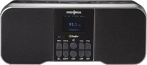
Comment on this article.

Product Evaluation: Insignia Narrator, the Only Fully Accessible HD Radio on the Market

It's a small thing, but you're a smart person, and you know that if only you could read the instructions that came with your new piece of equipment, you could be using and enjoying it in a flash. How often have you paused over the box of some brand-new, shiny toy to reflect along these same lines: "I wish there were instructions in this box I could read."

Have you ever imagined how lovely it would be if, say, when you took a new radio out of the box, a CD containing the audio instruction for setting it up were right there in the box alongside that pesky printed user's guide?

That is exactly the step that Best Buy, in partnership with the International Association of Audio Information Services (IAAIS), has taken in the launch of Best Buy's sleek, new, and fully accessible HD FM radio. The radio, designed by Best Buy's own Insignia Products team, is called the Narrator. When you take this radio out of the box, right there alongside the printed user's guide is an audio CD containing the complete user's guide conveniently divided into 12 audio tracks. When you take this radio out of the box, you can set it on a table, pop the CD into your computer or other player, and listen to the entire manual while examining the radio and absorbing its functions.

A Little History

IAAIS is a membership organization of radio reading and other information services throughout the U.S., Canada, and elsewhere. In 2008, IAAIS was asked to draw up a list of those features that, if available on an HD radio, would render it completely usable by a person unable to see the display. An IAAIS task force compiled those features in a document known as the STAR document, and Best Buy's Insignia line has built a radio incorporating those specifications.

The Insignia Narrator is a stylish, tabletop radio delivering the crisp, clear sound of HD radio, which includes some radio reading services along with AM and FM broadcasts. It also has an auxiliary mode for playing the audio of other devices through its speakers, a clock, two alarms, and the ability to mark up to 20 presets for your favorite stations. All of these features can provide audio feedback so that a person unable to see the display can use the radio without assistance. If, however, you don't need the accessible features, then you simply keep the radio tuned into ITR rather than IAAIS mode and perform all of the above functions visually.

First Look

Taking the radio out of the box, I set it up on the desk and popped the accompanying CD into my computer. The radio is an attractive, compact design, measuring about 12 inches wide by 5 inches tall by 6 inches deep. It is slightly elevated by back "legs" to tilt the speakers upward. The radio has two large speaker surfaces to the right and left of a display panel in the center of the front face. When in accessible or IAAIS mode, this display presents orange characters on a black background. There are two rows of buttons near the bottom of this display (or five "columns" with two buttons in each column). While flush with the display surface of the radio and, thus, consistent with the popular, sleek touch-screen appearance, these ten controls are shaped and textured so that locating them by touch is quick and easy.

Photo of the Insignia Narrator radio.

Caption: The Insignia Narrator Radio

On the top surface of the radio are six round buttons with three on either side of an oblong button or bar. A push of this long button gets an announcement of the correct time whether the radio is powered on or off. It also acts as the "Snooze" button when an alarm has sounded.

The six round buttons are "Power," "Source," two alarms, and two volume controls.

I must mention here that it was very empowering to listen to the audio version of the user's guide while exploring the radio and, thus, learning every function of every button immediately. Of course, because this is a radio with universal appeal, the earliest segments of the user instructions deal primarily with its visual interface with occasional references to the audio feedback available. The instructions do tell you straightaway, however, how to turn on the audio mode at power-up, and finally, an entire section at the end of the CD is devoted to step-by-step explanations of every audio function. It bears repeating that, for those individuals not interested in the audio feedback of this radio, they will never need to hear it. On the other hand, once you have activated it, the radio will come up talking on every power-on unless you want it to do otherwise.

On the back of the radio are the AC adapter connection, connectors for the AM and FM antennae (both included), and a jack for connecting auxiliary devices. The latter is useful for playing other devices, such as a Victor Reader Stream or Book Sense, through the radio's speakers. A 3.5 mm earphone jack is conveniently located on the front of the radio just above the first column of buttons on the control panel.

What It Has to Say

The Narrator's speech is clear, digitized human speech delivered as a pleasant female voice. If you have activated the IAAIS mode (by holding down the "Select" button on the front while pressing "Power"), the Narrator will announce, "Power on," as it comes to life and will then announce its sound source. This will be AM, FM, or auxiliary along with a frequency in AM or FM. The radio will remember the last source mode used and come up in that same mode when powered on again.

By tapping the "Source" button on top of the radio, you can move among these source modes. By pressing the "Seek Up" and "Down" buttons, the "Channel Up" and "Down" buttons, or the "Preset Up" and "Down" buttons from the front of the radio, you can select channels of your choice. Each frequency is announced in the same clear voice as you explore channels or switch to one you have marked as a Preset.

Setting the time and the two alarms can be done entirely independently without visual access to the display, as well. These functions are performed with the radio powered off so that buttons used to select channels and presets while playing the radio can now double as announcers of hours and minutes for setting clock or alarm time. Both 12 and 24-hour modes are available. The alarm sound can be any of the radio's source options or a repeated beep tone.

What It Can't Do

Well, of course, it can't make your coffee or tell you what to wear for work after waking you up in the morning, but there are a few features available to sighted users which have not been made accessible to the blind. These are the Bookmark and Artist Experience features. When not in IAAIS mode, the press of a button will provide album art and what is called "Artist Experience," i.e., identification of the content which is being broadcast. This is, of course, only available if it has been transmitted by the station which, reportedly, is still rather infrequent. The Bookmark feature allows a sighted user to Bookmark particular content. This, too, has not yet been made accessible via audio feedback. When the Bookmark key is pressed while in IAAIS mode, a single beep tone is heard, indicating that this feature is not accessible.

Every other feature on this radio, however, can be completely and conveniently enjoyed with nonvisual access.

The Bottom Line

HD radio broadcasts now cover roughly 90 percent of the U.S. At this writing, there are a reported 2100 HD channels and 1300 multicast channels, thus 3400 crisp, clear broadcasts for your listening pleasure. At least one radio reading service, Sun Sounds of Arizona, is also broadcasting on an HD channel, a kind of bonus for blind or visually impaired listeners who happen to buy an HD radio and live in that particular market.

Best Buy has taken a truly exemplary step in the development of this product. The Insignia Narrator is a great product at a great price that will appeal to many consumers and has the advantage of being completely accessible "out of the box" to blind and low vision users. The company has expressed an interest in developing other products with similar universal appeal, and if the Narrator is any indication of things to come, that is happy news, indeed.

Product Information

The Insignia Narrator sells for $99 and can be ordered at Best Buy's online website (not in Best Buy retail stores).

The STAR Project report, outlining the desired specifications for accessible radios, can be found on the website of the International Association of Audio Information Services.

Comment on this article.

Transforming Lives for People with Low Vision: An Evaluation of the Transformer, a Computer Compatible Electronic Magnifier from Enhanced Vision

Electronic magnifiers, sometimes called CCTVs, have been around for decades. Since their development, a host of features have been incorporated, and major changes have been made to their physical design making many full-feature models very portable. Improvements over the years have been made, and new features, such as line markers, auto focus, improved color, computer compatibility, picture taking capability, and HD technology, have been added. A much needed shift has happened in the low vision market because people are on the move and need to take their computers and magnification with them. Laptops enable people to take their computers wherever they go. They can be used with screen-magnification software, and they can be used with their electronic magnifiers.

This article evaluates the portable, full-feature Transformer electronic magnifier from Enhanced Vision. The Transformer can be used with a stand-alone monitor and is laptop/computer compatible, weighs less than 3 pounds, and has a rotating camera that allows for desktop, distance, and self-viewing. It has the ability to take a "picture" and save it to the computer. The Transformer and other portable, full-feature, laptop compatible electronic magnifiers also allow a student to sit in different areas of a classroom and read sections of the chalkboard on a laptop screen, a professional to sit at the back of a conference room and watch a presentation on a laptop screen, and a nature lover to watch birds from a kitchen window or from a picnic table at a local park, seeing everything up close on a laptop screen.

To help potential buyers make an informed purchase, this article provides highlights of the product's positive attributes as well as areas that could be improved. Since this type of access technology can be quite expensive, it's important to be as knowledgeable as possible about your options before you make a choice.

The Transformer was evaluated in four main areas: documentation, minimum requirements and product design, set-up and software installation, and features.

Documentation

The Transformer comes with a User Manual that describes the product, its features, and its setup and use. The User Manual, however, primarily uses 12 point font, which is too small for most people with low vision to read, and it doesn't reach the American Printing House for the Blind's guideline of at least 18 point font for print that is intended for people with low vision. Charts and diagrams in the User Manual use font as small as 6 point, while the manual's drawings and photos are small with many dim or low contrast. As a result of the smaller text fonts and photos, the manual may be of limited use for a person with low vision who is attempting to set up and use the device independently. A User Manual with larger fonts and diagrams and clearer photos would increase its accessibility for the intended user of this product.

A chart showing the keyboard commands for using the Transformer with a computer is shown on page 15 of the User Manual. Including a separate large print quick-reference sheet with this information would be a valuable tool, especially when people are first learning to use the device. Users could keep this quick-reference sheet close by and refer to it more easily.

While the User Manual is quite detailed in its explanation of the product, it would be very helpful to add a few sentences about how to toggle between the Transformer view and the computer view when using the device in conjunction with a PC. This may seem like a simple thing, but adding the information to the User Manual would be beneficial for customers.

System Requirements and Product Design

According to Enhanced Vision, to use the Transformer with your computer/laptop, at minimum, you will need Windows XP (Service Pack 2), an Intel Pentium M 1.5 GHz processor, 512 MB of memory, 1 USB 2.0 high-speed port, a graphics card supporting Directx 8.1, and 100 MB of free hard disk space. It is important to remember that these are the minimum requirements. The more advanced your computer's operating system and components, the better your end results will be using the Transformer or any PC based electronic magnification system.

With this in mind, Enhanced Vision recommends using a computer with Windows Vista or Windows 7, an Intel Core2Duo processor with 2 GB of memory, 1 USB 2.0 high-speed port, NVidia or ATI graphics card, and 100 MB of free hard disk space.

The Transformer is a compact, L-shaped electronic magnifier that sits on a base consisting of two "wish-bone" style legs that create its stable base. This device folds down easily and slips into its carrying case with a shoulder strap making it extremely convenient to take from place to place.

Photo of the Transformer

Caption: The Transformer

The Transformer has six buttons: "Find," "Power," "Mode," a" Zoom" wheel, "Freeze," and "Rotate." These controls give you access to many of the product's features. The camera rotates 330 degrees to provide distance viewing, reading and writing viewing, and self-viewing. The attached reading lens should be folded to cover the camera for optimal clarity when in the Reading and Writing viewing mode. There is also a built in LED light underneath the camera arm that can provide additional lighting in the Reading and Writing mode. The included VGA cable is used to connect the device to a monitor, and the included USB cable connects it to a PC, which provides additional functionality. The Transformer is powered through an AC adaptor and has a built-in rechargeable battery that can also be used to power the device for up to four hours when an outlet is not available.

Set-Up and Software Installation

The Transformer comes pre-assembled. To set up the device, you simply unfold it, plug in the AC adapter, and connect it to a VGA monitor or PC.

The Transformer software is pre-loaded onto the device itself, and its installation to your computer is easy to perform if you have screen-magnification software running. To install the Transformer software to your computer, simply connect the device to your PC via the USB 2.0 cable, start your computer, and follow the prompts on your screen. The screen-magnification software will enlarge the prompts to make them readable to people with low vision, and when the installation is complete, the Transformer viewer window will automatically open.

The Transformer is easy to transport from place to place. When you get to your destination, you unfold the camera arm, plug it in (if not using the built-in battery), and connect it to your choice of a VGA monitor or PC. If you are using a PC, connect its USB cable to your laptop, start the computer and screen-magnification program, select the EnhancedVision icon on your desktop, press the "Power" button on the camera, and you are ready to go.

It is important to note the Transformer's Viewer application is compatible with Dolphin SuperNova version 11.5 to 12, Ai Squared ZoomText version 9.xx, and Issist iZoom 3.xx. While the Transformer Viewer application is running, you can open the above mentioned screen magnification programs and simultaneously run the software and Viewer application.

Features

The number of features available with the Transformer increases when you transition from using it with a VGA monitor to using it with a PC. The following features are available when using a VGA monitor or a PC.

3 Viewing Modes

To increase its versatility and functionality, the Transformer can be used to see your desktop, yourself, or at a distance. To change the viewing mode, turn the position of the camera by rotating it on the arm. The device also has a memory feature that remembers the last setting in each mode and automatically returns to the last setting used in each mode.

Viewing Positions

When in Reading and Writing mode, the Transformer can be used in three different positions (facing left, right, or forward) to better accommodate specific circumstances, including people who are left handed, reading oversized books or newspapers, or to adapt to different types of workspaces. No matter which way the device sits on your desktop, you can press the "Rotate" button until the image displays correctly on the monitor's screen.

Magnification

The Transformer offers a wide range of magnification. On a 17 inch monitor, for example, 2.4x to 30x magnification is provided. As with all electronic magnifiers, the range of magnification is dependent on two factors: the size of the display screen and the distance from the camera to the object being magnified.

Find

The Find feature can help identify where you are currently magnified on a page or can help locate a specific part of a page or object you want to view more closely. To activate this feature, press and hold the "Find" button on the camera. The Transformer will zoom out to the widest field, and a "target" will appear in the center of the monitor's screen. You then move the reading material or object to the center of the "target" and release the "Find" button. The material you moved to the targeted area will then be magnified. This is a beneficial feature to help you find your place on a page when reading large blocks of text.

Freeze

The Freeze feature allows you to take a temporary "snapshot" of what is being displayed in the Transformer window in order to have more time to view the image. You could, for example, look up a number in a phonebook, apply the Freeze feature, put the phonebook away, and review the number being "frozen" on the monitor to dial the phone.

Rotate

The Rotate feature allows you to rotate an image on the screen 90 or 180 degrees. To activate this feature press the "Rotate" button on the underside of the camera arm. You can return to the original view by cycling through the views until the image is in your preferred position.

Line and Window Markers

Line and window markers are used to frame an image between two horizontal or vertical lines. These lines can be used as a reading guide for passages of text, a guide to keep your place as you move from one side of a page to the other, and to make handwriting easier. The size of the line and window markers is also adjustable.

Color Select

By pressing the "Mode" button, you can toggle through various background and text color schemes to better suit your vision needs. You can choose from full color, enhanced positive, enhanced negative, and six pre-set color selections. For even further customization, these six color selections can be modified to any of 28 color schemes.

The following features are available only when using the Transformer with a PC.

Capturing an Image

The Transformer's Viewer application allows you to capture a "snapshot" of the camera image. This snap shot can then be saved to your computer for reviewing at a later time. Pressing the "F5" key will take the snap shot. When this happens, a standard "Save As" dialogue box will open, and you can save the image as a standard JPEG file. Pressing "F6" will bring up an "Open" dialogue box where you can review the previously saved image. The image will open in the Windows program you have set as your default picture viewer.

Video Window Divider

When using the Transformer with a PC, you can view the PC window and the Transformer Viewer application window in a full screen view or simultaneously on your PC screen in a split-screen view. The position of the Transformer application window can be set to the left, right, top, or bottom of the PC screen, and pressing "F8" will cycle through the various positions.

Accessing the On-Screen Set-Up Menu

The on-screen set-up menu can be accessed by pressing and holding the "Freeze" button for three seconds. The "Zoom" wheel is used to move through the menu items, and pressing the "Mode" button will activate the selected option. This menu is used to access the following options and settings: Line and Window Markers, Marker Size and Position, Color Modes, Screen Display settings, and Product Information.

The issue here is that the on-screen menu items are displayed in fonts too small to be read by many people with low vision, and the fonts cannot be magnified either by the Zoom feature or by screen magnification software. Even though the settings in this menu may not need to be accessed often, they still need to be accessible to the user with low vision. This is definitely an issue that needs resolved, either by increasing the size of the fonts in the menu options or redesigning the menu's interface.

What Would Make it Better

The Transformer could be improved in the following ways:

  • (1) By increasing the font size in the User Manual to at least 18 point font and increasing the size and improving the visibility of the photos. This would better enable people with low vision to independently set up and learn about the product.
  • (2) By adding the ability to adjust the brightness of the built-in LED light. I used the Transformer in a typical office setting, and the LED light did not increase the brightness of the image on the monitor's display. It would also be a bonus if the LED light were repositioned so that it could be used when using the self-viewing feature.
  • (3) By improving the image quality when using the Transformer's viewing application with a PC. When using a PC, there is a bit of a delay in the display while moving text under the camera. This causes some pixilation of the text, though this is reduced when slowing the movement of text. The issue is that slowing your reading speed also reduces your productivity. I understand this delay is largely due to the PC's processing speed, and results will vary due to computer specs. This is why I recommend having a stand-alone monitor close by your main work station for more lengthy text reading.
  • (4) By improving access to the on-screen menu by increasing its font size or redesigning its interface.

The Bottom Line

The Transformer from Enhanced Vision is definitely an example of the newer generation of computer compatible electronic magnifiers. The product is very lightweight and portable, provides a wide range of magnification and color viewing options, has a rotating camera for desktop, distance, and self-viewing, and has the ability to capture an image and save it to your computer. All of these are great features, especially if you are a student or professional who needs portability and flexibility.

The issue is that when used with a PC, this portability and flexibility can come at the cost of compromised viewing quality when moving text under the camera (which is the case with all computer based electronic magnifiers I have evaluated). The transformer provides excellent viewing quality when using a VGA monitor for the display. In this situation, the image travels directly from the camera to the monitor's screen. When used with a PC, the camera's image must be processed through the computer, thus there is a delay when using the PC's monitor as the display. When using a PC's display to read text, you must move the text much more slowly to reduce pixilation. Therefore, I would recommend using the Transformer with a PC for spot reading or reading smaller amounts of text. I would also recommend using the Enhanced Vision's portable x-y table with the Transformer to improve the text reading experience.

For full featured electronic magnification on the go, however, the Transformer is definitely an option to consider.

Product Information

Product: Transformer

Price: $1,995 for computer compatibility only ($2,145 for computer and VGA compatibility)

Warranty: 2 year warranty

Manufacturer: EnhancedVision

Phone: 1 (888) 811-3161

Website: www.enhancedvision.com

Comment on this article.