Full Issue: AccessWorld August 2015

Letters to the Editor

Dear AccessWorld Editor,

In the past few years, I've purchased a BraillEdge 40, an iPad Air, a Samsung Galaxy S4 phone, and I had to get a new home phone. All of these items come with documentation, and some of them provide downloadable documentation. All of that is good. I'm an older person who grew up using braille, and I would find it far easier if I could get braille manuals for all these products. The technology is there to make braille downloadable. Everybody wants to sell their products and their apps, and I suppose the younger generations learn well using speech. But, if manuals were downloadable in braille, those of us who use braille devices could have our manuals easily available in that format.

Just a thought — for what it's worth.

Nancy Johnson

Dear AccessWorld Editor,

I am using the Kyocera Verve phone evaluated by Bill Holton in the article An Accessibility Evaluation of the Kyocera Verve Phone. Twice now, while the phone was in my pocket, it somehow got into emergency mode and dialed 911. What options do I have for avoiding this from happening? There should?be a way so that nothing could be dialed accidentally.

Regards,

Ted Larson

Dear AccessWorld Editor,

I would like to announce the publication of a free book called Getting Back to Work with JAWS. It is a guide for people who have never used JAWS before, but who need to use a screen reader to become productive again with their computer.

I lost my vision three years ago, and despite being a software engineer, I found it was hard work adjusting to using a computer entirely through a?keyboard and synthesized speech. I discovered that while there were a lot of high quality training materials available, there is something unique about learning to use a computer again after a vision loss. As the baby boomers continue aging, I expect there will be more and more people in my situation. My hope is that by focusing on essential skills as well as the challenges of the process, I might make the journey a little easier for others.

To download the book for free, please visit Back to Work Blind.

The book itself is a zipped set of RTF files that can be read by any word processing program, including Windows WordPad. There is absolutely no cost, [nor are there any] ads, registrations or commercial aspects to this whatsoever.

If you feel this book would be a useful tool for new JAWS users, please feel free to publicize or distribute it in any format. It is licensed under a Creative Commons non-commercial license. I simply want to help anyone who has lost [his or her] vision to return to work as quickly and easily as possible.

Sincerely,

George Calvert

Dear AccessWorld Editor,

I am writing in response to the article Evaluation of the Leasey (Learn, Enable, Advance — So Easy!) Computer Scripts from Hartgen Consultancy, by Jamie Pauls.

It would be so awesome if this could be made as a stand-alone package, not tied to a screen reader.

Dear AccessWorld Editor,

In response to the article Audio Description Comes to Netflix, by Jamie Pauls. Has anyone noticed that the first season of criminal minds is not audio described at all? Could we say [something] about completing the process with Netflix? It seems a bit strange to have everything from season two audio described but not season one.

Thanks,

D.R.

Dear AccessWorld Editor,

I loved the article The Blackboard Online Coursework and Learning Environment: Accessibility Reports from Two College Students and One Instructor, by Jamie Pauls. In fact, I loved the whole July "Back to School" issue! It's jam-packed full of helpful articles. We get loads of questions about Blackboard. Now I know where to guide folks. Thanks so much for such a wonderful issue!

Sharon Lovering,

Editor, American Council of the Blind

Dear AccessWorld Editor,

I would like to suggest that AccessWorld might look into putting AccessWorld on the NFBNewsline service where it could reach many more readers.

Dear AccessWorld Editor,

I was reading through this month's issue of AccessWorld and I enjoyed all of the articles and the letters to the editor. I have a question for you. Have you ever thought about doing a review of the Learning Ally Audio app? I have never seen a review about this app in AccessWorld. Hope to hear from you soon.

Thank you,

Roanna Bacchus

Response from AccessWorld Editor, Lee Huffman

Hello Roanna,

Thanks so much for reading AccessWorld, and I appreciate your question.

AccessWorld has published information about the Learning Ally App and provided links to further resources. It has not, however, published a full evaluation of the app. I will discuss the possibility of an article on the Learning Ally app with AccessWorld authors at our next team meeting.

Thank you for your suggestion.

Dear AccessWorld Editor,

I am writing in response to Janet Ingber's July article, An Update on the Finger Reader, an On-the-Go Reading Device in Development at MIT.

The Finger Reader is a brilliant, forward-looking device that would add levels of practical application for blind people. Ray Kurzweil would probably also be an invaluable person to advise on this product. I would be waiting with bated breath for the launch of the Finger Reader because of its application in a research library.

Regards,

Dr. Siva Modley, Researcher

AccessWorld News

Windows 10 Upgrade Considerations for Screen Reader and Magnifier Users, From the Microsoft Accessibility Blog

*Caption: *This blog post was written by Rob Sinclair, Microsoft's Chief Accessibility Officer. Rob is responsible for the company's worldwide strategy to develop software and services that make it easier for people of all ages and abilities to see, hear, and use their computers.**

On July 29, Windows 10 becomes available for PCs and tablets, and will be available on additional devices by the end of the year. If you currently use Assistive Technologies (AT), like screen readers or magnifiers, your experience on Windows 10 will be similar in many ways to what you are accustomed to on Windows 7 and Windows 8.1. In addition, Windows 10 introduces new features and applications that will continue to improve as we deliver Windows as a service to our customers over time.

For the most accessible Windows 10 experience possible, I suggest the following:

  • Ask your AT manufacturer about Windows 10 compatibility, their recommended upgrade process, and timing.
  • Set your default web browser to Internet Explorer for a more accessible web browsing experience.
  • Install a 3rd party PDF reader like Adobe Reader, for a more accessible PDF reading experience.
  • Use the Outlook and Office desktop applications for a more accessible email and productivity experience.
  • If you have a secondary computer, consider upgrading this one first, to familiarize yourself with the Windows 10 experience.

If you have upgraded to Windows 10 and find your AT is not working as expected, or you've encountered an accessibility issue, please consider the following options:

We're continuing to work with our AT partners to improve the accessibility of the Windows 10 experience and we value your feedback. If you haven't done so already, please consider joining the Windows Insider Program to share your experiences and suggestions.

Ai Squared, the makers of ZoomText and WindowEyes, is working toward compatibility with Windows 10

Ai Squared, the makers of ZoomText and WindowEyes is working toward compatibility with Windows 10, and it has put together some key information to help you plan for the release.

Ai Squared has set up a page to keep its customers up-to-date on its progress and is posting weekly updates. On this page, you will also find Frequently Asked Questions about Windows 10 compatibility. Check out Ai Squared's weekly Windows 10 updates for important compatibility information!

Dolphin Computer Access Brings Blind and Partially Sighted People Immediate access to Windows 10 in ALL its Software Solutions

SuperNova 15 (available as a public beta) is the first and only solution to bring magnification, screen reading and Braille support to Windows 10 devices, empowering visually impaired people to experience Windows 10 from release day.

Dolphin Guide delivers simpler, talking menu access to Windows 10; perfect for computer novices with age related sight loss.

Dolphin's alternative format creation tools also bring immediate support for Windows 10: EasyConverter to create Braille, large print & audio formats; EasyReader delivering DAISY talking book access and Dolphin Publisher as a professional DAISY talking book production tool.

Check Out SuperNova Links and Resources

Download the SuperNova 15 public beta with Windows 10 support

Existing SuperNova customers – Pre-order your v15 upgrade.

Read Dolphin's Windows 10 Tips
  1. How to reserve your free Windows 10 upgrade?
  2. Meet the new Windows 10 start menu – a blind and partially sighted perspective
  3. Multiple desktops.

JAWS 16 and MAGic 13 Are Windows 10 Ready

Freedom Scientific has announced the compatibility of the latest updates of the JAWS 16 screen reader and MAGic 13 screen magnification software with Windows 10. Windows 10 was released on July 29, 2015, and is offered as a free upgrade for devices running Windows 8.1 or Windows 7.

"Over the past few months we have worked with Microsoft to ensure compatibility with Windows 10. The newest versions of JAWS and MAGic are ready for Windows 10, without the need for paid upgrades," said Eric Damery, Vice President of Software Management at Freedom Scientific.

Anyone with an earlier version of JAWS or MAGic and who is planning to update to Windows 10, will need to follow the instructions provided in the Freedom Scientific prepared guide. Visit the Windows 10 Upgrade web page for the smoothest transition to the new Windows operating system.

Celebration of the Americans with Disabilities Act: 25th Anniversary

Twenty-five years ago, the Americans with Disabilities Act (ADA), a landmark piece of legislation prohibiting discrimination based on disability, was signed into law

To celebrate the anniversary, the Obama Administration hosted a reception at the White House. In addition, several other government agencies and departments are celebrating too. From July 24-26, the Smithsonian Museum of American History hosted a 25th ADA Anniversary Festival for Federal agencies to offer educational insights about the ADA, employment opportunities for people with disabilities, and the history of the disability rights movement. The festival also presented interactive demonstrations of accessible and inaccessible streetscapes, new way-finding technology, access technology, accessible vehicles, and more. Participating federal agencies included the Departments of Health and Human Services, Homeland Security, Justice, Labor, State, and Transportation, as well as the Equal Employment Opportunity Commission, the Federal Communications Commission, the Federal Emergency Management Agency, the National Park Service, the Social Security Administration, and the US Agency for International Development. The White House also hosted a series of events celebrating the ADA and the past, present, and future of the disability rights movement.

The passage of this act was one of America's great civil rights triumphs. It was the culmination of many years of struggle by the countless people who marched, organized, and refused to be treated as second-class citizens. In his remarks, President Obama not only spoke to the significance of this historic legislation, but also highlighted some of the steps being taking today to ensure equality and opportunity for all Americans, including those with disabilities.

The current administration works to ensure the full implementation of the ADA. In celebration of the 25th anniversary of its passage, the administration has announced a series of new actions aimed at improving the lives of and expanding opportunities for people with disabilities. These announcements include: employment opportunity, high quality education, civic and community participation, health care and healthy living, fair housing, accessible transportation, and information and communications technologies. For more information on the details of the ADA expansion please visit The White House Press Office website.

The New AccessWorld App Is Now Available!

The new AccessWorld app, Version 2.0, is actually a completely new app that has been rewritten from the ground up. Now, the app is much more responsive and includes the following new features: –    Updated automatically on new issue launch,
–    Ability to search the full AccessWorld archive,
–    Enhanced table of contents with author information for each article,
–    Improved article sharing through e-mail and social media,
–    Full interface refresh including text resizing through pinch to zoom and toolbar controls,
–    Now includes iPad support.

Be sure to update to Version 2.0 or download the new app from the Apple App Store today!

The AFB VisionConnect App Is Now Available

The American Foundation for the Blind is pleased to announce the release of a free, accessible iOS app: VisionConnect, a prescription for independence for patients who are blind or losing vision. This app provides a searchable directory of services available in the US and Canada for children and adults who are blind or visually impaired. By using this app, you can find services such as computer and technology training, daily living skills training, braille and reading instruction, dog guide training, employment services, low vision services, and more. You can also drill down into resources such as tips for modifying your home, accessible products, medication management, a Getting Started Kit, information for veterans, stories about people living and working with visual impairment, and more. Mock "prescription pads" are available to give to doctors and other health care providers to encourage them to "prescribe" the VisionConnect app to patients who need information about services and living with vision loss.

If you have questions, please e-mail Vision Aware.

Download VisionConnect for the iPhone or the iPad.

Envision Launches Global Search for Next Research Fellows

Envision announced that it has initiated a search for two additional postdoctoral research fellows to design and execute research projects in conjunction with the Envision Research Institute (ERI), launched earlier this year.

The new fellows will be sponsored by sister blind and visually impaired agencies Bosma Enterprises, the Indianapolis-based manufacturer and provider of job training, employment services, rehabilitation and outreach for those who are blind and visually impaired, and LC Industries, Inc., the Durham, NC-based manufacturer of Skilcraft brand products and operator of distribution centers and retail stores on military bases.

ERI research fellows will work on their respective studies for up to two years, partnering with mentors at Envision and at renowned educational, research, and medical institutions around the world. Their work puts them on a fast track to independent and impactful research careers, and provides a nurturing environment in which they can strive to pinpoint solutions to improve the quality of life for people who are blind or visually impaired.

"The Envision Fellowship Program offers post-doctoral candidates the chance to advance both their studies and their careers. In addition to classic training in research methods and scientific writing, fellows are immersed in Envision's programs and services, witnessing firsthand the challenges faced by the BVI community and the approaches that currently exist to address them," said Laura Walker, Executive Director of the ERI. "At ERI, fellows have the unique opportunity to pursue independent research, while experiencing how their science can have an impact on the lives of those who are visually impaired."

For further information, please visit the Envision Research Institute and its Fellowship program.

Envision Debuts New Website to Increase Accessibility to Participation in, and Support for, Programs and Services

Envision recently announced the debut of its revamped website, EnvisionUs, designed to better illustrate the organization's numerous and increasing facets and provide a stronger, more flexible foundation upon which to expand Envision's online presence in the future.

The new site reflects the evolution undergone by Envision in its drive to improve the quality of life and provide inspiration for the blind and visually impaired through employment, outreach, rehabilitation, education, and research. The site's design, structure, and content all have been retooled to make it easier for users—whether they are people affected by vision loss or impairment, professionals dedicated to improving the lives of such individuals, donors whose support helps fund Envision's ongoing activity, volunteers looking to assist in the execution of Envision's programs and services, job seekers hoping to secure employment within the organization, or other organizations interested in partnerships or purchasing Envision's products and services—to interface with the organization,.

The new website represents the ever-increasing breadth of this activity, said Heather Hogan, Senior Vice President of Foundation and Mission Services, and acknowledges that Envision's evolutionary process is far from over.

Improvements in accessibility include optimizing the new site to work with assistive technology such as screen readers and magnifiers. More vivid imagery and video have been added to tell the Envision story, and a section labeled "Our Stories" brings Envision to life by introducing visitors to a wide variety of individuals relating how their ties to the organization have had a positive impact on their lives. Other features include quick access to a blog that highlights the people and aspects that make up the Envision community, a calendar of coming events, and a tab to access an online donation form to help support the organization's efforts.

Access Technology at Discounted Prices Available from the Chicago Lighthouse for the Blind

The Chicago Lighthouse for the Blind Technology Store has two sections for products with discounted prices on its website, one for used and former demonstration CCTVs and another for new items that are discontinued or that the Chicago Lighthouse is no longer selling. If you are in the market for more affordable access technology, please check out the links below. You may also wish to save these links, as the listings are continually updated.

Sale-priced Access Technology

Pre-owned Electronic CCTVs and Other Access Technology

If you have questions regarding the Chicago Lighthouse and its discounted products, please e-mail Luke Scriven or call 312-997-3649.

Envision Named 2015 AbilityOne Contractor of The Year by USDA For Business Card Printing

Envision announced that its Envision Print division has been selected to receive the 2015 AbilityOne Contractor of the Year Award from the United States Department of Agriculture's Food Safety and Inspection Services division. The award recognizes exemplary service demonstrated by an organization participating in the AbilityOne program, the federal initiative established to help people who are blind or who have other severe disabilities find employment at nonprofit agencies that sell products and/or services to the US government.

This is the fifth time that the USDA has presented the prestigious award to Envision, which has been producing business cards for the agency since 2008.

Envision Print produces more than two million business cards each month at its ISO 9001:2008 certified Wichita facility, including cards enhanced with braille. The organization offers a simple and cost-effective way for government employees to obtain business cards under the AbilityOne Program, and is the only GSA-approved source for business cards purchased with appropriated funds. Its easy-to-use web-to-print service is a secure online ordering system that provides access to more than 3,200 online business card templates and approved agency templates as well as the ability to upload designs and artwork.

Richard Beausoleil: A Musician Harmonizing with Technology

At a board of directors meeting for Guide Dogs for the Blind in San Rafael, California, we learned that there would be a special after-dinner treat. One of the students in class at the time, we were told, is a professional musician, and he had agreed to sing for us.

Describing a voice is no easy feat. Richard Beausoleil's voice, however, is so, well, melodious, that it warrants an effort. The music was lovely. His voice is a tenor as smooth as butterscotch pudding, you might say, and his silvery guitar accompaniment was a perfect match for it. The effect was musical, of course, and soothing, too, lilting and lovely. This surprise entertainment was easy listening sans the oft-implied negative connotation associated with that label. It was "easy on the ears" and left my ears wishing for more of the same.

Richard Beausoleil, it turns out, is not only a professional musician who happens to be blind, but one with a very interesting set of tools and techniques that immediately prompted me to learn more for sharing his story with readers of AccessWorld.

Music in Any Language

When he speaks, Richard Beausoleil has a distinctly charming French accent. Born and raised in Quebec, where he lives and works today, his first language was French. One small part in selecting Guide Dogs for the Blind in California as his desired training center for receiving a guide dog was, in fact, the challenge of having to speak, listen, and learn exclusively in English for two whole weeks. He also commented that after each day of training, he was more than ready to call his wife for a relaxing conversation in his native French!

When he sings, however, his pronunciation is much the same as that of Billy Joel, Brian Wilson, Adele, John Lennon, or Paul Simon, to name only a few of the scores of artists whose popular songs from 1940 to the present he interprets. His diction while singing, in fact, is notably clearer than most, another mark in the plus column for the listening experience.

Richard Beausoleil's website identifies him as a musicien-chanteur (musician and singer) and, not unlike many professional musicians who make a living performing in restaurants, pubs, special events, and private parties; his repertoire is vast, aimed at pleasing audiences ranging in age from 20 to 100.

The methods he uses to be prepared to charm audiences with popular songs spanning so many genres and decades, however, are far from commonplace.

What's on Your iPod?

For me, Richard Beausoleil's performance was lyrical and flawless, and just plain pleasant. But I was not able to see his performance.

When a fellow board member who has normal vision asked, "What's on your iPod?" I began to understand that his performance style has some interesting visual elements, too.

First, Beausoleil plays his guitar with the instrument lying flat, rather than on its side against the body as is customary. Asked why this is, he explained: "I began to play when I was four years old. I just played to make the sounds I had heard. On a piano, you press on the keys. So I pressed on the strings."

How to hold the instrument, in other words, was not relevant to the four-year-old wanting only to make music. The answer to the iPod question was even more interesting. The "iPod" was, in fact a Victor Reader Stream. What Beausoleil is hearing while performing a song is the accompanying arrangement, (a track he has produced himself) in his left ear and the lyrics, (spoken by a speech synthesizer) in his right.

How he has these tracks for hundreds of songs is the rest of the story.

Beausoleil Productions

In his home, Richard Beausoleil has a professional recording studio. He uses a Windows 7 computer, JAWS screen-reading software, and software from Dancing Dots called CakeTalking for Sonar. Part of his business is rooted in producing demo tracks and arranging and creating musical accompaniments for songwriters and other musicians who require production services. For each of the hundreds of songs in his own performance repertoire, he produces the orchestral accompaniment. Sometimes, that multi-instrument sound is heard by his audience. Often, it is heard only by Beausoleil himself (as the track heard in his left ear), while his guitar and vocal performance is what his listeners hear.

Next, he develops a file with the lyrics, spoken by a speech synthesizer, and delivered in exact cadences, synchronized with the music, so that he is cued, line by line, as the song progresses.

For each song, he puts the two together, music for left track and lyrics for right, and adds it to his Victor Reader Stream. When a request is made, he simply searches for the desired song using the Victor Reader Stream text function, and begins to play and sing.

During our interview, Richard allowed me to cruise the amazing repertoire in his Victor Reader Stream.

"Dancing Queen," "Piano Man," "I'll Be Seeing You," "Big Yellow Taxi"—every artist from Elvis to Al Green, the Everly Brothers to Bruno Mars is there. And then, in the Victor Stream voice familiar to so many, I heard, "Mains Sur Tes Hanches," "Elle était si Jolie," and "Le Petit Bonheur."

I am momentarily bewildered. And then I remember: Oh, yes, of course, Richard Beausoleil would naturally sing as many songs in French as he does songs in English!

Sometimes, the left track is only the sound of a metronome, which he has synchronized with the right-ear lyric track.

I selected one song after another, listening to a bit of each, and admit that the strange effect of hearing a kind of robotic karaoke initially struck me as both brilliant and farcical. Reflecting, then, on how this musician can create such support materials, arrange and produce them, and then utilize them as he does on a regular basis, I was mostly just amazed.

Beausoleil says that technology has had tremendous and positive impact on his work. His wife, who works for HumanWare, happened to meet Bill McCann, president of Dancing Dots, at a CSUN conference over a decade ago. She knew immediately that the software created by that company, CakeTalking, providing access to SONAR, was exactly what her husband needed. And, of course, she was in the right place to recognize another valuable tool for him when the Victor Reader Stream was initially introduced by HumanWare.

How to Hear Richard Beausoleil's Music

Like many freelance artists, Richard Beausoleil's work is a collage of assignments. He produces demos and supporting tracks for other musicians. He provides the entertainment for parties, corporate events, weddings, and a variety of special occasions. And, if you are lucky enough to be in Quebec on a Friday or Saturday evening, he is the regular entertainment at a restaurant called Crêperie le St-L, 579 Avenue Notre-Dame, Saint-Lambert.

Of course, if you don't live in his part of the world, you can also hear plenty of samples Richard Beausoleil's website.

In a time when technology, both specialized and mainstream, presents work-arounds for so many professional and recreational tasks, there still are surprises. It was wonderful to see how talent, resourcefulness, and the ability to apply technology to the individual needs of one clever user have come together.

A Richard Beausoleil performance is, in other words, a sample of true harmony—the harmony of talent and technology—and the result is a treat indeed.

Comment on this article.

Related articles:

A New Music Streaming Service: iTunes Radio is Here by Janet Ingber

Making Music with the Beamz: A Tool for Fun and Education by Ike Presley

More articles from this author:

TactileView: Leveling the Playing Field with Raised Images

GW Micro and Microsoft Launch Window-Eyes for Office Website

Focus on the Hospitality Industry, Part III: What's on the Menu: a Review of Menu Accessibility on Chain Restaurant Websites

Many chain restaurants have websites that include their menus. This can be a great convenience if you'd like to know what they offer in advance of visiting, or if you want to order online or by phone. This article will review the online menu accessibility of the Applebee's, Denny's, Olive Garden, Outback Steakhouse, and Red Lobster restaurant chains. Keep in mind that many local restaurants also have their menus online, not just large chains.

Of course, if you're at the actual restaurant and you have an OCR app such as KNFB Reader or Abbyy TextGrabber, you can photograph the menu and hope the app reads it comprehensibly. Another option is to have a person with you read the menu aloud.

Both Internet Explorer for Windows and Safari for Mac were used to evaluate website menus. Window-Eyes was the screen reader used for Internet Explorer and VoiceOver was used for Safari.

Applebee's Online Menu Accessibility for People with Visual Impairments

Applebee's is a chain of family restaurants serving a wide variety of foods including burgers, steaks, pasta, and chicken. The restaurants stay open late and offer a menu for kids.

Applebee's website did not have any clutter. Navigating the site with the headings, links, Tab key, or Arrows worked well in both Internet Explorer and Safari.

When I loaded applebees.com for the first time, the site loaded with a nearby Applebee's location on the homepage. It wasn't the closest Applebee's, but it wasn't very far. Activating the "Location" link near the top of the page presents a search box. Results are clearly displayed. With each result was a link for viewing the local menu.

When the menu page loads, use heading or link keys for navigation. The menu is broken down into categories, including Entrees & Main Dishes, New Apps & Bar Snacks, Handcrafted Burgers, Kids, and Lunch Combos.

Activating the "Handcrafted Burgers" link presented a new page with a list of the many types of burgers served at the Applebee's location I had selected. Individual burgers could be located with headings or link hot keys. Each entry contained the name of the burger, what was on it, and the price. Activating the name link loaded another page with information about social media.

A Nutritional Info link, which opens a PDF document, is provided on all pages of the Applebee's menu. The VoiceOver Find command or the Window-Eyes Find command made it easier to find specific items and information. The PDF document had headings at the top of the page rather than next to the number. For example, "calories" was a table heading, but the heading did not appear next to the number of calories for an item.

Conclusion

The Applebee's website worked well with both Safari and Internet Explorer. It was a bit cumbersome to read the nutrition PDF document, but using the screen reader's Find command helped.

Denny's Online Menu Accessibility for People with Visual Impairments

Denny's had a big online menu that includes categories such as Breakfasts, Sandwiches, and Dinner Entrees, along with an offering for kids. Links for these categories were located near the top of the page and were clearly labeled. There was also a link to download the full menu as a PDF file, but this feature did not work well with Safari or Internet Explorer.

Activating the "Breakfast" link loaded a page with many options. Navigating by headings was an easy way to review the choices. Above each breakfast item heading was a picture with a description. For example, the description for the Belgian Waffle Slam listed all the items that came with that option. Below the heading was a "View Details" link.

On the next page, nutrition information such as calories, fat, and protein was presented in a vertical format that was easier to read than a table presentation. For example, next to the word "calories" was the number of calories in the dish. It was inconvenient that the item's price was not listed.

Conclusion

It was possible to find an item on the Denny's online menu and review its nutrition information with either browser. Including prices would improve the experience. The inaccessibility of the menu's PDF file was a disappointment.

Olive Garden Online Menu Accessibility for People with Visual Impairments

Olive Garden serves moderately priced Italian food and includes a menu for kids.

The Olive Garden homepage presented a lot of information, but it was not cluttered. There were some headings. Links were clearly labeled. The Find hot key was a useful navigation option.

When the home page loaded, I was immediately asked to allow Olive Garden to access my location. I chose to not allow access. With both Internet browsers, this made it impossible to get to the list of items within each menu category without first manually providing location information. Every page has an edit box plus instructions to put in a city or zip code before navigating. Once that information was provided, a list of the closest restaurants was presented. Each listing contained the restaurant name, address, phone number, and a "View Menu" link. Once a restaurant was selected and that link was activated, the menu could be accessed.

The menu for the selected restaurant could be viewed as a grid (default) or a list. The Dinner menu contained many items including appetizers and main courses. Just above the selection for grid or list view is a link to show more categories. When this link was activated, the entire Olive Garden menu was displayed in specific categories including Appetizers, Lighter Italian Fare, Traditional Favorites, and Create your Own Lunch Combination.

Selecting the Lighter Italian Fare link loaded several options. Each option included the price and a link to more information. Selecting an option loaded a page with a description of the dish. Below the description was a heading labeled Nutrition Facts and a link labeled Expand. The information can be read without activating the Expand link, but for VoiceOver, the table was easier to read when expanded. All the column headings were listed first and then the numbers were displayed. This made it a bit difficult to read, but it was certainly decipherable.

Conclusion

The site works well with both Internet Explorer and Safari. Letting Olive Garden know your location will save you extra work. Unfortunately, the nutrition information was presented in an awkward way.

Outback SteakhouseOnline Menu Accessibility for People with Visual Impairments

Outback Steakhouse is known for its steaks, but they also offer seafood and other main dishes.

When the website loaded, I was presented with several options regarding location access. If you allow location access, the closest restaurant's address, phone number, and hours of operation appear at the top of the page. Selections and prices may vary from one restaurant to another.

The website was uncluttered and was clearly labeled. A "Menu" link was near the top of the page. The next page presented category links including "Aussie-Tizers," "Signature Steaks," "Bold Combinations," and "Irresistible Desserts." Below the category lists were links to some of Outback's most popular items. Selecting a category link loaded a new page with items in that specific category.

The specific item links had one link labeled with an image and the other labeled with just the name of the item. In Safari, VoiceOver distinguished between the links, but with Internet Explorer, Window-Eyes read both links the same.

I selected the link for Outback Special Sirloin. Although it initially appeared that result was quickly located with the headings hot key, the first part of the result was about social media. Menu information followed and included a description of the steak and how it was prepared. No price was given.

For each menu item's description, there was a Nutrition Facts link. When the link was activated, the resulting page was labeled "Outback Steakhouse Nutrition Information By Item." However, in Safari there wasn't any accessible nutrition information. In Internet Explorer, there were combo boxes broken down by menu categories, rather than one combo box for the item. Each selected result was displayed in a table with the category heading and then the nutritional value.

In order to get a price for an item, the "Order Now" link, below the description, needed to be selected. When the Order Now link was activated, the first page indicated that before downloading a menu it was necessary to choose a particular Outback. This is the advantage of letting Outback know your location. There is a search form where a zip code or city can be entered. After restaurant information was presented, there were links to download various menus such as dinner, lunch, and drinks. Menus could be read with Internet Explorer but not with Safari.

Conclusion

Outback's website performed better with Internet Explorer. Safari was a frustrating experience beyond reading an item's description.

Red LobsterOnline Menu Accessibility for People with Visual Impairments

Red Lobster serves mostly seafood, but they also offer some beef and chicken options.

Near the top of the homepage was a search box to find a restaurant. Results were difficult to read since the beginning of the result was a graphic. The restaurant's name, address, and a link to view the specific restaurant's menu appeared below the graphic.

When the new page loaded, I used the headings hot key to get to the very top of the menu. The first part of the menu listed Red Lobster's featured dishes. In this case, it was their "Island Escape" specials. Further down are other menu categories including Specials, Dinner, Fresh Fish, and a kid's menu.

I activated the "dinner" link. The next page had various categories including Soups, Salads & More, Crab & Seafood Bakes, and Lobster & Steak Combos, followed by an Accompaniments section that provided information about what can be added to a meal and which side dishes come with entrees. The "Crab & Seafood Bakes" link displayed a variety of dishes that could be located with the headings hot key. Each item was well described and included the price. However, nutrition information was not provided in this part of the site.

Appearing on all Red Lobster pages was a link labeled "Health Benefits of Seafood." When that link was activated, the next page had a link labeled "Nutrition Facts." This link loaded a PDF document. VoiceOver could read the numbers, but could not read column headings. Window-Eyes could not read the file. I kept getting the message that the document was being processed.

Conclusion

Except for nutrition information, this website worked very well. Both VoiceOver and Window-Eyes did a good job of reading content in their respective browsers.

Conclusion

Each of these websites had some kind of accessibility issue, some minor and some not. It is unfortunate that these big restaurant chains still do not have websites that are completely accessible.

Comment on this article.

Related articles:

Focus on the Hospitality Industry, Part I: A Guide to Online Reservations for Marriott and Hyatt Hotels by Janet Ingber

Focus on the Hospitality Industry, Part 2: Using Your iOS Device to Book a Hotel Room by Janet Ingber

More articles from this author:

An Update on the Finger Reader, an On-the-Go Reading Device in Development at MIT

Spring Cleaning for your Mac: Apps to Help You Clean Out the Virtual Cobwebs

The American Foundation for the Blind Launches an Accessible HTML5 Video Player

Anyone who uses a screen reader on the Web knows the frustration of trying to play streaming videos. If you are fortunate, a link to the content will cause the video to begin streaming when activated. More often, however, the player controls that start the playback of the video are embedded into the page you are currently on. Assuming you can even locate the player controls, the next hurdle you must jump is figuring out what each one does, since these controls are not often labeled in a way that screen readers can make sense of them. Even if you figure out how to use a particular Web player, there is no guarantee that the website won't change the look of the player at some point, forcing you to go through the process all over again. There are examples of easy-to-use video players on the Internet, but they are scattered far and wide.

Thanks to a project recently launched by the American Foundation for the Blind (AFB), Web designers no longer have an excuse for posting videos that are not accessible to the blind. Several years ago, AFB began working on an accessible Web player that would allow blind people to easily play video content on the Web. At the time, Flash-based content was the norm, and this standard presented a lot of problems for screen readers. With the emergence of HTML5, which is proving to be much more accessible to the blind community, there is even more that AFB can do with its accessible player.

Frequently Asked Questions About the AFB Accessible HTML5 Video Player

Crista Earl, AFB Director of Web Operations, has identified some of the most common questions people have about the new player.

The question asked most often is, "Can I use the player for my own personal use?" Earl states that the Web player is not really intended for use by individuals who are surfing the Web and want to play video content. It is designed more for Web administrators who would download the player, paste some code onto their Website, and then give the player a path to the content being streamed. The AFB player can be used in conjunction with other video players, or as a replacement for those other services. The player can handle many different types of video content, including streaming YouTube videos. Imagine a service such as CNN making use of the new player. All video content on that site would be easily navigable by people who are blind. No more hunting for that elusive news story only to give up in frustration after several unsuccessful attempts. Or what about that video clip of your cousin's wedding that you just can't seem to locate on YouTube? Imagine being able to simply jump to the player controls, start playing the video, and rewind a few seconds to replay the punch line of that joke your uncle told.

The second most often-asked question, according to Earl, relates to use of the Player on a WordPress site. Many blind bloggers want to be able to upload videos that can easily be viewed by other blind people as well as sighted visitors to their blog. At this time, the AFB Web player does not work with WordPress, but a WordPress version of the player is on the list of new features to be added in the coming months.

The final question relates to the cost of using the player. AFB is making the player available for free, but donations are most certainly welcome.

Using the Accessible HTML5 Video Player

Taking the AFB HTML5 video player for a test drive couldn't be easier. Simply download the AFB Accessible Player to get started. Along with a .zip file containing the Web player for developers, you can find a video of Crista Earl talking about the player. Low vision users can expand the video to full screen if they choose to do so. Video controls can be navigated with a mouse, with the keyboard using clearly labeled buttons, and with keyboard commands that vary from browser to browser.

Using the AFB Accessible HTML5 Video Player with Safari On a Mac

I first used the video player on my Mac with Safari as my Web browser. I played the included video first using the player controls with VoiceOver commands. I was easily able to locate the Play/Pause, Fast Forward, Rewind, and Stop buttons with no difficulty. All controls worked as expected. I then used keyboard commands to play the video. Each button contained a help tag that told me which keyboard command to use. Control + P plays and pauses the video, while Control + X stops video playback. Control + W allowed me to fast forward through the video, and Control + Q allowed me to rewind the video. A clearly labeled progress indicator told me how far into the video I was, and updated itself in real time. To the best of my recollection, this is the first time I have ever been able to successfully fast forward and rewind through streaming video content on the Web. The response of the player was instantaneous with regard to all commands issued, especially the fast forward and rewind commands.

Using the AFB Accessible HTML5 Video Player with an iPhone

As with my experience on the Mac, I found the Web player controls to be easy to locate and navigate using my iPhone's on-screen keyboard. I was able to play and pause the sample video with no problem, but I was not able to rewind or fast forward through the content using the clearly labeled buttons. I found myself taken back to the start of the video when pressing the play button after trying to fast forward or rewind through the content. I was, however, able to use the progress picker to move through the video forward and backward by percentage. As was the case with my Mac, I was able to easily locate the progress indicator.

Using the AFB Accessible HTML5 Video Player on a Windows PC

For my final test of the AFB accessible Web player, I moved to my desktop computer running Windows 7 and Internet Explorer version 11. I tested the player using JAWS 16 as well as the latest version of NVDA, but I see no reason why the player wouldn't run under all the current Windows screen readers. As with the Mac, all player controls were well labeled in Internet Explorer, and there were access keys available for each control as well. Alt + P paused/played the video, Alt + X stopped video playback, Alt + Q rewound the video, and Alt + W moved me quickly through the content. I found the player to be just as responsive on the Windows platform as it was on the Mac, and, once again, I was able to view the progress of the currently playing video with no difficulty.

The Bottom Line

AFB has released an excellent tool for making streaming video content readily accessible to everyone who uses the Internet, whether they are fully sighted, have partial vision, or are totally blind. More enhancements are planned for the player in the coming months, including support for closed captioning. Now, all that is needed is for Web designers to download the AFB Accessible Player and required software, read the instructions, and begin implementing accessible streaming video content on their sites. Kudos to AFB for a job well done.

Product Information

Product Name: Accessible HTML5 Video Player
Developer: The American Foundation for the Blind
Price: Free

Comment on this article.

Related articles:

More articles from this author:

Stream It! Music, Movies, and More with Apple TV and VoiceOver, by Jonathan Mosen: A Book Review

I have never watched a lot of television, but I can't imagine not having one around. When I do watch TV, I generally know exactly what I want to watch and what channel the program is on. My wife, on the other hand, would be lost without the digital TV guide that is available as a part of our cable subscription. She also frequently uses the DVR feature of our cable box as well. A couple of years ago, I began thinking about the differences in our television watching habits. I wondered if I would use our cable provider's TV guide if it were made accessible to me. Unfortunately, our small cable service is not likely to provide an accessible set-top box anytime soon. My thoughts turned rather naturally to Apple TV. I was hearing a lot of buzz about it from the blind community, and I wondered if it was something I could make use of. I began doing a bit of research into what I would need in order to make the thing work properly. Once I purchased a television for my office along with a 3rd generation Apple TV, I began looking for information about how to set it up as a blind person. I was surprised to find that there wasn't a lot of information available. The remote only had three buttons, and the unit itself had no buttons at all. I knew that Apple TV had the Apple VoiceOver screen reader built in, but that still left me with quite a few unanswered questions. With the help of my sighted wife, I eventually got everything up and running, but I would certainly have enjoyed being able to read a well-written book on how to set up Apple TV as a blind person. As it happens, that book now exists.

Available from Mosen Consulting and National Braille Press, and written by Jonathan Mosen, Stream It! Music, Movies, and More with Apple TV and VoiceOver provides all the information you will need when it comes to unboxing, setting up, and configuring your Apple TV. The book is available in EPUB, RTF and PDF formats from Mosen Consulting. The price of the book is $19.95, but you can bundle the Apple TV book with Mosen's audiobook Imagine There's No Countries which teaches you how to set up multiple iTunes accounts from around the world for $29.95. National Braille Press makes the book available in eBraille, hard-copy braille, Word, and DAISY formats. Any of the downloadable formats can also be obtained on a USB drive. The price of the book from National Braille Press is $15. Also be aware that if you decide to purchase the book from Mosen Consulting, the title of the book is listed simply as Apple TV 3rd Generation with VoiceOver.

Getting Up and Running with Apple TV

Since my wife helped me get my Apple TV up and running, I didn't pay as much attention to the ports on the back of the unit as I might have. If I had been reading Mosen's book at the time I was setting up my Apple TV, I would have known that I could plug an Ethernet cable into the device rather than using my Wi-Fi connection. I am definitely using a hard-wired connection with my Apple TV now. Had I chosen to use the remote that comes with the Apple TV as I was setting up the unit, Mosen's book would have helped me orient myself not only to the remote itself, but to the grid of letters, numbers, and symbols that appear on the screen when entering information such as my Apple ID and password. If I had not wanted to go through the rather tedious process of entering information with the Apple TV remote, I could have used a Bluetooth keyboard or my iPhone to get the job done. Mosen does not make the common mistake of being very thorough when describing how to accomplish a task using one method and then leaving out steps when providing alternate methods of completing the task. His descriptions are equally thorough for each and every method.

Once VoiceOver is talking and Apple TV is set up, next comes the job of setting things up the way you want them. Mosen talks you through setting up Apple TV in a way that will work best for a VoiceOver user. That said, many settings have nothing to do with accessibility but a lot to do with personal preference and productivity. Mosen presents all of this information in a clear, concise manner with a bit of well-placed humor scattered throughout.

Finding Your Way Around Apple TV

As with all of Apple's products, there is a lot of consistency in the layout of various areas of the Apple TV interface. When there are differences, Mosen is careful to point them out. On some screens, icons are presented in a grid format, while other screens present them vertically. In addition to a discussion of simple screen differences, Mosen talks about reasons to use the Apple TV Remote app, the on-screen keyboard, and a Bluetooth keyboard. He even talks about different types of Bluetooth keyboards, and why you might choose one type over another. If you decide that you don't like the way the Apple TV home screen is laid out, no problem. You can rearrange, and even hide, items. If you decide later that you want to see an item again, that is no problem either. Mosen takes you through the process of doing all of these tasks.

Obtaining and Watching Content on Apple TV

Now that you have your Apple TV set up the way you like it, let's get down to the business of watching television. Have you ever gone to a movie rental store with a sighted person and had them try to read all the movie titles to you? If you managed to find a title that sounded interesting, then they had to take the time to read the description of the movie. Thanks to Apple TV and the iTunes store, you can now purchase or rent movies and TV shows without assistance needed from anyone. As you read through the sections of Mosen's book on obtaining content for your Apple TV, you might want to keep a firm grip on your wallet. What with being able to rent and purchase movies as well as episodes and even full seasons of your favorite television programs, it would be very easy to over-spend your entertainment budget for the month.

Not everything requires a purchase, however. Mosen takes the reader on a tour of several of the channels available on Apple TV that either cost no money at all or require only verification that you are a cable subscriber. Sadly, my local cable company does not show up in the list of providers when I try to access content from, say, the History Channel. Rumor has it that Apple may eventually release a bundle of channels that can be accessed with a monthly subscription. Even without being able to verify that I am a cable subscriber, I am able to find a lot of free or low-cost content on Apple TV. Thanks to the Video Description toggle found under the accessibility settings, blind people are beginning to gain access to audio-described content on Apple TV. Mosen devotes an entire chapter of his book to Netflix, discussing the audio-described content available on that service, and how to access it with your Apple TV.

Sharing Content with Others

Mosen also goes into a great deal of detail about how to stream content from devices such as your Mac to Apple TV, and vice versa. This is an area that I have not personally been interested in, but I am confident that I could accomplish the task with Mosen's book at my side. The book also discusses Apple's Family Sharing tools as they relate to Apple TV.

The Bottom Line

If you are like me and have had an Apple TV for a while, but haven't really gotten as much out of it as you could, or if you are thinking about buying a 3rd Generation Apple TV but haven't yet taken the plunge, then Stream It! Music, Movies, and More with Apple TV and VoiceOver is definitely worth the price. After reading the book, I have gained a renewed interest in my Apple TV, and will undoubtedly use it more than I have previously.

Product Information

Stream It! Music, Movies, and More with Apple TV and VoiceOver, by Jonathan Mosen
Available from: National Braille Press
Price: $15
Formats: Hard-copy braille, eBraille, DAISY, and DOC

Apple TV 3rd Generation with VoiceOver, by Jonathan Mosen
Available from: Mosen Consulting
Price: $19.95
Formats: EPUB, RTF, and PDF

Comment on this article.

Related articles:

Apple TV 3rd Generation: Apple Maintains Accessibility Excellence by Aaron Preece

Watching TV Blind: A Love-Hate Relationship by Paul Schroeder

More from this author:

Choice of Robots from Choice of Games LLC: A Game Review by Jamie Pauls

Evaluation of the Leasey (Learn, Enable, Advance — So Easy!) Computer Scripts from Hartgen Consultancy by Jamie Pauls

Workflow: Powerful Automation Made Simple…and iOS Accessible

On June 18th, Apple received the prestigious Helen Keller Achievement Award from the American Foundation for the Blind for their notable breakthroughs in accessible technology. But a few weeks earlier, at the 2015 Worldwide Developers Conference (WWDC), Apple also presented an award for accessibility, the first annual design accessibility award, which went to DeskConnect, creators of an iOS app called Workflow.

In this article we will take a closer look at Workflow, describing not only what it does and how it works, but also how iOS VoiceOver users contributed to the app winning the Apple Design Award.

Workflow: An App that Streamlines Your iPhone Tasks

Let's start with the basics. A workflow is defined as the series of steps that are required to accomplish a specific task. Consider a recipe for your favorite casserole. Each step, from preheating the oven to adding the final garnish, is described in the order you should follow. You probably also have an informal workflow for cleaning your living room: first clear the clutter, next dust, and lastly vacuum.

Notice that the steps follow in a logical order that needs to be adhered to. After all, what is the sense of dusting before you have tossed the clutter? And you should probably dust those end tables before you vacuum the carpet.

Many computing tasks—desktop and mobile—are also best accomplished via workflows. Suppose, for example, you would like to e-mail someone a link to this article. You would:

  1. Locate the webpage URL.
  2. Copy the URL to your clipboard.
  3. Move to an e-mail app.
  4. Open a blank e-mail or reply to an existing e-mail.
  5. Copy the clipboard into the e-mail body text.
  6. Send the email.

Using a computer, this workflow can be accomplished in large part with the use of hotkeys and keyboard shortcuts: CTRL or Command + C (depending on whether you are using a PC or a Mac) to copy that URL from the browser window, then CTRL or Command V to paste it into the body of an e-mail. On a mobile device such as an iPhone, however, performing this task requires a good deal of tapping, scrolling, and swiping. "Too much" says Ari Weinstein, cofounder of DeskConnect, and one of the lead developers of the Workflow app.

Workflow for iOS takes over 200 of the tasks you perform on your iOS device and turns them into building blocks, called "Actions," that you can select and arrange to automate everything from getting walking directions to nearby coffee shops to sharing content with friends and business associates via text or e-mail.

The first time you open the app you are offered a guided tour, during which you will create a simple workflow to turn a series of photos into a GIF. Let's skip this for now. Instead, we will activate the Workflow Gallery tab, where we can browse a library of preconfigured workflows you can download and begin using immediately.

Workflows fall into two categories: Apps and Extensions. Workflow apps can be opened and run from within the Workflow app itself. They can also be saved to your home screen, and then activated and run via a one finger double-tap the same as any other app. Extensions appear in the Share Sheets of existing apps, in the same place you find other options such as "Email," "Message," "Copy," and "Open In…"

To demonstrate, let's run a few workflows from the Gallery.

Examples of Gallery Workflows

Make PDF

Safari, Google Chrome, and other iOS browsers include a Share Sheet, where you can send a link to the app's content via text message or e-mail. But what if you are sharing a blog post, or your local newspaper's headline page, where there are no permalinks and you fear the content might change before your recipient has a chance to give it a look?

The "Make a PDF" workflow adds this extra option to your iOS browser's Share Sheet. Invoke it and you will be presented with an accessible PDF version of the entire page, which you can then share with others via e-mail or text message, or open in another app such as Voice Dream Reader.

Walk to Coffee Shop

This workflow summons Apple Maps walking directions to nearby coffee shops for those times when you are out and about and need a quick jolt of caffeine. As described above, there are two ways to run this app. If you double tap the Walk to Coffee Shop workflow inside the app, you can then double tap the Run Workflow icon. Alternatively, you can invoke the Workflow Settings icon, which includes an option to add the workflow to your home screen. If you do this, the Walk to Coffee Shop app will now display as a home screen icon, which you can run directly.

You might even consider saving two or more versions of this app. When you open the workflow you will find a text entry field beneath the "Search" action, in which the word "Coffee" has been entered. Replace "Coffee" with "Grocery," and presto, you now have an app that will find the nearest food mart. Rename the workflow "Walk to Grocery Store" and save it to your home screen. You now have a pair of apps that will call up directions to either coffee shops or grocery stores on demand.

Speak Clipboard

There is one more workflow of interest to VoiceOver users we will mention here. It is called Speak Clipboard, and that is precisely what it does.

Marking and copying text using VoiceOver can be tricky, at best. The Speak Clipboard workflow can help you confirm you have the text you want in the clipboard. For many, this single workflow, which can be run as either a Share Sheet extension or a home screen app, may be worth the $4.99 price of admission.

Let's take a look at this extension step by step.

Get Clipboard action
As its name implies, this action grabs the contents of the clipboard.

Speak Text action
This action causes the device to speak the contents of the clipboard
These are the only two actions in this workflow, but for this second action several settings appear.

  1. Wait Until Finished (switch button) On
    This pauses any future actions until the clipboard has finished reading.
  2. Rate, 45%
    This is the speech rate that will be used. You can change this rate and resave the workflow.
  3. Pitch, 33%
    Again, you can change and save this setting.
  4. Language, Default
    You can change this to any iOS speech language and voice installed on your device.

That's it. As you can see from our deep dive into the Speak Clipboard workflow, creating a new workflow of your own is as simple as selecting the building blocks and then assembling them in the logical order: No programming knowledge required. In the next section we will demonstrate this fact by creating a simple workflow app that opens your camera, then, after you snap a photo, automatically attaches the image to an outgoing text message.

The Workflow Interface

When you create a new workflow, the app displays two tabs: Actions and Workflow. The Workflow tab includes options to select the type of workflow you wish to create: a normal workflow, which can be saved as a home screen app, or an Action Extension workflow, which will appear in other apps' Share Sheets.

By default your new workflow will display as "Untitled 1." You can edit this name in the Settings menu. Tap "Done" and you are ready to begin assembly.

VoiceOver users can use a three-finger left or right swipe to move back and forth between the two tabs. There are also labeled tab icons near the bottom of the screen.

The Actions screen lists many, but not all, possible actions. There is a search box, however, and since we wish to begin our workflow by taking a photo, we will enter "photo" in the search field. Indeed, one of the first choices is "Take Photo Action." Here, the developers have done an excellent job of adding VoiceOver hints: "Draggable. Double-tap and hold, wait for the sound, then drag to the right to add to your workflow." Double tapping the element speaks: "Uses the camera to take photos. Result: images, photo from the camera."

Performing a double-tap and hold gesture enables us to begin dragging the action toward the right. VoiceOver speaks "Added Take Photo Action to workflow" when it is in the proper position. We are now prompted to set the number of photos to be taken (one, for our example app), and which camera to use (we'll select the front camera).

We next want to send the photo via text message. To do this we will drag the "Send Message Action" onto our workflow action list. This time when we drop the action Voiceover will report its position: "below Take Photo," which is exactly where we want it. Had we inadvertently placed it above Take Photo, all we would need to do is to use a second drag and drop gesture to move it down. Voiceover announces each change of position.

You can add one or more contacts to the Send Message action. Say, for example, you frequently take photos of pantry items and text them to your spouse, sibling, and best friend. You can add all three to the Send Message action item. You can optionally add a "Save to Photo Album" action item above the "Send Message" item, but leaving this action out is a great way to stop your photo album from becoming cluttered with pictures of jars, cans, and boxes.

That's all there is to this simple workflow. You can now save it as a home screen app, or run it right away. Your camera app will open, and after you take a picture and confirm you wish to use it, the image will automatically be attached to a text message prepopulated with your desired contact or contacts.

You can also share your new workflow with friends, submit it to the Gallery, and accept shared workflows from other users. The Action list is always available, and studying other workflows is an excellent way to learn how the various action items work and inspire you to modify them and create new and useful workflows of your own.

Workflow Accessibility for People with Visual Impairments

The initial release of the Workflow app was only partially accessible. There were no VoiceOver hints, and performing a drag and drop in the app was extremely difficult. It also was not obvious how to exit the Gallery once it was opened.

"The very day Workflow appeared in the App Store we began getting e-mails from VoiceOver users telling us how potentially useful our app could be, if only we could improve accessibility," says Weinstein. "I knew a little about VoiceOver, but not how to make an app VoiceOver accessible."

The developers began corresponding with Maine technology trainer Alex Hall and other VoiceOver users who wished to use Workflow. "They could not have been any more cooperative," says Hall. "They would send me and several other VoiceOver users fresh betas. We'd offer our feedback and report any new accessibility bugs."

"With their help and all the online accessibility resources Apple offers it didn't take us very long to make Workflow completely VoiceOver friendly," says Weinstein.

At the WWDC Design Award ceremony a pair of blind software engineers demonstrated the Workflow app in this video. The Workflow demo begins approximately 35 minutes in, at 61 percent.

Product Information

Workflow
Price: $4.99
Available from theiOS App Store.

Comment on this article.

Related articles:

AT&T NYU Connect Ability Challenge: Programming for Accessibility by Bill Holton

Dolphin Guide from Dolphin Computer Access: A Suite of Access Programs that Simplify Computer Use by Jamie Pauls

More from this author

Apple Receives AFB's Prestigious Helen Keller Achievement Award by Bill Holton

Running Galaxy TalkBack on the Sprint Galaxy S6 Smartphone by Bill Holton

Stepping Over The Threshold: Windows 10 in 10,000 Words, Thoroughly Reviewed


AccessWorld Editor's note: AccessWorld would like to express its appreciation to Cool Blind Tech for permission to reprint the post below, which originally appeared on Cool Blind Tech on July 28, 2015. We believe you will find the following information very useful as you investigate and consider upgrading to Windows 10. The article is being published here with minor edits to style and language.

Introduction

It is with another year that we once again face the cycle of upgrading our computers. You're probably familiar with this cycle: You first buy new hardware, and eventually to keep it current, software upgrades provide new experiences. As the release of Microsoft's Windows 10 operating system unfolds, everyone is now faced with the daunting challenge of deciding upon whether it is worth it to upgrade. How much of a transition would one have to endure to use computers with the same proficiency as before? Has Microsoft screwed up another operating system as they have in the past? There is a running joke not just among computer enthusiasts, but also within the world at large. Usually, people say that every other version of Windows is "good." We had Windows 98, which was a solid release; ME, which was plagued with problems,;XP ,which rebuilt the foundations of Windows; Vista, which had serious performance issues; and 7, which brought the cycle back. Windows 8 was another unfortunate child of a terrible experience. It would then follow that Windows 10 will smooth out the bumps in this arduous road.

Back when Windows 8 came to light, I heralded the OS as one of the most revolutionary in the lineup of Microsoft's history. It was, for lack of better terms, the first truly connected version of Windows, one where cloud and touch became central to the Windows experience. This connected people not only to online services, but also their computers to the realities of touch gestures. As much as Microsoft is a company for the enterprise, it needs to cater to the experience of consumers, as we live in a world where work and home interactions are converging. Windows 8, in many ways, met this goal. There was only one problem. In reality, multiple problems.

The Big Problem

Manufacturers of new computers rarely included touch panels on their releasing hardware. At the time of Windows 8's release, only 15 percent of computers had touch panels in mid 2013, as reported by Digital Trends, which made it a rare buy for many users. There existed only two or three categories of computers that shipped with touch at the time: eight- and ten-inch tablets, all-in-ones, and hybrids. The former was meant to be a cheap alternative to the iPad and other Android offerings, and came with a slower Intel Atom processor and usually 32 or 64 gigabytes of storage. This never made the dent that Netbooks did back in the day. There were also all-in-one computers, similar to Apple's iMac, that offered a touchscreen inside which lay the components for the computer. Finally, so called "hybrid" PCs came to the market, offering foldable, detachable, or swivel designs to allow for use in several scenarios.

All of these had problems, too. The tablets were subpar in some areas, usually screen resolution. They offered only a port for charging, which meant that there was no way to both charge and plug external devices into the system. The all-in-ones were relatively OK, except for the little fact that most people used them as entertainment devices, not as actual work machines. Finally, hybrid designs lacked a balance in what they tried to accomplish. Either these were too much like a tablet (with a detachable keyboard), or they were too much like a laptop and very heavy or clunky as tablets. Microsoft really had a problem, and the bets slowly had to be on Windows 10.

The Rise of a New Strategy

These issues made it incredibly hard for Microsoft to move past the flaws of Windows 8. They had to come up with a new path for the future of the PC, or risk it dying in a sea where mobile computing was the new shark. Internally, this project was code-named Threshold. Information about this leaked out in early to mid 2013, and it was seemingly confirmed after a demo of a Start menu was shown at a conference by corporate executives. While the plan for how everything would unfold was not yet laid out completely, it was apparent that customer feedback would greatly shape the future direction of computing. People did not mind touch, but the edge- swipe gestures made it sometimes inconvenient. Thus the entire concept of a "charms bar" was slashed in favor of more intuitive experiences, and in Windows 10 the charms are now part of the action center, making it a more unified design.

Our Journey, Together

How have these problems been addressed in Windows 10? Did they really succeed? What about the challenge of migrating older users to something that is not too overwhelming with touch commands? Worse yet, what about those Windows apps, which flooded the market with low quality, inaccessible, and terribly designed tools?

Windows 10 adds new features that connect you to an online world even further, should you choose to use them. Cortana, a new search assistant available in most English-speaking territories at launch, allows you to perform both voice and text searches in a quick manner. The ways in which Windows 10 receives updates have drastically changed (these changes are covered in the upgrade section). Notifications have been revamped into one unified center, which means that accessing messages or "balloons" from standard programs and apps is now easier to do. Virtual desktops also allow you to organize various windows into "stacks" of your choosing. This could seriously improve the ways in which your list of windows is organized, as windows can now be placed in groups. Edge, Microsoft's solution to the browser wars, recreates your Web browsing experience from the ground up, as Internet Explorer is slowly retired. Finally, smaller changes, such as further settings in the unified control panel, are quite welcome and add more of a completed feel to the 1.0 style of Windows 8.

Join me in a journey of an operating system that promises, really promises, to appeal to all people. As we explore Windows 10 together in this 10,000-word article, please keep my points from here in mind. While it is impossible for me, dear reader, to give you a proper rundown of what will work best for you and how your exact road will be, I wrote this piece to give you the smoothest possible solution and guide. We will see whether upgrading is worth it, and how the new model of Windows updates changes the game completely. From there, I will show you just how a free upgrade to Windows 10 from a prior version will work, though mostly from the setup and experience standpoint. For the last ten days, I have spent my resources upgrading machines, configuring changes, and trying my best to compile knowledge of what could go wrong and how the process works on a slew of computer form factors. Out of any past upgrades I have performed, this one has been the smoothest one. Let's dive in!

The Ways in Which the Game Changes with Windows 10

For the first time in the history of Microsoft, Windows 10 is a free upgrade for the first year of its release. Until the summer of 2016, you are able to "reserve" a copy of Windows 10 and have it installed during a time when you are the most comfortable with not having a computer for a bit of time. USB flash-drive versions of Windows 10 will also be available on August 16th, costing $120 for home and $200 for pro versions.

"Wait… I thought you said it was a free upgrade? Why are you bringing money into this?"

Indeed, it is definitely a free upgrade. I would bet $10 that you have received a notification already asking you to "reserve your copy of Windows 10," via a pop-up in the system trays of anyone running Windows 7, 8, and 8.1 over a month ago. When invoked, this prompt showcased a browser-style window wherein it was possible to supply an optional e-mail address, along with a button to reserve the upgrade. Presumably, a notification will be sent to your e-mail once the upgrade for your computer is ready to go, and we know that it will definitely prompt you when it arrives.

I know you have a lot of questions, so I have created a little Q and A to help you in understanding this entire process. I just scratched the surface of this upgrade schedule, though I certainly did not do so with a Surface tablet. Perhaps I could have scratched it deeper with one?

Answers to Your Most Common Transition Questions

Q: If I opt for the free upgrade, what version of Windows 10 will I get? What versions did Microsoft release?

A: Such a well-thought-out question! If you are running Windows 7 home basic, home premium, or starter, you will be given a copy of what is called Windows 10 Home. This is essentially the "standard," nonbranded version of Windows 10. It lacks some features, such as remote access (RDP) support, Windows To Go flash drive creation, and some of the other facets that professional users use. More importantly, if you get this version, any future Windows updates will be installed automatically for you. This is a strict requirement that cannot be bypassed in any way.

If you are running Windows 7 Professional or Ultimate, and perhaps Windows 8/8.1 Pro, you will be given a copy of Windows 10 Pro. Enterprise users can also deploy Windows 10 Enterprise. Both of these will allow you to "defer" Windows updates for a time, though not forever. Essentially, you will be able to choose the branch of Windows you want to get updates from. While home users can only choose the "current branch," Pro users can use "current branch for business," which is much slower and more delayed in pace than just the standard type. Enterprise customers can, in addition, use a long-term branch that will probably only provide security updates for a time, rather than introducing new features.
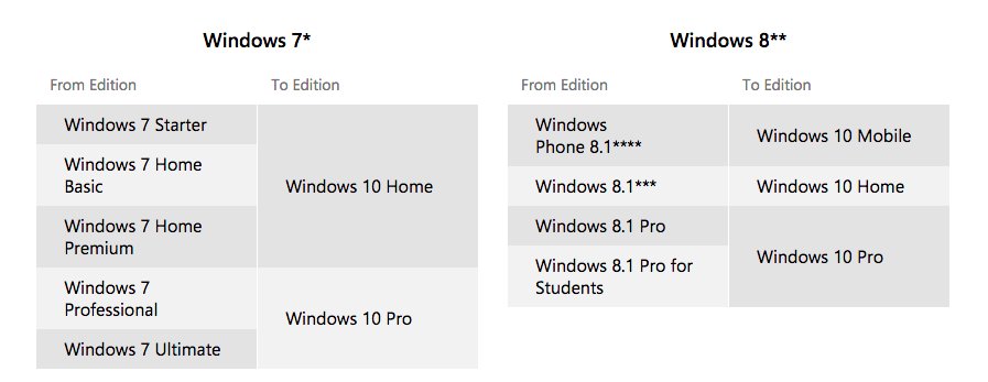
An image of the upgrade chart for various Windows paths and releases.

Caption: The upgrade chart for various Windows paths and releases.

Q: I don't know if I like the sound of this. What do you mean "new features"? If I'm a home user, am I stuck with just having random changes sprung at me without warning?

A: Users of assistive technology often understand that new changes to their environment can cause severe pain and delays, especially if the changes are not up to a high standard. Regardless of your software and hardware usage, this has everyone in slight fear. I want to help you feel a bit calm about this. So take a deep breath, don't stop reading just yet. Please?

The Windows Insider program will continue even after Windows 10 is launched. Insiders are special people who risk their computers to run pre-release versions of Windows 10, and there are about 5 million of them at this time. If new features are coming down the pike, the Insiders get them first. Those poor guys. Wait… I'm one of them! This means that anything new will generally have heavy testing before it becomes a standard. Also, you can bet that Cool Blind Tech and other blogs will report about it way before it hits mainstream. Isn't that our job? While you will still be required to eventually cave and update, you can be confident that the transitions will be less painful. Keep in mind that Microsoft will not roll out 10 different major upgrades at once, or significantly change the look or feel of Windows one morning to the next. While they do have this power, chances are updates will provide a gradual introduction of new features and fixes.

However, if you're still concerned, How-to Geek has a great article that addresses the question of whether you should upgrade to Windows 10 Pro. The cost of this will be $99 if you are running Windows 10 Home, and it might be worth it if you want to have a slower pace with how they are provided.

Q: Does this mean my computer will restart without warning to install updates? Will this be just as annoying as it has been before?

A: As you will see when we explore some of the new settings screens, considerable work has gone into making the Windows Update mechanism more intelligent. It now "knows" when you least use your computer, and there are ways to schedule installs manually so that you are not caught off guard. With that said, yes, you will eventually have to cave and restart from time to time. Unless an entire new build is being installed, updates take a bit less time to complete, especially when the initial loading screen appears after boot.

Q: What if my copy of Windows is not genuine and I'm a pirate who loves to sail the seas?

A: Microsoft is providing the opportunity for pirates to finally turn themselves in and admit to their wrongdoings. If you're a pirate, you can be converted to become a Windows Insider. This means that you will be able to install Windows 10, though only through the Windows Insider program. You will have to continue being a tester no matter what, as Insider previews expire after a time. If your copy of Windows is not genuine, you probably did not get the notification for your free Windows 10 upgrade. This is because the tool does check your license to make sure you are running something legal, and does not present the option if you are not. As an Insider, the upside is that you have a "free" copy of Windows. The problem with this is that you are also enslaved into getting bleeding edge features, so it might actually be worth it to cash in and buy yourself a copy of the OS. Come on, didn't you collect treasures while out on the sea?

Q: Will I be able to install Windows 10 on July 29?

A: This depends. Microsoft will stagger downloads of Windows 10 so that there is a queue for upgrades. This is so that servers do not become bogged down too quickly with people grabbing the file. If you're an Insider, you should already have the "shipping" version of Windows 10, or what was commonly called RTM. Stores around the world are offering upgrades to Windows 10, and certain cities will have launch parties that will provide a worldwide upgrade experience. Expect these to be events, as Microsoft is very excited about this new release. As August ramps up, your copy of Windows 10 will be downloaded, and you will be able to buy full copies of Windows 10 in stores later during the month.

Q: What happens if I have to re-install Windows 10 on my computer after a year is up? Will Microsoft know that I've reserved my upgrade a while back?

A: The answer to this is yes, though I cannot give exact details on this. There is a process known as activation caching, whereby activation servers remember which computers were activated when running Windows 10. This means that if you download an ISO file of Windows 10 and install it, your copy should activate with the same product key. Microsoft has said that people who get the free upgrade will have an option to save a serial number for Windows 10 through the Microsoft store. In case your hard drive gets replaced or you don't want to use the reset or refresh features of Windows to do a clean install, you will be able to download a standard ISO and obtain your product key through the Windows store before re-installing.

Q: This is great news! So if I'm a pirate, and I have a computer that can get the free upgrade, does it mean that I can now get a copy of Windows 10 free for that machine too?

A: You wish, you wish. Product keys are tied to specific hardware activations, so this loophole will not work as Windows knows which hardware you are activated on. If you are found to activate on machines that were not tied to the original activations of your product key, the key might even become blacklisted and you will not be able to reuse it even for the primary one you got the upgrade for. It's best to just face the facts and join the Insider program if you're pirating. Volume-license customers do have a chance to use one product key for multiple machines, however this usually is only found and available in corporate environments.

Q: Do I have to upgrade? When should I do it, anyway?

A: Upgrading to Windows 10 is not a requirement, nor will it ever be forced upon you. Windows 7 has five more years before it is placed by the wayside. After 2020, Microsoft will no longer provide updates to that system, and it will become what Windows XP is known as being today—unsupported and full of gaping holes—so it's quite possible that Windows 7 will become the "new XP."

With that said, there absolutely is no rush for you to upgrade, and just as with any upcoming product, there will be both early and late adopters. If you want to wait it out for a bit as others jump on and see their experiences first, do so! There really is no reason to not stick with your current setup if it works for you, and by writing this piece, in no way do I encourage people to perform a specific action.

The Upgrade Experience: Second Verse, Same as the First

The system requirements for installing Windows have changed very little over the past ten years. For 64-bit, this entails 20 gigabytes of disk space, at least 1 gHZ for a processor speed, 2 gigabytes of memory, and a 3D DirectX 10 graphics card. The requirements for 32-bit are even lower, with only 1 gigabyte of RAM needed. Of course, requirements often do not tell a complete story. With Windows 10, upcoming computers can ship with additional components that create new experiences. Besides the obvious touchscreen, these could include fingerprint readers, infrared cameras that recognize facial features, and built-in microphones. They are sub-components though, which are not required to operate your computer. Cortana, the new virtual assistant, can also just as easily answer questions when they are typed, although she will not provide voice prompts. Similarly, traditional passwords can be entered, thus using biometric identification is not the only way to go.

Upgrading Windows to this latest version changes very little when it comes to the actual procedure. Whether you grabbed an ISO file from Microsoft, or used the free upgrade, you will still be asked what you wish to keep at the beginning. The three options are "Nothing," "Personal files," and "personal files, apps, and settings." Unfortunately, just as before, choosing "Nothing" does not let you pick a drive or partition on which to install Windows. For that, you will need to use an actual ISO file and run setup.exe, located inside the sources folder.

A Note About Software and Screen Reader Compatibility

From personal experience, I can verify that most modern screen readers do require an uninstall if you upgrade. These include copies of JAWS 15 or 16 and Window-Eyes. Free products such as NVDA or System Access To Go will not be flagged for compatibility issues, as they do not significantly modify your system with video drivers and the like. Unfortunately, migrating these solutions is more difficult during an upgrade, so we recommend that you at least consider using the free NVDA screen reader if you need to use something reliable. The good news is that if you are prompted to uninstall an incompatible program, you can do so without exiting Windows setup, and once it detects that you have completed your job, everything will move forward.

Other programs that might be flagged for issues could include anti-virus or spywear tools, as these can also prevent successful installation. In one of my upgrades, a driver that provided access to partitions made under Linux was flagged and had to be removed.

At the time of this writing, every screen reader has provided some form of update to add support for Windows 10. NVAccess has started implementing reading of various elements of the new interface, such as for Cortana and the Edge browser, in the latest snapshot releases. Freedom Scientific announced an update to JAWS for Windows and MAGic, which provides preliminary access, and GW Micro released Window-Eyes 9.2 with the same goal this week. Even if your product did not announce direct information about Windows 10, there is a good chance that it will still work relatively well. In short, while there are new aspects that require learning, most of them use already defined standards from prior releases of Windows.

Upgrading Across the Universe

To help you prepare for your upgrade, should you decide to jump in, I will provide a quick rundown of my experiences on the systems I installed Windows 10 on. These ranged from desktops to newer devices, along with computers that did and did not support touch. My ultimate goal was to experience the environments that people will most commonly use.

Microsoft has said that they want to make this release as scalable as possible, so that over a billion users can be upgraded in the next year. Is this hype truly realistic?

Scenario 1: The Regular PC

In this test, I used a laptop from late 2010 with a normal screen that had no touch points, an Intel dual-core first-gen processor, and 4 GB of RAM paired with a 160 GB hard drive. Nothing special, but such basic configurations will be commonplace especially as hardware requirements are the same.

The upgrade was very smooth, and took about 45 minutes in total. Oddly enough, My Bluetooth driver was not preserved, which meant that after install, I had to grab the driver from the website of my manufacturer. This is important to keep in mind, as sometimes Windows will think that the newer versions it has are better or more suited for compatibility. I noticed that some functions, such as tablet mode, are still present even on this laptop which will never have such a form factor. Turning on tablet mode changes the start screen a bit and places all apps in full-screen mode, but serves no real purpose for machines without touch. Start-up seems faster than the Windows 8 that ran on this computer before, although I'm noticing a slight sluggish feel when typing or navigating the computer.

Overall, keeping such older hardware on Windows 7 might not be a terrible idea. Windows 10 will not detract from your experience, but could lead to minor annoyances or lag. In the period of five years, chances of an entire hardware upgrade are possible, and by this point you will probably have retired 2010-era computers.

Scenario 2: Mac Mini and Bootcamp

This scenario is interesting, because Apple has always provided their own drivers for many of the core functions inside their devices. These include Bluetooth and wireless chips, and display, screen, and sound drivers. In addition to this, Bootcamp uses its own services to provide the capability of changing over to Mac OS if you decide. The Windows 10 set-up did not provide or indicate any upgrade problems, but I noticed a significantly larger amount of restarts before everything ran smoothly. In my scenario, at least five restarts were required, which definitely provided a big scare to go through. After the upgrade was completed, several familiar elements were missing. The Bootcamp control panel was no longer present in Settings, nor could it be found through the standard search capabilities. A stranger aspect relates to drivers. While my first scenario lead to replaced drivers, set-up left everything untouched here. Some of my sound and hardware settings were reset, such as paired Bluetooth devices, although this is to be expected. The "lag" I spoke of, which I noticed on the older computer, was definitely not present this time.

Scenario 3: Touch-based Yoga Laptop with Windows 8.1

This machine is a newer arrival to my family of computing devices. It features a 3rd-generation Core I5 processor, with 8 GB of RAM and solid-state drive. The touch screen folds back around the body of the machine, which gives me access to the new Continuum features of Windows 10 whereby the switch to tablet mode is automatic depending on how my screen is positioned. Out of any computer I upgraded, this had the most pleasant ride, and was the quickest one thanks to the amount of storage. When I first launched Windows after the upgrade, I was even asked if I would like to enable Continuum when I flip to tablet mode. This popped up as a notification in my action center. There were absolutely no hardware issues, and I'm even noticing a longer battery life per charge perhaps by an hour.

Scenario 4: Windows 8.1 Tablet

If there ever exists the "world's most difficult task," it surely has to be upgrading a Windows tablet to Windows 10. The storage on these devices is so low that I was required to store installation files on an SD card and hope that the 10 GB left over would be sufficient enough to allow Windows to perform my upgrade. On top of this, I was using a Bluetooth keyboard solution to navigate the screen, which lead to awkward device problems throughout set-up. To avoid this happening to you, you will need an external, wired keyboard. To do this, you will need to purchase a USB OTG (on-the-go) cable through an online retailer, which will convert your Micro-USB charging port into a standard-sized one. Of course, you better have enough battery life to complete the upgrade, as the process is a bit slower even though these devices do not use hard drives. Even after everything was finished, re-paring the Bluetooth keyboard was essential. Leftover storage after upgrade? Just 6 GB. Doing a bit of temporary cleaning got this up to 11, but it also meant that I had to get rid of my recovery partition. The terrible part of this is, of course, that my device had at least 32 GB of storage. Some products only have 16, and with even less memory than 2 GB. If you're going to attempt to upgrade such a tablet to the latest Microsoft offering, you are probably better off doing a clean install after formatting your hard drive from the installation media on a thumb drive. Microsoft will offer this option, so this should not be a difficult task, provided you can create a talking installer media and use an external keyboard. In short: Your mileage will definitely vary with this one.

Post-Upgrade Notes

There are a few interesting aspects to the upgrade that I must also mention, as these helped create a more positive view of Windows 10. On those devices that I upgraded from Windows 8, set-up remembered my Microsoft account sign-in credentials, and kept my synced settings. With upgrades from Windows 7, you will be asked to sign in to an account, although your username will still be what it was prior. Some services, such as Cortana, will not be set up after upgrading, even if you are signed in, though when you decide to go through that process, you will not be required to enter your password.

Some odd settings will need to be reconfigured, while others, which you would normally not expect to be kept, will be fine. Sound device configuration, such as enhancements, will be reset. However, various input methods, or views for folders, will remain the same. If Microsoft truly intends to release future upgrades to customers, this transition has to become as seamless as can be.

The Underpinnings of Windows 10
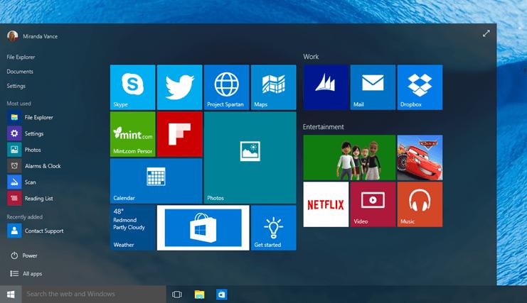
An image of the new Windows 10 Start menu

Caption: The new Windows 10 Start menu

Now that we got all of the upgrade information out of the way, it is time for the fun to truly begin. What fun, you ask? Pictured above is the new Start menu found in Windows 10. Here we will drill down to the core of Windows 10 and explore just what has changed and how some things have remained the same. Both Windows 7 and 8 users will feel at home with many of the things mentioned here. The Start menu, which is what you will see first after your upgrade, has become a hybrid of the Windows 7 and 8 solutions. On the left side, you will see the familiar recently viewed list, which changes over time to represent your personal list of icons. What I found odd is how Microsoft placed some of its own apps here, such as the new Calculator app, or Groove Music, which now replaces the older XBox music solution. On my convertible, it even put the Lenovo companion app there, which I never in my life have opened. Don't be scared by these icons. They are there only as placeholders, and will disappear over time. The most recently used apps list also includes a section for "recently added," which will reflect regular desktop programs that you also installed. This is important to point out: There is no separation between what Microsoft considers "regular desktop apps" and "Windows Store apps." This was not the case before in Windows 8, as Store apps always took priority.

The top left corner also includes a Power button, and it does what you'd expect: Pressing it brings down a menu where you can log off, restart, shut down, or place your computer in sleep mode. There is an all-apps button next to it, and if you are using a screen reader, it will announce "all apps with new apps available button." This indicates that new apps were installed or updated. After your upgrade, this will be the default message. Pushing this button will place you in a full-screen grid of every app you have installed, though skimming through this is much easier than it ever was.

The main part of the start menu is taken up by your apps, grouped into various categories. By default, Windows gives you some sample ones, such as "life at a glance" and "play and explore." These tiles are directly taken from Windows 8's book, as they update dynamically to include new information. If you signed in to a Microsoft account, some of your data will transfer over, such as locations you placed into your weather app.

The New Windows 10 Search Experience

Nowadays, search has shifted to being more Web-centric and smarter in knowing your habits. Virtually every operating system remembers what you search for, and can dynamically show you results based on this history. Windows 10 is no exception. As you begin to open apps with specific names, it will know which to place at the top of the list. This "smart" search ability was definitely not a part of Windows 7. Typing on the Start menu behaves just as it always has.
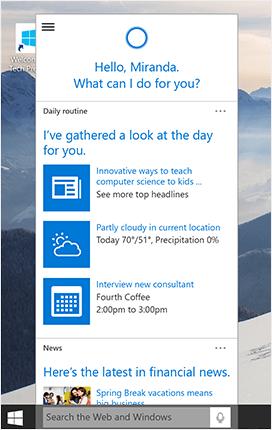
An image of the Cortana Screen in Windows 10

Caption: The Cortana Screen in Windows 10

Cortana is your new personal assistant, and it is heavily integrated into Windows. The first time you do a search in the Start menu, you can Tab to a list that will say, "try Cortana." Tabbing once more will display a button for Next, as well as a link to Windows Help, which provides a tutorial of what Cortana can do. Today, Microsoft is the only company with successful integration of a personal assistant into the core search experience. Using Cortana is not a requirement for search, either. If you only want to search for apps and Web content, you can easily skip setting her up and use the Start menu experience as you have prior. If you decide to use Cortana, do keep in mind that its notebook can be edited, and this process is fully accessible. Signing into a Microsoft account is required, as your settings are stored so that they may be synced with other Windows devices.

The beauty of search with Cortana is that both text and voice search are possible. If you have a microphone connected, the Start menu will include a microphone button, and you can speak just as you would to any other assistant. You can also type, and results are shown inline. Type "how are you?" and you will a strip of Web content containing your answer will appear on the screen.

The Magical Cortana Notebook
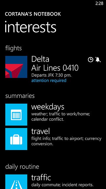
An image of the Cortana's Notebook Screen

Caption: The Cortana's Notebook Screen

After you have configured Cortana, go back to the start menu and start typing text to bring up search, or press Windows + S. Next, press Tab twice, which will place you on the pane of the screen that contains various categories. By default, this is set to home, but expanding this brings up a few other choices: Cortana (which opens the app in full-screen mode), Notebook, Reminders, and Feedback. Let's open up the Notebook choice by clicking on it or pressing enter. The screen will now include various categories of information that you can add details to. The About Me section will contain information such as how your name should be pronounced and what your frequently used addresses are, should you choose to set these. Essentially, Cortana can remember the locations you identify as "work" or "home," so that it may provide you with the proper directions when needed.

In other categories, you can add specific pieces of information. Food and Drink ties into your favorite recipes, while Finance could include a list of the stock symbols you follow. Remember how I mentioned a "full-screen" Cortana mode present in that list of categories on the Start menu? If you expand it, the main Cortana screen will pop up, and will include precise information on those items you have set in this notebook. Weather, news, stocks, perhaps an awesome dinner you could make… The limit really is what you are comfortable with sharing.

Using Voice Search with Cortana

In truth, the goal of Cortana is to create a hybrid solution that combines Google's "Now Search" and Apple's Siri. Similar to Google, Cortana can search your e-mails for specific information, such as flights, although results might not be as comprehensive. This is because Microsoft has had less experience in this arena thus far. Cortana borrows from Siri's intelligence capabilities, in that you can ask it normal questions and receive proper responses. In reality, Cortana strikes a good balance between Google search and Siri. There are specific questions that Cortana will simply not respond to, yet other times it will say something appropriate. In those cases where there is no response, the assistant will just launch your Web browser with the text you just asked already filled into the search bar. This can get rather annoying if all of your questions are a miss and have no answers, since you could rack up over 20 tabs quite easily.

I never quite understood why spoken searches can't be placed into a full-screen Cortana app, and be transitioned to your default browser when you click one of them. This would make more sense, provided that your search is not even done using the default engine of your browser—it uses Bing—so there's no transition between Cortana's interface and your browser. While I've found Cortana to be good at general chit-chat, it definitely shines, to an extent, with pulling up information.

Ask Cortana when the sunrise and sunset times are in a region, or even your own city. It will bring up your browser with the question that you phrased, rather than giving you a specific answer. Ask Siri or Google the same question and you will be told the times for both. Siri will even tell you calculated times ahead, such as when asked, "When will the sun rise on December 16 in Seattle?"

Yet ask Cortana the simple question of "What's up?" and it will launch into a lengthy explanation of something important for that day. This changes with the calendar, which leads me to believe that new prompts are recorded at some point in the day. This makes Cortana very dynamic, because new information is always added. Depending on the region you reside in, sports scores or other cultural information will also be customized to you. Canadians might be far more interested in hockey than Americans, for instance. Not that Americans don't care about the sport, though. To bring up voice search, you can press Windows + C from anywhere, and you'll hear the sound for when the computer is listening. There is, however, another way that might be even easier.

The Really Hot Hotword

When you're charging an iOS device, you have the ability to enable a command known as "Hey Siri!" which provides you the power to call up Apple's assistant any time your phone is plugged into a wall outlet. We are talking about Windows though, of course. Microsoft took this concept a few steps further, making an ever-present assistant possible. If you go back to Cortana's Notebook area, you can click on a "Settings" link. There are several options for how the assistant behaves. One of these is a "Hey, Cortana!" hotword, which you can enable for always-on listening. The neat aspect to this is that you can limit the command to only your voice. If you choose "To Me" instead of "Anyone" in the group of radio buttons next to this option, you can begin a training mode to make sure only your voice can trigger Cortana. Going through this is a bit difficult, especially if you are using a screen reader. You will be asked to say specific phrases such as "Remind me to go to the airport tomorrow!" or "Text John 'Hello!'" These are good generic phrases that showcase your vocal range. If you're using a screen reader, you can tab past the Microphone button to hear the phrases. If for some reason this method does not work, you can always use the object navigation or screen review modes built in to your solution of choice. I suspect soon enough scripts will be crafted to substitute for this arduous inconvenience, as the prompts do time out after a while. If you need more time to read and memorize the phrases, the Microphone button on this test screen lets you repeat the phrases. Therefore setting this up is doable regardless of your requirements, but might take longer at times.

I am quite thrilled with this cool ability. When saying "Hey, Cortana," it even ignores my voice at various unnatural pitches or tones, so fooling it is hard. This is useful if you have little kids who might want to pester your workflow by talking to your computer, or in general if random coworkers could shout it and trigger every computer at your workplace. Can you imagine what a disaster that might be?

Is Microsoft Edge Worth It?

You probably heard of the new browser that ships with Windows 10, called Microsoft Edge. Edge will replace Internet Explorer at some point in the future, though not for a while as businesses still rely on IE for compatibility. Microsoft Edge is such a disappointing addition that I almost chose to not write about it. While the browser is meant to be faster in performance, I did not have a chance to test this as it is severely lacking in the accessibility department.

As of the launch of Windows 10, only one screen reader can even read Microsoft Edge content. Window-Eyes will pop up a warning informing you that the browser is not accessible, and JAWS will not speak at all. Our own Cory Martin reported on the accessibility of Edge with NVDA, which could be useful if you want to learn more. Because of the nature of this app, it is the only time I have made an exception for not being able to review something due to poorly designed accessibility.

Changes to the Taskbar

Though there are other, equally important shifts to be discussed, Cortana is a central and probably the most important change to Windows. I cannot understate Cortana's importance. It is so important, in fact, that you can access Cortana even through the Taskbar area. When you are on your desktop, you will find the familiar Start button, along with the bottom portion containing your running applications. There are, however, a few new buttons and features that have changed.

An image of the new Windows 10 Taskbar

Caption: The new Windows 10 Taskbar

The new taskbar now includes a few extra buttons. Next to the Start list is a button for Cortana, if you have her activated that is. If not, you will see only the new "Task View" option, which is used to present virtual desktops in a pop-out window. The system tray, which shows icons for programs that place status information on your system, also includes the new Notification Center button next to the touch keyboard toggle. All of this is highly customizable, so let's open up the standard "Taskbar and Start Menu" properties window.

There is an impressive flexibility to what can be customized when it comes to both of these user elements. Some of it will no doubt feel familiar. The Taskbar tab contains the same "auto-hide the taskbar," "taskbar buttons," and options for customizing the system tray icons. The Navigation tab provides you with choices to change other more advanced settings. It allows the standard "command prompt" options in the Windows + X menu to be replaced with Power Shell, and for the Start screen to pop up instead of the Start menu. If you are used to the way Windows 8 looked, this will bring some of it back.

Other customizations that relate to the start menu and taskbar are hidden deep within Windows. Press Windows + I to open up Settings. In the grid-list that pops up, choose "Personalization." On the other pane, highlight the Start option. Here, more choices abound. You can hide the most recently used list from your Start menu, and change which items are shown on your jump list.

Virtual Desktops Help Get Rid of Clutter

One of the new Taskbar buttons that I brought your attention is called "Task View." This directly ties in to a new feature of Windows 10, and can also be accessed by pressing Windows + Tab. Microsoft calls open programs "tasks" to allow for flexibility for the scope of what they might include. When you start your computer, there is only one desktop created, and most people might not even worry about what windows they might have open and how they are organized. The use of this new tool is not required, but can definitely make life easier. Go to your Taskbar, and Tab to the new "Task View" button.
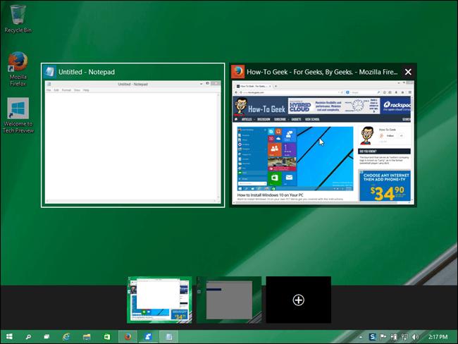
An image of a desktop in task view mode

Caption: An example of task view mode

This image above is a great example of what happens in "task view" mode. You will have a list of desktops, with labels such as "Desktop 1." On each label, a list of tasks is shown. Use the Left and Right Arrows to move among desktops, and Tab to see the list of opened items on each. You will also find an "new desktop" button, which will give you the ability to then move various tasks onto a new desktop by pressing the Applications key or right-clicking on a thumbnail or item within the task list. A menu will appear with an option labeled "move to…," inside which you will find your desktops.

Admittedly, it's a lot easier to know what apps you placed on what desktop if you have access to a mouse and can visually track this. The idea is that you could make a desktop where only your browser windows are located, and make another where your word processing apps are. Then if you launch a Twitter client or Facebook, you might decide to add a third with just social networking windows. Alt + Tab, the normal way of cycling through apps, will only cycle you through the tasks on your currently focused desktop. Windows + Tab is an all-inclusive switcher and a quick way to bring back the tasks view. You can also use Windows, Control, and Left or Right Arrow to move among desktops. Aha, now you know why Twitter clients are no longer compatible with their keyboard shortcuts! This makes it very simple to organize your workflow though, because as you press Control + Left or Right Arrow, you are dropped directly into whatever app was last open on that specific desktop.
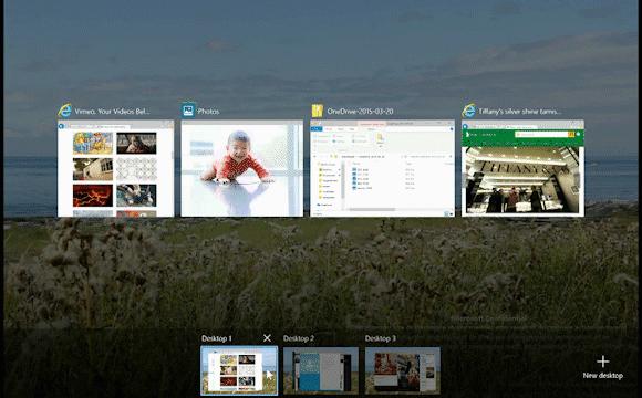
An image showing an example of what is displayed when you hover over a desktop

Caption: An example of what is displayed when you hover over a desktop

The image above shows what is displayed when you hover over a desktop. To be fair, creating an easy way to track desktop contents with a keyboard might be a challenge, but it's not impossible. Perhaps screen readers should announce what's on each desktop as you Arrow among the names of those open. For example, a screen reader could say: "Desktop 1 containing Microsoft Word, Notepad, and Firefox." Right now, you're only told "Desktop 1," and you must individually check what's there.

Still, this ability should not fall by the wayside. Other operating systems have had the implementation to organize programs in such ways, such as Apple's Mission Control or even various Linux distros. Microsoft should definitely be commended if they add this, even if it comes a little too late, as it will appeal to both the power user and people at work who might not have multiple monitors. There is no limit on the number of desktops that can be created, nor are there restraints on how many apps you can pin to each.

Action Center

There lies a slight confusion with the term "Action Center." In Windows 7 and 8, Microsoft used the phrase to describe the part of performance and system tools that showed you various "actions" that you had to take in order to protect your computer. If your virus definitions were out of date, a message would appear in the Action Center, which was always visible on the system tray.

The term changes in Windows 10. Action Center now refers to a collective grid of notifications that apps can show to give you various bits of information. Windows 8 introduced the idea of "toast" notifications, so-called because of how they popped up on screen as a top-right rectangle. You could press Windows + V to cycle through active toasts. Regular desktop programs used the older balloon-style system, which made a distinction between the type of programs you were using. Toasts never really fixed a gaping problem that already existed before: Once a toast notification disappeared after a specific amount of time, there was no way of getting it back or ever seeing it again. It was almost a game of its own, based on how quickly you could react. Toasts are still present today, however they will now fly out from the bottom portion of your screen, and thanks to a new home, will reside there until you dismiss them. Think of it as Windows 10 coming with its own toaster oven.

The new Notifications view can be invoked by pressing an icon next to where the volume and other status icons are on your system tray. With keyboard commands, you can just press Windows + A. (The term here is a bit confusing. In official documentation, the company prefers to use "Action Center," yet in its own dialogs and labels, it calls it Notification Center. Can we combine and call it the "Action-Notification-Center?" That might be a bit too long of a phrase though.)
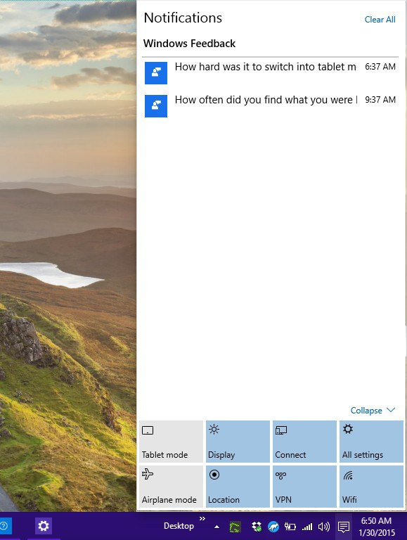
An image of the Notifications view in Windows 10

Caption: Notifications view in Windows 10

When you open Notifications view, you will see two panes. One will contain a list of apps that have popped-up notifications thus far, and the other will contain the notifications themselves. Next to each app, there is a "dismiss notifications in this group" button, which will clear a specific section. Notifications can either be "collapsed or "expanded," as they might include additional options such as a Reply button on a social network. At the top, there is a button to clear out all notifications. You can easily Tab to all of these — to clear everything, Shift + Tab back once from the notifications list and press the Spacebar. Visually, the icon on the system tray will change to a white color when there is nothing unread, or it will be a speech bubble when there is something new. Again, to screen readers, there is no indicator to say how many notifications are present in the center. I have made the mistake a few times of opening it, only to find the groups empty—so your best option is to check it once in a while. If you know specific programs that post status information as pop-up balloons or toasts, you will have to remember to do this.

The bottom icons are configurable, and replace the old charms bar. These too can be collapsed or expanded. When collapsed, only four options are shown, which you can manually pin. If these bottom actions are expanded, they include a toggle for airplane mode and Wi-Fi, tablet mode, location access, quiet hours, opening settings, and connecting to a wireless device.

The nice aspect to this is how notifications will sync across your devices and platforms. If you have multiple computers running Windows 10 and they all have the same Twitter client, you'll find that what you dismissed on one device will also disappear from all other ones. As developers will be able to target multiple devices with their Windows Store apps, this could be huge.

Customizing the Action Center

Shall I give you a further taste of the new Settings app? The usual Windows + I command will open Settings from no matter where you are, or you could put some new skills to use by going to Settings directly from the Action Center.

We were here once already, when I mentioned the Start screen Settings group. Click System in the list that pops up, then "notifications and actions." Be sure to press Enter on the Settings group you're expanding, if you are using your keyboard. Here you will see the four "pinned actions," with each presenting a drop-down list that lets you choose what you would like to pin. Past these, there is a "show app notifications" option, which you can toggle to completely disable all of them if you wish. Options for the lock screen, such as "Show alarms, reminders and incoming VOIP calls on the lock screen" allow you to hide personal information. You can disable notifications during presentations, which happens when Windows detects a connected projector. You have the capability to customize how notifications appear on a per-app basis, or you can simply toggle the switch next to each one to quickly turn it off. This list will only include those programs that have displayed alerts before.

Breezing Through the New Windows Settings

Good news! More settings are now included in the new, modern-styled Control Panel. Bad news! The old "classic" control panel is still around, and sometimes even the new one will refer you back to it if you need more advanced options. As much as there is now less of a distinction between desktop and modern-mobile, it still exists, and we even have seen this with the various customization walkthroughs above. Fear not, we'll sort this out together.
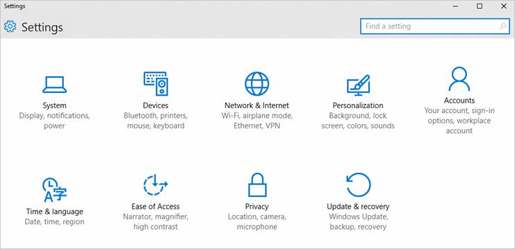
An image of the Settings screen in Windows 10

Caption: The Settings screen in Windows 10

Running Down the Various Setting Groups

Let me provide you a rundown of each category in a nice list, with brief descriptions.

System

The largest of the groups, this includes:

  • Display. This replaces the original display control panel, as it allows for many of the same configuration changes, including resolution, TrueType fonts, and more.
  • Notifications. We've explored this, haven't we?
  • Apps and features. Curiously, here you can remove even regular, non-Windows Store apps. An alternative to the "programs and features" that existed in Windows 7 and 8.
  • Multitasking. This allows you to alter the behavior of snapping windows, as well as the Alt + Tab action. Yes, you can make it cycle through all open windows, regardless of which desktop is up.
  • Tablet mode. You can change whether it is turned on upon sign-in, or if app icons are hidden on the Taskbar when it is active. Nifty.
  • Battery saver. This is something that every modern OS will now have, and it's no different than such expectations. You can see a graph of battery usage on a per-app-basis, and configure when the saver is turned on. In this mode, Push and other background activities are reduced, and the screen and processor settings are lowered.
  • Power and sleep. A replacement for the old "power options," here you can specify when the display turns off on various modes of operation. Don't worry, die-hard classic Windows fans. Instead of providing you the advanced aspects such as what the Sleep button does, this is a very sparse screen and links to an "additional power settings" link, which opens up that old Control Panel. Ah, fresh air.
  • Storage. This is a nice list of what takes up the most space on your device.
  • Offline maps. Here's something useful: If your location changes, Windows will automatically grab maps for that region over Wi-Fi and store it in a cache. You can turn this off entirely, or choose to delete the current database. Useful if you have limited Internet but would still like to know what is around.
  • Default apps. Another drop-in replacement, here you can pick which various formats open with which programs. Calendar, e-mail, music… It's all here.
  • About. This displays a bird's eye list of various system information, but again contains a link to open up the old system screen with more information should you require it.
Devices

Here you can choose various options for device types such as:

  • Printers and scanners. To add a new printer, go here.
  • Connected devices. Here you will find a list of USB and other wireless, local peripheral hardware.
  • Bluetooth. Another separation, this lets you change device-specific settings to what is paired.
  • Mouse and touchpad.
  • Typing. To modify auto correct and punctuation settings, here's the place to be.
  • Auto Play. It's still here ever since Windows XP, and works just as before. You can define what actions are taken for each type of plug and play device.
Network and Internet

To change what various network interfaces use to establish a connection.

Personalization

Background colors, Start screen customization, and lockscreen options are here.

Accounts

Add e-mail or Microsoft account information in this panel.

Time and Language

All of the regional and language formats have been moved here.

Privacy

Choose whether to allow location data, camera, microphone, speech data, account info, calendars, contacts, messages, and background app syncing. This is very comprehensive, and you can disable permissions on a per-app basis. Note that your standard Windows desktop programs do not use this interface, only modern, Windows Store apps will show here.

Update and Security

This is where you can refresh and reset Windows, and where the new Windows update is located. Windows update is important, so let us go in here and see what it contains.

Windows Update, Simplified in Every Way

Everything in life goes full circle. Just as I began this review talking about how Microsoft made it a requirement that everyone keep themselves up-to-date and discussed this free upgrade strategy, I shall also end with that same topic. Because Windows 10 is free, your tradeoff is how it has to be kept maintained at all times. This is a benefit not just to you, but also to the rest of the world: as more and more computers are connected 24/7, keeping secure needs to be very important to minimize risks for the future. There are already two updates, and Windows 10 has not even launched yet. People are generally afraid of Windows Update, because in the past it had a high potential of breaking everything. For this reason, I recommend that you enable System Restore, which you can find by searching for it in the Start menu. By default, Windows 10 turns System Restore off; having it on could aid you in not facing problems.

The Windows Update screen only contains a few options, and the older version of it is no longer around. When you open Windows update, you will see a list of possible new downloads. If these have already been downloaded, Windows Update will tell you.

We'll schedule a restart for a time when you usually don't use your device (right now 3:30 AM tomorrow morning looks good). If you want, you can restart now. Or, you can reschedule the restart for a more convenient time. Be sure that your device is plugged in at the scheduled time. The install may take 10–20 minutes.

This is pretty much all there is to Windows Update. Wait, wait. There's an Advanced Options link, which allows you to view your update history, or "defer updates" if you are running Windows 10 Pro. Here you can also opt into being a Windows Insider — so, yes — you have to do this within Windows update. Although your copy of Windows will not become magically activated if you had a bad product key, being an Insider means that you will be able to use a new number once upcoming builds are released.

Bonus! Fun Windows 10 Keyboard Shortcuts

Since we've gone full cycle with this review, the final task I have is to give you some magical keyboard commands that will improve your experience. As I stated earlier, some applications will break in Windows 10, particularly if they use the combination of Control and Windows keys. These two modifiers are now reserved mostly for system commands, so they cannot be bypassed easily.

  • Windows + Left and Right Arrows: Snaps windows in those directions.
  • Windows + Up and Down Arrows: Snaps windows to the top or bottom halves of your screen.

The above two commands can be combined, so that pressing Windows + Down Arrow and then Windows + Right Arrow will place an app at the bottom right corner of your display. Cool, huh?

  • Windows + Control + D: Creates a new virtual desktop.
  • Windows + Control + F4: Closes the current virtual desktop. This will move all active windows to the previous desktop.
  • Windows + Control + Left and Right Arrows: Switches virtual desktops.
  • Windows + C: Opens Cortana voice search. Start speaking right away, chief.
  • Windows + S: Opens Cortana's search interface.
  • Windows + I: Opens Settings.
  • Windows + A: Opens the Action Center, so that you can take action right away.
  • Windows + L: Locks the screen.
  • Windows + H: Activates the Share button, if you are in a Windows Store app that can share something.
  • Windows + X: Opens up the Advanced Power Users menu.

Conclusions

Have you really read up to this point? You can be honest, I know that there was so much said here. And yet, there is so little space. I didn't even go into the new Windows Store! Alas, there really are many new minor changes that make this version of Windows so worth it, if you decide to do your homework and perform an upgrade. I took so much time and effort writing about it because I truly believe that for the future generations, this is here to stay.

Performance and app compatibility have not changed from Windows versions in a long time, so it is safe to say that Microsoft learned a lesson from the debacle of the Vista days. If you want to use NVDA, be sure to grab the latest NVDA Snapshot and use it instead of the current 2015.2 release. Of course, you could always wait until late August, when NVAccess has set a goal for releasing an update that is stable and not a beta.

I'm also confident that when it comes to upgrading, this will be one of the smoothest processes in the history of Windows. Unless you have specific needs and situational configuration issues, it's not an exciting hour. In the land of computing, this is good! Remember that Microsoft is providing support to anyone upgrading with the reservation system.

This is the final chance Microsoft has of righting Windows, putting it into the era in which we currently live. Because mobile is dominating the world, it is their only option for unifying the computing landscape by striking a balance among the various form factors that this will be running on. And that's not an easy task, dear readers. Imagine telling someone to design a game piece that can be used in 10 different board games. For what was created, I think that balance is here. The question remains: Will you feel the same way?

Credits and Citations

I've gone through college, but providing you with a formal, Chicago-style citations list would confuse everyone. However, I can't deny that multiple people helped form this review—from the people who proofread it to those who provided screenshots. I'm going to link to those articles, because stealing is definitely not believing.

First, I would like to thank the entire Cool Blind Tech team. Shaun and Leo for proofreading, and Cory and Greg for providing me with various points of information that I needed to complete this review. Of course, Nelson and everyone else responsible for this site provide me with the infrastructure of hosting it and moving along.

Here's the Business Insider article answering common upgrade questions to Windows 10.

Microsoft's Windows 10 tutorial pagewas used for several screenshots, so why not check it out?It's fun, useful, and will help you in adapting to Windows 10

Paul Thurrott's site is really cool, and if you want more tips on Windows 10, you should definitely head there. He made the taskbar screenshot used in this article.

How to Geek gave me that Virtual desktops image, and they too will be offering tips to get used to this new era we now live.

Finally, I thank you, the reader, for taking your time and sorting through this review. Upgrade responsibly!

Comment on this article.

Keep Reader Feedback Coming

Lee Huffman

Dear AccessWorld readers,

Four years ago at this time, AccessWorld implemented a "Comment on this article" link at the end of each article to bring your comments, questions, and ideas right to my inbox. Since that time, hundreds of you have written to share your thoughts, and many of these responses have been shared in the monthly "Letters to the Editor" column. Your feedback has been extremely valuable to the AccessWorld team and has helped us better understand your access interests and challenges, and I thank you for taking the time to share your thoughts with us.

In response to reader suggestions and requests, we also added buttons to the end of every article that allow you to share to Facebook and Twitter, e-mail the article to a friend, and print the article. You asked for easier ways to share AccessWorld articles, and we listened. Also in response to readers' comments, we have added links to recent related articles and additional articles by the author at the end of each AccessWorld article.

For those who still haven't taken the opportunity, I encourage you to send me your comments on articles and your thoughts on any topics you would like to see addressed in AccessWorld. In order to gain even more specific information about you, your technology interests, and your interests and concerns about mobile apps, AccessWorld added a reader survey in the June and July issues. To gather as much feedback as possible, we are extending the duration of the survey through the month of August. This survey is fairly comprehensive. We want to make sure we are providing the information you want, in the way you want to receive it, and the AFB app development team wants to know about your mobile app usage and needs. Our goal is to be your "go-to" resource for technology related information. The more we know about what our readers are thinking, the better we can meet your needs. So, if you haven't yet provided us with your feedback, please take a few moments and complete the AccessWorld questionnaire. The AccessWorld team appreciates you reading our magazine, and realizes many of you have been loyal readers for years.

As everyone knows, Windows 10 is the current buzz in the entire tech world. The questions of, "Should I upgrade now or later?" "Is it going to be compatible with my access technology?" and "What is it going to cost me?" are all serious considerations. Please check out the AccessWorld News section for a first look at information from access technology manufacturers and some suggestions from Microsoft's Rob Sinclair. We will continue to follow the Windows 10 saga as it unfolds over the coming months, so stay tuned, and hang on, as it may be a bumpy ride.

We hope you enjoyed the July 2015 Back-to-School issue and gained information to help with getting ready for the upcoming school year. Speaking of going back to school, if you are the parent of a child with vision loss or you know a child with vision loss, I encourage you to visit the AFB FamilyConnect website to learn about all its resources.

If you are a student transitioning from school to work, thinking about your future and beginning career exploration, or if you are looking to build a resume or change careers, please visit the AFB CareerConnect website. There you will find a variety of resources for teachers, students in transition, professionals in the job market, and employers.

Also, if you are an adult living with vision loss or know someone who is, I encourage you to visit the AFB VisionAware site. VisionAware has many resources, tips, and information on eye conditions, support groups, working life, and everyday living for adults of all ages who are blind or visually impaired.

By joining the VisionAware community, you can receive e-mail alerts for events and activities near you, as well as tips for living with vision loss and new articles or announcements relevant to you, your family members, or the individuals you serve. Simply visit the VisionAware Sign-Up Page.

The AccessWorld team hopes you enjoy the August 2015 issue. We encourage you to continue sending us your feedback, and to visit the AFB CareerConnect, FamilyConnect, and VisionAware sites!

Sincerely,
Lee Huffman, AccessWorld Editor-in-Chief
American Foundation for the Blind