This issue of AccessWorld presents two articles on the accessibility of today's home appliance controls. Easy-to-feel knobs and buttons were the normal controls for home appliances of the past, and using them was no problem for a blind person who had learned the proper skills and techniques. However, as flat touch-panel controls and electronic visual displays are becoming more and more common, people who are blind or have low vision are becoming more and more concerned about their ability to use these appliances independently. This first article presents the results of a usability study that was conducted at the product evaluation lab at AFB's Technology and Employment Center in Huntington, West Virginia (AFB TECH). In this study, we invited local volunteers who were blind or had low vision to our lab and observed their interactions with a set of home appliances that represent the spectrum of controls that are available today. The second article, written by Brad Hodges, provides a snapshot of the home appliances that are available on the market and provides some advice and ideas for choosing a useful model.
The Usability Study
As we began to notice a great deal of chatter in the blindness community about the inaccessibility of today's home appliances, we decided to visit a variety of appliance stores to take a close look at the trends in appliances. Because of the experience we have gained evaluating the accessibility of various products in the AFB TECH lab and because of our experience as users of home appliances who are blind or have low vision, we know that many of the appliance interfaces we observed can pose major barriers to accessibility. We had formed some preliminary ideas about how a person who is blind or has low vision could mitigate these barriers and about how manufacturers could make design changes to remove those barriers. However, we wanted more input from other people who are blind or have low vision to confirm or change our opinions.
Procedures
We first defined three classes of controls that cover the range of accessibility that we observed on the market. These three classes include "accessible controls," "inaccessible controls," and "ambiguous controls." We defined these classes as follows.
Accessible controls are those that have historically been provided on appliances, including conventional turn knobs, such as those that are found on stove burners and dryers. Mechanical push buttons that latch or change position when engaged also fall into this category. In almost all instances, accessible controls can be felt to determine their status. On a stove, reaching to feel the burner control at the 9 o'clock position would let the cook know that the burner is set to simmer. Feeling the pointer of the dryer control periodically as the cycle progresses would allow the user to predict how much longer the cycle will take. Of the three classes of controls, these are the only ones that allow a person who is blind both to position the appliance settings and to confirm those settings independently.
Inaccessible controls are those that provide no means of direct tactile identification or direct interrogation of the settings. They are typified by the flat touch panel that is found on the majority of microwave ovens and many other appliances, such as wall ovens and dishwashers. Inaccessible controls require modification to be usable nonvisually. In some instances, even modification, such as the use of braille or other tactile markings, cannot mediate the inaccessible behavior of the control.
Ambiguous controls are those that fall in between the accessible and inaccessible classes. The ambiguous control provides at least some feedback to the user. Examples include oven controls that set a default temperature of 350 degrees when turned on. Pressing textured regions on the smooth control panel activates the controls. Pressing the Up and Down controls increases or decreases the temperature by 5 degrees for each press of the control. In addition to changing the temperature, a distinct beep is heard as each control is pressed. By counting beeps, one can set the temperature accurately. Direct verification of the temperature is not provided because direct observation of the display is not possible with the electronic oven control. This ambiguity creates a situation in which it is possible to set the oven nonvisually, but full independent access to the information on the display is not provided.
After we defined the categories, we assembled in our lab five home appliances that represent the range of accessibility that we observed on the market. We brought in one appliance from the accessible category, a Whirlpool dryer with knobs that are easy to feel and distinguish by touch. We brought in three from the ambiguous category: a Whirlpool stove with traditional easy-to-feel burner knobs but an oven control that uses a textured touch panel like the one described in our example; a General Electric microwave oven with tactilely distinguishable buttons but an inaccessible display screen; and a Breadman bread maker that also had tactilely distinguishable buttons but an inaccessible display screen. From the inaccessible category, we brought in a Sears Kenmore microwave with a completely flat touch-panel control.
We then invited ten local volunteers who are blind or have low vision to come to our lab and use the appliances. We filmed each participant's testing session and took detailed observational notes along the way. For each participant, the test had three phases. In the first phase, we brought the participants to each appliance, one at a time. We told them what type of appliance it was, such as a dryer or a stove, but we did not go into the details of how to operate it. We let the participants observe the appliance tactilely and visually if they had some functional vision. They could ask questions if they wanted to, and we provided braille, paper, and electronic devices if they wanted to take notes. On each appliance, we asked the participants to perform a simple task, such as setting the oven to bake at 375 degrees. We rated the participants' success on a scale of 1 to 5, with 1 being completely unsuccessful and 5 being completely successful. We then asked the participants to rate their own confidence level in performing the task on the same scale of 1 to 5.
In the second phase, we provided much more extensive information about the controls and how to use them. We asked the participants to repeat the task from the first phase, providing them with some tips and techniques for accomplishing the task independently. We again rated their success and asked them to rate their confidence. We then asked the participants what they might do to modify the appliance if it was in their home and to suggest how the manufacturer might make design changes to make the appliance more usable by people who are blind or have low vision. The third phase was a short exit interview in which we gathered additional thoughts from the participants and found out their preferences for the various control interfaces that they had tested.
The Participants
The participants had different levels of skills and levels of vision. Of the ten, five were blind and five had low vision. Eight were female and two were male, and they ranged in age from 25 to 74. During a pretest interview, we asked the participants about any independent living skills training they may have received, and they all said that they were mainly self-taught, but four also reported that they had at least some agency-based training in the past. We also asked the participants to rate their level of self-confidence in using appliances independently on a scale of 1 to 5. The responses showed a high level of confidence among the participants, with the average response being 4.5.
Results
As mentioned earlier, we conducted this study to test our ideas about the ability of a person who is blind or has low vision to use these appliances and to get ideas about how manufacturers could make design changes to improve their accessibility. Our results show that certain techniques can indeed be used to make these appliances more usable as they are currently designed. However, the results also show that for these appliances to be completely accessible to people who are blind or have low vision, design changes must be made by the manufacturers. The results of the usability study for each device are summarized in the sections that follow.
Whirlpool Dryer
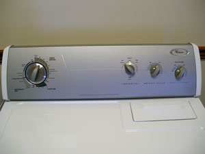
The participants had the most success using the Whirlpool dryer, which confirmed our choice of putting it in the class of accessible appliances. The task we asked them to perform was to set the load to medium dry, normal cycle, and to press Start. During the first phase, in which we provided little information about how to use the controls, self-reported confidence ratings were low, averaging 2.4 out of 5, as were the success ratings for completing the task, averaging 2.9. However, during the second phase, after we provided extensive information about the controls and how to use them nonvisually, the participants' confidence ratings increased to an average of 3.9, and the success ratings increased to an average of 4.4.
Caption: The Whirlpool dryer's controls were in the accessible category.
When asked how they might modify this dryer if it was in their home, nearly all the participants said that they would place braille or other tactile markings around the control knobs. When asked how the manufacturer could improve the design of the dryer, most said that they liked how the controls click into place and that once they became aware of how to use the controls, the appliance would not need much improvement other than access to an accessible manual. However, one participant suggested that the manufacturer should design the large control knob used to set the dryer cycles so that it gives more tactile and auditory feedback when it clicks into place for the various settings. Two participants asked that speech output be added to remove all the guesswork when setting the controls, but said that they would not pay a great deal more for the speech access. Four of the five testers with low vision suggested that the labels for the controls should be larger and bolder.
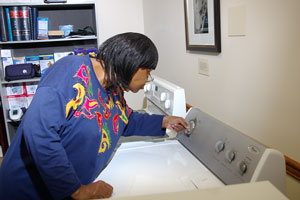
Caption: Testing the Whirlpool dryer.
Whirlpool Stove
The Whirlpool stove was the first one in the ambiguous category. It has traditional knobs for the burners, but relies on a visual display screen and features a touch pad with roughened areas for the oven control buttons. The task we asked the participants to perform was to set the oven to 375 degrees and to activate it. The confidence and success ratings during the first phase were low, averaging 2.2 and 2.6, respectively. However, in the second phase, these ratings increased to 3.4 and 4.0, respectively. When asked how they might modify this stove if it was in their home, nearly all the participants again said that they would mark the oven and burner controls with large-print labels, braille, or other tactile markings. When asked how the manufacturer could improve the design of the stove, most said that they would prefer more tactile oven-control buttons and that the stove needs speech output to provide access to information on the display screen. The participants with low vision all asked for a display screen with larger fonts and better contrasts, as well as for larger labels for all the controls. Again, accessible manuals and other documentation were requested.
Caption: The Whirlpool stove was ambiguous in terms of the accessibility of its controls.
General Electric Microwave
Another appliance in the ambiguous category, the General Electric microwave, has a control panel with raised tactile buttons and uses a visual display screen. The task on this one was to set the cooking time to 3 minutes and 30 seconds and to press Start. The confidence and success ratings for the first phase were again low, averaging 2.5 and 2.7, respectively. However, the ratings again rose—to 3.7 and 4.0, respectively—in the second phase.
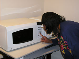
Caption: The controls on the GE microwave had raised tactile buttons, but the labels were small.
When asked how they might modify this microwave if it was in their home, participants who are blind said that they would add a nib to the 5 key on the number pad and add braille markings to some of the buttons. Those with low vision said that they would place larger labels on the buttons. When asked how the manufacturer could improve the design of the stove, nearly all the participants asked for speech-output functionality for accessing information on the display screen, and some suggested that the manufacturer should add a nib on the 5 key and provide accessible manuals. The participants with low vision asked for larger and better-contrasting print labels on the buttons and suggested that the display information should be larger and that the display should produce less glare.
Caption: The controls of the GE microwave were in the ambiguous category.
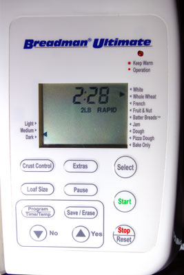
Breadman Bread Machine
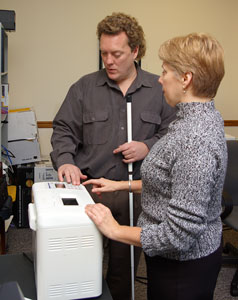
The last appliance in the ambiguous category, the Breadman bread machine, has a control panel with raised tactile buttons and uses a visual screen to display the various settings. To make bread with this machine, you first place the ingredients into the hopper. Then you have to use the buttons to choose three different settings: the type of bread, such as whole wheat or rye; the weight of the loaf, such as 1 or 2 pounds; and the type of crust, such as light, medium, or dark. For example, to choose the type of bread, you press the Bread Type button repeatedly to scroll through the available choices that are on the display screen until the indicator light beside the choice you want lights up. If you cannot see the display screen, you have to learn and memorize the order of the 16 choices and count your presses.
Caption: Using the Breadman bread machine required a lot of memorization.
The task on this appliance was to set it to whole wheat, 1.5 pounds, with a medium crust, and then press the Start button. The confidence and success ratings in the first phase were again low, averaging 2.3 and 1.9, respectively. However, in the second phase these ratings rose to 3.8 and 3.8, respectively. When asked how they might modify this machine if it was in their home, the participants gave similar responses to those they gave for the other appliances, including placing larger-print labels and braille or other markings on the buttons. Some also said that they would create a braille or large-print "cheat sheet" to list the order of all the setting choices that one has to memorize as one scrolls through. When asked how the manufacturer could improve the design of the bread machine, nearly all the participants said that they liked the tactile nature of the buttons, but that the manufacturer needed to add speech output functionality. They said that if the choices were spoken as you scroll, you would not have to memorize as much, and speech would help if you were interrupted as you counted the button presses.
Caption: The Breadman bread machine has a control panel with raised tactile buttons but uses a visual screen to display the various settings.
Sears Kenmore Microwave
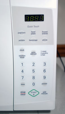
The Sears Kenmore microwave is the appliance that represents the inaccessible category. Like the majority of microwaves that are available today, it uses a flat, featureless control panel with buttons that cannot be felt and relies on a visual display screen. We did not add any tactile markings to the control panel for the participants because we wanted it to represent the flat, inaccessible touch panels that we are beginning to see on a wide range of appliances. Although we did not expect success, we still subjected the participants to the task of trying to set the cooking time to 4 minutes and 30 seconds and to press the Start button. As expected, the confidence and success ratings in the first phase were extremely low, averaging 1.7 and 1.5, respectively. We expected even lower ratings, but the design of the labels and display screen was good enough for some of participants with low vision to be able to see them sufficiently to be somewhat confident and to partially perform the task. Because we did not add braille or other tactile markings to the flat display and had no helpful techniques to pass on to the participants, the results for the second phase had the same low ratings.
Caption: The Sears Kenmore microwave controls represented the flat, featureless control panel with visual display screen that makes so many microwave ovens inaccessible.
When asked how they would modify this microwave if it was in their home, the participants again suggested adding tactile marking and larger-print labels. They said that the manufacturer needs to add speech output and tactile controls. Although those with low vision thought that the visual nature of the controls was better than the other appliances, they said it still could use some improvement.
Exit Interviews
After we finished our tests on the various appliances, we conducted a short exit interview with each participant. We first asked the participants to list, in order, their preferences for the various types of control interfaces that they had just tested. The most popular one was the traditional knobs found on the dryer and the stove burners. A close second was the tactile buttons found on the General Electric microwave and the Breadman bread machine. In third place was the touch pad with the roughened control areas of the Whirlpool stove, and, of course, the flat touch pad found on the Sears Kenmore microwave was in last place. We then asked the participants to give us any thoughts they might have about the appliances they had just tested. They all said that with some additional time and practice with the appliances and with some minor modifications, they could use most of them adequately for basic tasks. They said that the dryer was pretty much fine the way it was, other than needing large-print or tactile labels. However, they thought that the other appliances, since they rely on visual displays, would need speech output to be completely accessible. Most of the participants added the caveat that they would not want to pay a significant amount of money for speech output. Interestingly, the participants reported a wide variety of techniques that they would use to mark the controls of the various appliances and tended to agree that they would like to do the marking themselves, instead of having the manufacturers provide the markings. Finally, all the participants said that all appliances must be available with accessible manuals in alternate formats.
The Bottom Line
This usability study was not designed to evaluate the specific units that were involved in the test. Instead, we wanted to test the usability of the various types of controls that are found on today's appliances. As expected, we found that the more tactile and audible an appliance's controls are, the more usable they are. We also found that with some better information about the proper use of the controls and with some modification, such as adding braille and tactile markings or creating cheat sheets, the basic functions of today's appliances can be made to be more usable. We tested just the basic functions of these appliances, however, and the more advanced functions of many appliances would be much more difficult or impossible to access, especially functions that rely on the display screen. For example, if a washing machine had flat touch-screen controls only, you might be able to place some tactile markings to help you access some of the controls, but you would never be able to come back and check the status of your load as it runs through the wash cycle. In cases such as this, speech output is necessary to give people who are blind or have low vision full access to every feature and function of today's appliances.
We at AFB TECH will now do our part and take our results to the manufacturers and do what we can to convince them of the need to make the necessary design changes. Until these changes are made, however, you may want to know what your choices are in today's market. For this information, please read Brad Hodges's article in this issue, "We're Cooking Now: A Guide to the Accessibility of Major Appliances," which provides a snapshot of the home appliances that are currently available and offers some advice and ideas for choosing a useful model. It also provides some advice generated by our usability study about using appliances that are not perfectly accessible.
This article was funded by the Teubert Foundation, Huntington, WV.
