AccessWorld occasionally reports on the activities of AccessWorld Solutions, the consulting division of the American Foundation for the Blind, which works with corporations and governmental agencies to make their products and services accessible to people with vision loss. The following article is not a product evaluation, but reports on a recent project focusing on the Otis Elevator Company's new destination-based elevator system. It describes the efforts of a producer of mainstream products to make those products more accessible and usable for people who are blind or visually impaired.
Elevator manufacturers have recently been developing new so-called "destination-based" control systems that are designed to expedite the way that elevators are dispatched in tall buildings with multiple elevator cars. With these new systems, instead of pressing an "up" or "down" button to call an elevator, a passenger enters his or her destination floor on an entry device in the hallway or elevator lobby. The system then chooses the elevator car that will most efficiently take the passenger to his or her chosen floor, and the entry device directs the passenger to that particular car. For these new systems to be usable by people who are blind or have low vision, both the input and the output portions of the interface must be accessible. A person must be able to choose his or her destination floor on the entry device independently, and all the output that directs passengers must be conveyed through both easy-to-understand speech and visual displays that are easily viewed by people with low vision.
To ensure the accessibility and usability of its destination-based elevator control system for passengers who have disabilities, the Otis Elevator Company engaged AccessWorld Solutions (AWS), the consulting division of the American Foundation for the Blind (AFB). Otis is the world's largest manufacturer of elevators, escalators, and moving walkways. Elisha Graves Otis introduced the world's first safety elevator in Yonkers, New York, in 1853, permitting architects to design taller buildings that could reach beyond the limitations of stairways. In 2004, Otis asked AWS to evaluate the accessibility features of its new elevator control system and to provide recommendations for making this system more usable for people with disabilities. This article discusses the accessibility features of one destination-based elevator system and the process of collaboration between the manufacturer and AFB's consulting group to make the system accessible.
The Interface
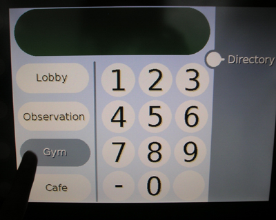
Otis designed two new entry devices for passengers to use to call elevators. One is a keypad-style interface that would be located on the wall near the elevator doors where the "up" and "down" buttons would traditionally be. The other is a kiosk-style touch-screen interface that could be placed elsewhere in the lobby, which could also call the elevator and would have additional functionality, such as a directory. When this system is installed the interior of the elevators would have the standard Open Door and Close Door buttons and the various emergency buttons, but would not have the familiar grid of buttons to press that we currently use to direct an elevator.
The Keypad Interface
The keypad interface features speech-output functionality and has been designed to be accessible to people who are blind or have low vision. It features a telephone-style keypad with 12 keys arranged in the familiar 3-by-4 grid. The keys are large 0.8-inch-square buttons that are amply spaced 0.4 inches apart and that protrude 0.2 inches from the panel. The large 0.7-inch black labels contrast well with the shiny silver background of the buttons. The labels are etched into the buttons to give a slight tactile indication, and there is a substantial nib on the 5 key for orientation purposes. The star key has no function at this time, but the key where a pound key would usually be located is labeled with a dash, or negative sign, and is used to enter negative numbers for floors that are below the main, or ground, level. Below these buttons is a long horizontal Accessibility Function key that passengers who are blind or have low vision can press to enable the speech-output functionality of the system. This key, which measures 3.4 inches wide by 0.8 inches high, is labeled with the image of a person in a wheelchair, the international symbol of accessibility. It also has three substantial nibs in the center that are arranged in a triangle for tactile identification purposes.

Caption: Pressing the accessibility button on the keyboard interface in a demonstration unit.
Directly above the keys is the speaker for the audio output, and above the speaker is a small-screen visual display measuring 3 inches wide by 2.3 inches high. The text and numbers that appear on the screen are very large, ranging from a 36-point font to a high of 1.3 inches tall, and they contrast well with the background, alternating from black on white to white on black, depending on the information that is being displayed.
Typically, a passenger who is blind or has low vision first locates a keypad on the wall adjacent to an elevator and presses the Accessibility Function key to activate the speech output of the system. The system responds by saying "Please enter destination floor." The passenger then enters the numbers for his or her destination floor. For example, if the passenger wants to go to the 25th floor, he or she presses the 2 key and then the 5 key. The system responds, saying, "Floor 25." It then announces the car that has been assigned to serve the 25th floor and directs the passenger orally to the car's location. For example, it may say, "Proceed to Car E, to the left rear." All the spoken information is also shown on the display screen in large text, with arrows pointing in the general direction of the chosen elevator. When Car E arrives, an in-car oral enunciator, audible from the lobby area, announces its arrival. The passenger then enters the car, the doors close, and when the car reaches the 25th floor, the in-car oral enunciator says, "Floor 25."
The Touch-Screen Interface
Although the touch-screen interface was not designed to be accessible to passengers who are blind, it does have visual characteristics that make it usable by many people who have low vision. Instead of having mechanical buttons that can be identified tactilely, the touch screen is a flat-panel LCD display with images of the buttons that have to be located visually. Passengers press the area of the panel that corresponds to the image of the button they want to activate. The active area of the touch screen measures 6.3 inches tall by 8.4 inches wide and features contrasting colors with large text in fonts ranging from 24 points to 72 points. The main screen has an image of a telephone-style grid of pressure-sensitive buttons that passengers can press to enter their destination floor. It is similar to the layout of the keypad interface, with large 72-point dark blue numbers on a white background.
Caption: The touch-screen interface, with "quick" buttons along the side.
The typical scenario with this touch-screen interface is the same as with the keypad interface, except that all feedback from the system is visual, not oral. The touch-screen display can also be customized to fit the building, with "quick" buttons added for destinations, such as the lobby, gymnasium, restaurant, or observation deck. It can also be equipped with an optional directory button, which, when pressed, allows the passenger to enter his or her destination by selecting a building tenant from a drop-down listing. So, a passenger who wants to visit Dr. Hassenfeffer could simply press the directory button, scroll through the list, and select the doctor's name, and a car will be sent to serve the floor where the doctor's office is located.
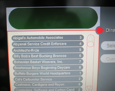
Caption: The touch-screen interface, with a drop-down directory along the side.
Evaluating Accessibility
The Otis engineers designed this system to move a large number of passengers quickly and more efficiently to their destinations, but they also wanted to ensure that it would be accessible to as many people as possible. In meeting this challenge, Otis sought to develop a system that not only would meet the intent of the accessibility codes set forth by the American National Standards Institute, but would be intuitive and easy to use by passengers with disabilities. The Otis design team spent numerous hours testing various scenarios and making cost and performance trade-offs. Once a preliminary design was finalized, Otis brought in consultants from AWS to test it and to get feedback from end users. One blind accessibility expert and one sighted accessibility expert from AWS traveled to the Otis test facility in Bristol, Connecticut, and conducted a complete review, along with the Otis design team. The AWS consultants were able to use the hardware and to test several scenarios using a functioning elevator in the Otis test tower. They tested numerous variations of the scenarios to evaluate the real-life practicality and usability of the system.

Caption: Testing the keypad accessibility on a demonstration unit.
Keypad Interface Accessibility
The keypad interface is essentially accessible and usable, providing easy-to-understand recorded human speech for oral output and clear and effective directions. However, the AWS consultants did suggest some enhancements that could be incorporated to improve the overall usability of the keypad interface, such as these:
- When the Accessibility Function key was pressed, users had 10 seconds to enter the destination floor before the system timed out and speech output was canceled. The AWS and Otis teams found this time to be too short for a passenger who may need more time to orient himself or herself to the keypad or for a person with a mobility or dexterity disability. So, Otis extended the time limit to 20 seconds.
- After entering the first digit of a two-digit number for a destination floor, passengers had only 1.5 seconds to enter the second digit before the system timed out. So, if a person who wanted to go to the 29th floor pressed the 2 key and took longer than 1.5 seconds to locate and press the 9 key, the system would log the destination floor as the 2nd floor instead of the 29th floor. Otis extended this time to 3 seconds.
- When the system orally directed passengers to the appropriate elevator car, it did not noticeably pause between words when giving multidirectional cues. For example, it might string the words left and rear together and say, "Proceed to Car E to the leftrear." Otis enhanced the system to insert the appropriate pause, so the directions are spoken more clearly.
- When a car arrives to take the passenger to his or her chosen destination floor, it announces only its own name, such as, "Car E." The AWS consultants suggested that the car should also say the floor that it is serving, such as, "Car E, serving Floor 20." They also suggested that the system should alert passengers with the addition of a "Doors Closing" announcement.
Otis will evaluate these suggestions for implementation in the future.
Other suggestions for possible improvements for the keypad interface were the following:
- If there is a great deal of background noise in the elevator lobby, a passenger may misunderstand the oral instructions produced at the keypad. The addition of a "Repeat" button would allow passengers to replay oral instructions. The unused "star" key could serve that purpose, and adding the braille letter R on that key might also help.
- Information on how to use the systems could be made available at the lobby or security desks of the building.
- The voice could announce, or echo, each digit as it is entered.
- The elevator could have the capability of speaking in multiple languages, possibly using a smart card system in which a passenger would swipe a smart card through a slot in the interface to activate the appropriate language for him or her.
Touch-Screen Interface Accessibility
As was stated earlier, the touch-screen interface was not designed to be accessible to passengers who are blind, and the Otis and AWS teams agreed that this is the most important issue that Otis must address. Although, as noted earlier, there will always be an accessible keypad interface in addition to the kiosk-style touch-screen units, both systems should be accessible, especially since some of the features that are available through the touch screen, such as the directory and the quick buttons, are not available through the keypad interface.
The sighted AWS consultant noticed no problems with glare or the lack of backlighting, but he did make the following suggestions for improving the visual properties and usability of the touch-screen display:
- Although the colors that are used for text and icons on the display contrast well with the background of the display, there were some instances in which this contrast could be improved, especially on the directory screens.
- The same time-out issues that were identified with the keypad interface are also present in the touch-screen interface.
- The AWS consultants suggested adding the instruction "Select destination" to the directory screen and emphasizing the Select and Scroll buttons visually.
- Although the system beeps to confirm that users have successfully pressed buttons on the main screen, AWS suggested that the beeps should be added to the directory screen as well.
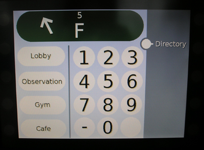
Caption: The touch-screen interface showing car F at the left rear going to the 5th floor.
Other suggestions for possible improvements in the touch-screen interface include these:
- The touch screen has good contrast, but the display uses a shadowed font that makes the contrast less clear. The shadow bordering the text and numerical characters is small, but removing it should greatly improve the quality of the contrast.
- The directory button should be made larger and moved slightly on the display, as it was too close to another control. It was only half an inch in diameter and only one-eighth of an inch away from the other control.
Essentially, the keypad interface makes Otis's destination-based elevator system accessible for a passenger who is blind or has low vision. However, some of the tweaks and enhancements that were mentioned in this article could certainly improve the overall usability of the system.
Of course, the major enhancement that is necessary is to redesign the touch-screen interface to be accessible, so that passengers who are blind or have low vision can use both interfaces and take advantage of the extra functionality that is found only with the touch screen. Beyond these enhancements, awareness is the other real major issue. As long as a passenger who is blind or has low vision is aware of the process of calling an elevator with this system, there will be no major problems.
A problem may arise if a person walks into a building that is equipped with a destination-based system without being aware of how to use it. A person who is looking for the familiar control pad with an "up" button and a "down" button will be confused to find the Otis keypad interface instead. In addition, if an individual in the elevator lobby of a destination-based system heard the familiar "ding" followed by the sound of the elevator doors sliding open, stepped into the elevator, and felt around for the traditional buttons to choose a destination floor, he or she would be out of luck because those buttons wouldn't be there. AccessWorld Solutions suggested that a Help button with a braille label be added to the interior of the car which would produce a verbal message telling passengers to exit and use the keypad in the lobby to enter a destination floor.
These new scenarios may be confusing for a while. However, it is easy to imagine the confusion that must have occurred a few decades ago when the once-commonplace human elevator operator was replaced by buttons that automatically called and directed elevators. It no doubt took some time for the general public to get used to the change then, and it will likely take some time for passengers to get used to this new system as well.