Full Issue: AccessWorld May 2010

24 Hours with the iPad

One of the more troublesome problems when managing a publication that addresses technology is the arrival of an important new product just a few days before deadline. The much-anticipated release of Apple's iPad is such an event. Because the iPad was going to be available shortly before AccessWorld's April 1 deadline, the AFB TECH staff considered what approach to take. Would it be best to perform a comprehensive evaluation, knowing it wouldn't appear until the following issue? Or was a quick look and a report based on first reactions a useful contribution to our understanding of the device? After some thought, it was decided we would start with an article capturing some initial thoughts from 24 hours with the iPad. In a future article, we plan to spend more time exploring the iPad and reporting on its low-vision features and the potential the larger screen provides for using the zoom features.

Technical Observations

AFB TECH preordered the iPad. On Monday morning at 10:00, the FedEx box arrived on my desk. Unpacking the box revealed that Apple has maintained its high level of attention to packaging and presentation. It is reassuring that the manufacturer of a product that can cost more than $600 cares enough to present the product beautifully. That package contained the iPad, a folder of print information, a power cord, and wall charger. No earphones were included.

As you already may have read, the iPad shares many technical and design characteristics with Apple's iPod Touch and iPhone. Of particular interest to AccessWorld readers will be the availability of VoiceOver, the built-in screen access program. Rest assured, Apple has not only included VoiceOver on the iPad, but has refined it as well. The iPad/iPhone family tree is very much in evidence during the setup and registration process. Other information and reviews are available online and in print that discuss this process in detail.

One potential roadblock did reveal itself during registration. When using iTunes version 9.1 on a Compaq PC running Windows XP and my customary screen reader, some important edit fields were unrecognized. The name and address portion of the registration screens could not be read with my screen reader, requiring the assistance of a sighted person. After consultation, it was determined the problem was with my particular setup, but it would have been a show stopper were it not for the immediate availability of sighted help.

By 10:30, the registration was successfully completed, and the iPad was ready to go. I am familiar with VoiceOver screen-reading technology, and out of the box, it worked smoothly and as I expected. As on the iPod/iPhone, the screen is divided into three regions: the status region at the very top, the application (app) icons, comprising the majority of the screen, and the four persistent icons (Safari, Mail, Photos, and iPod) found along the bottom-most row. Apple refers to this region as the "dock." VoiceOver announces "dock" whenever your focus moves from the last app icon to the bottom row. This is one of many refinements to VoiceOver for iPad.

For many of us who enjoy listening to streaming audio, an occasional frustration with VoiceOver for iPod/iPhone has been eliminated. The volume of the streaming program is reduced when VoiceOver is speaking. This is identical to the way in which VoiceOver has always behaved when using the "Music" app on the iPhone/iPod.

Another useful addition includes increased verbosity when using the on-screen keyboard. As a letter is focused upon, the letter is spoken immediately. If focus remains, the letter is announced using the phonetic alphabet (n for November or v for Victor). Similarly, when reviewing any text letter by letter, allowing VoiceOver to remain focused on a letter will announce the phonetic value. When navigating into or out of the keyboard, VoiceOver announces "keyboard." I found this particularly helpful as the size of the screen invites, and in some instances requires, direct interaction.

Shortly after a quick lunch, some of the differences between my iPod Touch and iPad revealed themselves. It is the ability and necessity of interacting directly with the screen that separates some tasks on the iPad from those on the iPhone/iPod. An example is found in "Settings." When the settings menu is opened, two columns appear. Choices familiar to iPod/iPhone users are found in the left-hand column. I selected the AOL Radio app to set my preferences. I immediately observed that selecting an app on the left changes the content of the right-hand column to reflect the available options for that app. When encountering this layout, I tried two navigation methods. The first was to swipe in the usual manner. The second was to touch the screen in the middle along the right-hand edge. When swiping, it took quite a while to move beyond all the app choices and finally get to my destination. However, touching within the column appeared to focus VoiceOver at the top of the right-hand column, making swiping among the AOL Radio settings much faster.

As I explored iPad's Calendar, several intriguing screen layouts revealed themselves. For the first time, I found it most convenient to use a calendar's "month view" as I could easily run my finger up and down or across the rows of dates. Again, a refinement of VoiceOver makes rapid navigation convenient. A date with an event is announced in a lower pitch than dates with no appointments.

Using the "search" function of several apps brought me into contact with another new, and occasionally frustrating, object: the "pop up." In their most basic form, pop ups appear above the keyboard on the screen and display choices that result from the text entered into the edit field. A sound alerted me to the appearance of the pop up on the screen. A "dismiss pop up" button is found by navigating up or swiping to the left of the keyboard. Once dismissed, the more familiar edit field configuration used on iPod/iPhone remains, including the "clear all" object.

Over the next several hours, I observed that pop ups changed depending on the apps that used them. A particularly frustrating example appeared when I searched for NPR's Fresh Air using iTunes. It may be lack of experience or the wrong conclusion on my part, but I did not notice any method of knowing a pop up had appeared or that I was navigating within a pop up. The difficulty is that if I swiped among objects and did not touch the screen elsewhere, I concluded I had looked at all available options. This was not the case; rather I was repeatedly moving among only those items in the pop up. If you're confused reading that, imagine how I felt while looking for the program.

Pop up issues appear to be more significant in those apps that resemble a webpage than in apps such as the iBook Store. After work, I took the iPad home and began to explore the iBook Store. Installing and setting up the iBook app was as flawless as the process for other apps I have downloaded. A free book was offered, which I soon realized was chosen for me. At the age of 52, Winnie-the-Pooh introduced me to the iBook.

The main iBook screen is very straightforward and includes "Store," "iBooks," "Grid View," "List View," "Edit," and the list of available titles. The default grid view arranges thumbnails of book covers in rows on the screen. Swiping among objects and from title to title worked well. Both title and author are announced as each thumbnail is focused on. Searching for books by following the store button was a bit more of a challenge, but I suspect that as I become familiar with the store layout, finding what I am looking for will become more convenient.

Double tapping titles opens books immediately. Focus moves to the last page you were reading, or in the case of opening a new title, is placed at the beginning of the book. Each page of the books I tested included several recurring sets of buttons and controls at the top and bottom of the screen. These included (at the upper left) "Library," "Table of Contents," "Brightness," "Fonts," "Search," and the book title. Another group of objects appeared consistently at the bottom of each page and included "Page Chooser," followed by "Page X of Y," where X was the current page and Y was the total number of pages in the e-book. In the lower right-hand corner, chapter information was given as "X Pages Left in This Chapter."

The page chooser is an interesting control. VoiceOver instructed me to "Double tap, then hold; drag left or right to change page. Adjustable; swipe up or down." Following these instructions resulted in an opportunity to slide my finger back and forth along a kind of virtual number line. Lifting my finger after hearing a page number opened that page immediately. After working with the chooser for a while, I realized it is potentially a very useful method of navigation, especially for large books. I also realized that subtle movements are critical to success.

The real meat and potatoes, however, aren't the controls. It is the ability of iPad and iBook to read the page contents aloud. Flicking three fingers right to left turned the pages in my virtual book. Each page was read automatically as I turned it. Within iBook, one may move line by line, but not by heading, sentence, or word. A fairly significant bug that needs to be addressed is iBook's inability to determine the spelling or pronunciation of proper nouns or words that may be confusing. In addition, some early reviews reported that the utility to open individual words in a dictionary/thesaurus was not working with VoiceOver. AccessWorld will follow up and report on any changes and patches to this first-generation app. On the other hand, the iBook's font button does allow one to change the appearance of fonts. One may choose a sans-serif font as well as increase the font size significantly.

The Pooh book includes delightful illustrations that have been enjoyed by generations of children. The iBook version includes well-written descriptions of every illustration, helping to make the Pooh experience quite extraordinary. I have not evaluated the labeling of illustrations, photographs, and other graphic elements in other books.

Back at my desk on Tuesday morning, I noted a few other technical points worth mentioning. The first of these is the availability of video controls whenever video content is presented. Double tapping the screen brings up the controls and the usual navigation moves focus. This worked well with both YouTube and Netflix.

The iPad's audio quality is substantially better than that of the much smaller iPod/iPhone. At its loudest setting, the quality of VoiceOver speech reminded me of a typical netbook. Stereo sound is only available through the headphone connecter.

The iPad's size results in a device that is considerably heavier than iPod/iPhone--think of holding onto a notebook screen in one hand. I found it convenient to set the iPad on my lap or a flat surface. I also found myself tilting the iPad to a 45-degree angle. This resulted in my left-right swipes moving at a diagonal and producing inconsistent movement of focus. This was fixed by paying closer attention to my hand position.

Finally I should mention running my iPhone/iPod apps on the iPad. It was very easy (and free) to download my purchased apps from the App Store to my iPad. They all ran very well and with the stability I have come to rely on when using my iPod Touch.

Using the Apple Bluetooth Keyboard

After seeing the iPad for the first time, it was immediately apparent that word processing was a viable option. For this reason, I purchased an iPad-compatible Bluetooth keyboard from my local Best Buy.

Connecting the device was both simple and accessible. In settings, I turned Bluetooth on. The Apple keyboard appeared on the right-hand column as an option. Selecting it brought me to a dialog box with two options. I had to enter a short series of numbers on the keyboard, as the instructions clearly stated, and then press the return key on the keyboard.

More information about the use of the keyboard is available elsewhere. Although its use is confined to edit fields, it is a very convenient and invaluable accessory for anyone planning to use iWork for the iPad. Managing the keyboard and iPad took a bit of juggling when browsing apps and iBooks from my easy chair. Placing both devices on my desk at the office turned out to be more convenient and efficient

The More Personal Experience

There have been two transformative moments in my professional career that I associate with gaining equal access to the printed word. The first was in the mid-'90s, when, as a university researcher, my department obtained a braille embosser and access to the fledgling Internet. One afternoon, a graduate assistant who worked with me casually dropped a braille copy of the cover article from that week's Time magazine on my desk. For the first time, I could read the same text as my sighted colleagues at the same time they did.

The second transformative moment took place Monday evening, April 5, 2010. On that night, I purchased a book from a book store, exactly as my sighted neighbors and colleagues would. I then sat in my den and read that book on the same device as my sighted counterparts.

Just as the introduction of VoiceOver for the Mac and iPhone suddenly and dramatically changed our expectations for ourselves and for those who provide access technology to our community, I believe the advent of accessible iBooks will be viewed by future generations as one of the landmark events in the lives of the blind.

In the next several months, technology companies will file written comments to the U.S. Access Board responding to proposed changes in federal standards for technology and information accessibility. It is safe to say that these companies will assert that providing equal access to e-publications is expensive, overly complicated, and generally unworkable. On April 3, Apple wrote a new iBook on accessibility, and thanks to the company's example, all the other commentaries justifying inaccessibility can now be placed in the fiction collection, where they belong.

Lighting Up Your World: A Closer Look at Illuminated Magnifiers, Part 2

If traditional eyeglasses or contact lenses do not provide enough visual correction for a person to read printed material, he or she or a family member or friend will often purchase a magnifier. However, there is a good bit to consider when selecting a magnifier, and without a proper clinical, low-vision eye examination and guidance, few actually get the magnifier best suited to their needs.

In this two-part series, AccessWorld reports on the findings from a study of illuminated magnifiers conducted by AFB TECH. The study incorporates laboratory research and data collected from experts in the field of low vision. This project is being undertaken to provide relevant information to the increasing number of people with vision loss who are looking to acquire an illuminated magnifier. This information will enable consumers to become much better informed about these devices, and with the assistance of their professional eye care team, select the magnifier best suited to their vision needs.

The first article in this series discussed the importance of a clinical low-vision evaluation and provided background information about characteristics of illuminated magnifiers, including the types of illuminated magnifiers, magnification levels, illumination levels, types of light bulbs, light color, battery life, size of the lens, and weight of the magnifier.

In this second article, we compare the stand and handheld magnifiers from two competing brands of illuminated magnifiers, Mattingly Advantage and LS&S. These two brands were chosen at random, but they are good examples of the many differences that exist among illuminated magnifiers.

The Advantage and LS&S magnifiers are nearly identical to one another in size, shape, and appearance, but the illumination and battery power offered by the two brands differs greatly. This is something that may be difficult for a consumer to realize when comparing magnifiers in a store, when shopping online, or even when in a clinician's office, but it can have an impact on the magnifier's effectiveness. This article will use these two brands to illustrate the point of how magnifiers may look the same, but vary a good deal in actual performance.

Measuring Illuminated Magnifiers

When presented with many choices, it can be difficult to decide which illuminated magnifier is best for you. There is little information available to consumers regarding the differences among magnifiers, such as which magnifier provides the highest level of illumination, which magnifier has the longest battery life, and which provides the largest viewing area.

One purpose of this article is to provide consumers with the information they need to more fully participate in discussions with their eye-care team as to which magnifier best suits their needs. With that goal in mind, we compared hand-held and stand magnifiers currently available for sale by using the following criteria:

  • The amount of light given off by the magnifier (illumination)
  • The color of the light
  • Battery life
  • Magnifier weight and size of the lens

Handheld vs. Stand Magnifiers

Handheld magnifiers are generally lighter and more compact than stand magnifiers as they are meant to be held away from the reading surface. Handheld magnifiers offer greater convenience and portability, but often at a cost to illumination and battery life.

The Advantage handheld illuminated magnifiers

Caption: The Advantage handheld illuminated magnifiers

By comparison, stand magnifiers are meant to be placed directly on the reading surface, and as a result are often heavier and less easy to move. Stand magnifiers usually feature an enclosure around the lens and a light source that many handheld magnifiers do not, which has the effect of making the magnified area much brighter.

The LS&S stand illuminated magnifiers

Caption: The LS&S stand illuminated magnifiers

In addition, they usually use larger batteries, and although larger batteries lead to a heavier and bulkier device, they also extend the battery life of the magnifier. Stand and handheld magnifiers both have their advantages, and it is important for you and your eye care team to consider which of the two types better suits your needs.

LS&S and Advantage Handheld Illuminated Magnifiers

In this article, we examined a sampling of the Mattingly Advantage and LS&S lines of handheld illuminated magnifiers, which included the 5x, 7x, 10x, 12x, and 14x models from both manufacturers, as well as the 3x illuminated magnifier from Advantage. Our measurements and comments for each of these magnifiers can be found below.

Handheld Magnifiers: Illumination

The light provided by illuminated magnifiers can increase the contrast and brightness of the magnified area, making it easier to see. However, while all of these magnifiers can brighten the reading area, the actual amount of useful light provided, or the illumination, can vary wildly from magnifier to magnifier.

The amount of illumination offered by a magnifier is dependent on a number of factors, including the type and strength of the light bulb and the distance between the magnifier and the reading area. When measuring the illumination of these magnifiers, we first determined how far the magnifier needs to be placed from the reading area to be in focus. We then measured the amount of light that passes through the magnifier from that distance. We used a state-of-the-art light meter to measure the illumination in candelas per meter squared (cd/m2), the most widely accepted unit for illumination. In our measurements, we found that the amount of illumination provided by these magnifiers can range from 50 to 5,000 cd/m2.

Across its entire line of magnifiers, Advantage offers noticeably higher illumination over LS&S. The Advantage magnifiers range from 7 to 79 percent brighter than their LS&S counterparts. Both brands have LED light bulbs, but the Advantage magnifiers use a brighter and more powerful LED bulb than LS&S. Unfortunately, this added brightness comes at the cost of a reduced battery life for the Advantage brand.

For both Advantage and LS&S magnifiers, objective measurements showed the 10x magnifier offered the best illumination, with a particularly sharp drop-off in illumination for the lower-level magnifiers. Each magnifier needs to be placed a certain distance away from the reading surface to be in focus, and because of this, the actual illumination offered by different magnifier strengths can vary greatly. For both the LS&S and Advantage magnifiers, the 10x magnifier offered over five times greater illumination than the 5x model.

Handheld Magnifiers: Light Color

Most handheld magnifiers use a bluish-colored LED bulb that provides a very bright light, but can have the effect of giving the viewable surface a slightly blue tint. Of the magnifiers evaluated for this article, the only handheld magnifiers that do not use bluish-colored LED bulbs are the Advantage 5x and 7x, and the LS&S 7x. Those magnifiers use a white-colored LED bulb that generally does not offer the same level of illumination as the bluish version, but that better retain the color of the surface it is used on. You should consult your eye-care team to determine which light color is best for you.

Handheld Magnifiers: Battery Life

Both the Advantage and LS&S magnifiers use three AAA batteries, which are loaded through the battery compartment on the front of the device. Both magnifiers also use LED light bulbs, which can run for hundreds of hours on a regular set of batteries. However, it is very important to understand that as the batteries lose power, the LED bulb becomes weaker and shines less brightly.

The Advantage magnifiers, because of their more powerful light bulbs, go through batteries more quickly than the LS&S magnifiers. After being used for 24 hours, the LS&S magnifiers were at about 75 percent battery strength, whereas the Advantage magnifiers were closer to 65 percent. For best results, we suggest you change the batteries of your magnifier as soon as you notice a drop in illumination, which can occur after just a few hours of use.

Handheld Magnifiers: Weight and Lens Size

The Advantage and LS&S handheld magnifiers are identical to one another in size and shape. At every magnification level, the lens size and magnifier weight are the same.

For both brands, the less powerful magnifiers have the largest lenses and are the heaviest. The 5x magnifier has a lens size of 2.1 inches and a weight of 4 ounces, whereas the 14x magnifier has a lens size of 1.1 inches and a weight of 3.0 ounces. The difference in weight among the magnifiers is fairly small, with only 1 ounce separating the heaviest and lightest magnifiers. However, the difference in lens size is noticeable. If you intend to use your magnifier for extended reading, keep in mind a 1-inch lens may be too small to fit more than a few letters at a time in the magnified field.

LS&S and Advantage Illuminated Stand Magnifiers

We also examined the 3x, 4x, 5x, 6x, 7x, 8x, 10x, 12x, and 14x stand magnifiers from LS&S and Advantage. Our measurements and comments for each of these stand magnifiers can be found below.

Stand Magnifiers: Illumination

Stand magnifiers generally offer more illumination than handheld magnifiers, because of their design and their placement directly against the reading surface. This certainly proved to be the case with these magnifiers. Without exception, the stand magnifiers provided more illumination than the handhelds at every magnification level.

Among the stand magnifiers, again, we found the Advantage line provides significantly more illumination over LS&S. The Advantage stand magnifiers are 10 to 200 percent brighter than the LS&S stand magnifiers. Like the handheld magnifiers, Advantage uses a brighter light bulb that provides more illumination, but at the cost of a shorter battery life than LS&S.

For both the Advantage and LS&S stand magnifiers, the 8x magnifier offered the most illumination, with a noticeable drop-off for both the lower- and higher-level magnifiers. The 8x magnifiers had over three times greater illumination than the 3x models, and twice as much as the 14x.

Stand Magnifiers: Light Color

Unlike the handheld magnifiers, nearly all of which use bluish lights, the light color of the stand magnifiers is divided by brand. All of the LS&S stand magnifiers use bluish LED lights, while all of the Advantage magnifiers use a white LED light. People with low vision respond differently to different color lights, and you should consult with your eye-care team to determine which color light is best for you.

Stand Magnifiers: Battery Life

Both the Advantage and LS&S magnifiers use three AA batteries, which are loaded through the battery compartment on the front of the device. The Advantage magnifiers, because of their more powerful light bulbs, go through batteries more quickly than the LS&S magnifiers. After being used for 24 hours, the LS&S stand magnifiers were at about 82 percent battery strength, whereas the Advantage magnifiers were closer to 77 percent. For all illuminated magnifiers, we strongly suggest changing the batteries as soon as you notice a drop in illumination.

Stand Magnifiers: Weight and Lens Size

Like the handheld magnifiers, the Advantage and LS&S stand magnifiers are identical to one another in size and shape. For both brands, the less powerful magnifiers offer the largest lenses and are the heaviest magnifiers. The 4x magnifier has a lens size of 2.6 inches and a weight of 8.4 ounces, compared with the 14x magnifier, which has a lens size of 1.1 inches and a weight of 6 ounces

Weight is a bigger issue with stand magnifiers, as the stand magnifiers weigh about twice as much as handhelds. Even though stand magnifiers are meant to rest on a surface, the added weight is noticeable when moving the magnifier around the page. The difference in lens size is also very noticeable, as the 1.1 inch lens for the 12x and 14x magnifiers makes them difficult to use for extended reading.

The Bottom Line

Once the best magnification level and magnifier type (handheld or stand) are determined for your situation, you may want to ask your eye-care team questions about illumination, battery life, light color, weight of the magnifier, and size of the magnified field, in addition to those concerning price, warranty information, and return policy.

The Advantage magnifiers offer more illumination, but they also go through batteries faster than the LS&S brand. Also, nearly all of the LS&S magnifiers use bluish LED lights, whereas Advantage magnifiers use a mix of white and bluish lights. If you keep these issues in mind when shopping for magnifiers, you should be able to find a magnifier that fits your needs comfortably.

Results

Manufacturer

    Type

    Magnification
        Level

    Lens Size
    (inches)

    Weight
    (ounces)

    Illumination
        (cd/m2)

    Battery Strength
    (after 24 hours of
        use, %)

    Light Bulb
        Type

    Light Color

LS&S

Handheld

        5x

        2.1

        4.0

        249

        72

        LED

        Bluish

LS&S

Handheld

        7x

        1.8

        3.7

        1,020

        73

        LED

        White

LS&S

Handheld

        10x

        1.3

        3.1

        2,100

        73

        LED

        Bluish

LS&S

Handheld

        12x

        1.1

        3.0

        1,900

        75

        LED

        Bluish

LS&S

Handheld

        14x

        1.1

        3.0

        1,680

        75

        LED

        Bluish

Advantage

Handheld

        3x

        2 by 3

        5.1

        59.5

        65

        LED

        Bluish

Advantage

Handheld

        5x

        2.1

        4.0

        445

        66

        LED

        White

Advantage

Handheld

        7x

        1.8

        3.7

        1,330

        66

        LED

        White

Advantage

Handheld

        10x

        1.3

        3.1

        2,600

        65

        LED

        Bluish

Advantage

Handheld

        12x

        1.1

        3.0

        2,270

        66

        LED

        Bluish

Advantage

Handheld

        14x

        1.1

        3.0

        1,798

        66

        LED

        Bluish

LS&S

Stand

        3x

        3 by 4

        13.9

        1,002

        82

        LED

        Bluish

LS&S

Stand

        4x

        2.6

        8.4

        1,660

        82

        LED

        Bluish

LS&S

Stand

        5x

        2.2

        7.4

        1,130

        82

        LED

        Bluish

LS&S

Stand

        6x

        2.0

        7.4

        1,340

        82

        LED

        Bluish

LS&S

Stand

        7x

        1.8

        6.9

        1,980

        82

        LED

        Bluish

LS&S

Stand

        8x

        1.4

        5.8

        3,310

        82

        LED

        Bluish

LS&S

Stand

        10x

        1.3

        5.8

        1,580

        82

        LED

        Bluish

LS&S

Stand

        12x

        1.1

        6.1

        1,060

        81

        LED

        Bluish

LS&S

Stand

        14x

        1.1

        6.0

        990

        81

        LED

        Bluish

Advantage

Stand

        3x

        3 by 4

        13.9

        1,465

        77

        LED

        White

Advantage

Stand

        4x

        2.6

        8.4

        1,850

        78

        LED

        White

Advantage

Stand

        5x

        2.2

        7.4

        2,270

        78

        LED

        White

Advantage

Stand

        6x

        2.0

        7.5

        2,400

        79

        LED

        White

Advantage

Stand

        7x

        1.8

        6.9

        2,700

        78

        LED

        White

Advantage

Stand

        8x

        1.4

        5.8

        4,900

        78

        LED

        White

Advantage

Stand

        10x

        1.3

        5.8

        4,840

        76

        LED

        White

Advantage

Stand

        12x

        1.1

        6.1

        2,440

        77

        LED

        White

Advantage

Stand

        14x

        1.1

        6.0

        2,450

        76

        LED

        White

A Product for Taking the Blues Out of Your Green

In 1999, Orbit Research, a small company in Delaware, developed and released a talking scientific calculator that many blind students and professionals have come to embrace. Based originally on the Texas Instruments TI-34 model and, more recently, on the TI-36, this unit displays and voices every operation and offers a learning mode in which the user can press a key to hear its function without performing an inadvertent calculation. The talking scientific calculator was a success and filled a void, but in the decade since, the company has dedicated itself to identifying and filling a more significant gap.

"We wanted to develop a product that would fill a need of everyone in the [blind and low-vision] community," explained Brian Rao, director of engineering for Orbit Research. Not everyone, in other words, uses a scientific calculator, talking or otherwise. The company searched to identify a need and accompanying solution that would fill a gap in the daily lives of all blind people.

The staff at Orbit Research did their homework. After speaking with scores of blind people, including those affiliated with various organizations, the universal problem that surfaced was the identification of currency. Blind and low-vision people in all walks of life expressed their frustration with not being able to identify, independently, whether a piece of currency was $1 or $100, and the company focused on developing a solution.

"There were three challenges that we wanted to address," Rao explained. Essentially, the product had to be compact and unobtrusive, accurate, and affordable. The iBill meets all three criteria with ease.

When asked if the project was selected in response to the widely publicized lawsuit brought by the American Council of the Blind against the U.S. Treasury Department for its failure to make American currency distinguishable by touch, Rao demurred. "We hear that question a lot," he said, "but we were working on this product long before we ever knew anything about a lawsuit."

What It Looks Like

The first striking feature of the iBill is how small and sturdy it is. Measuring 3 by 1.6 by 0.7 inches, it is about the size of two packs of chewing gum laid side by side (thus smaller than most cell phones). The unit is completely solid with no moving parts. On one long edge is a slot the exact width of the narrow end of a piece of U.S. currency. On either end is a single push button. And that's all there is to it.

The iBill with a ten dollar bill ready to be inserted for identification.

Caption: The iBill

To use the iBill, one inserts the narrow end of a bill into the slot as far as it will go (about an inch). By pressing either button, the denomination of the bill is announced in a clear female voice. The announcement is a single word, "one," "five," "ten," etc., spoken once. With the bill still inserted, you may press a button again, for as many repetitions as desired, and the single word will be repeated. Recognition takes about one second. There are three modes for identifying currency: speech, tones, and vibration. While the speech mode will undoubtedly be the most widely used by customers, the tone and vibration modes are additions that indicate serious planning from the Orbit Research team. Vibration mode renders the device completely accessible to those low-vision or blind individuals who are also deaf or hearing impaired. Similarly, even if your hearing is perfect and you want to identify your money discretely or in a noisy place, the vibration mode makes that easy to do. The tones mode may be preferred by some who have difficulty discerning speech or, again, who prefer more privacy when identifying currency.

It occurred to me that sometimes I might not want others to see me with a stack of bills in one hand and the iBill in the other while I figure out if I have, say, enough money for taxi fare or the right bills to tip the person who is carrying my luggage. With that in mind, I tested the iBill's ability to identify currency while still inside a purse or laptop bag. It worked perfectly.

While in speech mode, the iBill has three volume levels. To cycle through these three levels and then to tone and vibration modes, you simply press and hold a button on one end of the iBill and then press and release the other. It doesn't matter which button you press first. With each combination of holding down one button and then quickly pressing the other, the device cycles through the five positions in this order: speech minimum volume, speech medium volume, speech maximum volume, tone, vibration, and back again to speech minimum volume.

The recognition in tone and vibration modes is delivered via a set number of beeps or pulses. One dollar, for instance, is a single tone or single pulse. A $2 bill is two tones or pulses. Some denominations are identified with a combination of high-low beeps and/or long-short pulses. A $5 bill, for instance, is identified by three high beeps or three short pulses. A $10 bill is identified by one high beep or one long pulse, a $20 bill by two high beeps or two long pulses. A $100 bill is identified by four beeps in a low-high low-high pattern or, in vibration mode, four pulses in a short-long, short-long sequence. No amount up to $100, in other words, takes longer than four beeps, four pulses, or a single word in order to be recognized. Coupled with the rapid recognition, the device is extremely quick and efficient in any of its three modes.

The iBill operates on a single AAA battery, easily replaced by the user. When the battery is low, the iBill emits two beeps after announcing a bill. After doing this for several recognition sessions, it will eventually just quit entirely, although I didn't push it to that point for this article. I used it for about 10 weeks on a daily basis before finally hearing the battery warning.

Returning to the company's original criteria for a moment, the resulting product is clearly compact and unobtrusive. It is also extremely easy to use. The company Website claims 99.9 percent accuracy and I would concur with that claim. I tested it on all denominations from a $1 bill to a $100 bill, including a $2 bill and the newer $5 bill. When the iBill does not recognize a bill, which happens rarely, it says "error." Typically, if the bill is flattened, turned around, or simply inserted a second time, it will be identified correctly.

At $99, it is without doubt the least expensive currency identifier available. The only serious drawback I can see with this out-of-the-blue product is the initial difficulty the company had in meeting buyer demand. At this point, the iBill can be ordered directly from Orbit Research, the National Federation of the Blind, AT Guys, and possibly some other online sources.

A Review of Oratio: A Screen Reader for BlackBerry

We announced the release of the Oratio screen reader for the popular BlackBerry cell phone/PDA in the March 2010 issue of AccessWorld, providing our initial impressions and promising to delve more deeply into this issue. Since that announcement, my fellow AFB TECH lab rats and I have had the chance to put the BlackBerry through its paces, and this article reports our findings.

The release of Oratio is significant because we now have access to a screen reader for the most popular line of smartphones in the United States. Looking at several Internet sources, we found that the BlackBerry leads the way with a greater than 40 percent market share. The BlackBerry line has been a favorite of business for its speed and support of productivity tools such as e-mail and instant messaging, and for the high level of security it provides for communication and the data stored on your phone. If you happen to lose your BlackBerry or if it is stolen, your company's IT administrator can remotely disable it and wipe it clean of all data, which is a very important advantage for people working with sensitive information. This is one of the reasons many government agencies choose BlackBerry as their employees' mobile device.

BlackBerries are also popular because they have many of the other features common in today's smartphones, such as Internet browsing, texting, chatting, a still/video camera, a music player and slots for memory cards for more data storage. You can connect the BlackBerry to your computer and synchronize your contacts, calendar, and other data, or you can do this wirelessly over the BlackBerry's secure network. The BlackBerry's QWERTY keyboards are also often cited as a reason for the phone's popularity because they are considered to be well designed from an ergonomic standpoint.

Because many businesses and government agencies require their employees to use a BlackBerry as their mobile communications tool, Oratio can have a positive effect on the employability of people with vision loss. AccessWorld readers may remember that we reported on a work-around for accessing the BlackBerry network in our November 2007 issue

In that article, Brad Hodges reported that a software product called BlackBerry Connect could be used on a handful of other smartphones along with a screen reader to access e-mail and some other features of the BlackBerry network. Although effective, BlackBerry Connect does require considerable practice and patience, and it still does not provide direct access to the BlackBerry device itself as Oratio now does.

The Hardware

The BlackBerry devices are manufactured by the Canadian company Research In Motion (RIM). The first release of the Oratio screen reader is available only on the BlackBerry Curve 8520, but it will reportedly be available on more phones in the BlackBerry line with future releases. The Curve 8520 is available from AT&T in the United States and from Fido in Canada. We found a Curve 8520 at our local AT&T store for $99.99 with a 2-year service agreement, and we found it online without a service agreement for $349.99. The Curve 8520 is a flat, candy bar-style device weighing 3.9 ounces, and it measures 4.3 by 2.4 by 0.5 inches. It has a 2.0 by 1.5 inch display screen taking up most of the front panel, with a physical QWERTY keyboard below it. In the center between the screen and keyboard is a small square trackpad for navigating through the device's interface. To the left of the trackpad are the send and menu keys, and to the right are the back key and the end key, which is also the power button. The left-side panel has a headphone jack and a USB port, and the right-side panel has two up/down volume buttons. In the middle of each side panel are two other buttons called the left and right convenience keys, and they are used to quickly launch specific applications (apps). The right convenience key is significant because it is used in combination with other keys to activate specific Oratio commands.

The BlackBerry phone

Caption: The BlackBerry phone

The Software

Priced at $449, Oratio is the result of a collaboration among RIM, HumanWare, and Code Factory. HumanWare is a well-known player in the assistive technology arena, and Code Factory is the maker of the popular Mobile Speak cell phone screen readers. Oratio currently is available in the English language, with more languages to be supported in future releases. Oratio is available for purchase online.

You can download Oratio to your computer and then transfer it to your BlackBerry using the BlackBerry Desktop Manager software. You can also get sighted assistance to use the device's Web browser to download the software directly onto your device. Both processes, as well as the licensing/registration processes, are well described in the user guide, also available at online.

Oratio uses the Samantha speech synthesizer from Nuance as its text-to-speech voice, a voice that is also featured on the iPhone as well as HumanWare's Victor Reader Stream and Plextalk's PTP1 book-reading devices. It features many of the same configuration settings we see with other screen readers, such as volume, speed, pitch, verbosity, keyboard echo, and punctuation. Oratio can be set to launch when the phone is turned on, and the voice can also be muted when appropriate. In addition, Oratio can be set to be active or inactive during a call. The release note on HumanWare's webpage reports that Oratio supports BlackBerry's core apps, but it does not support every app. Some of Oratio's features include:

  • Talking caller ID
  • Spoken battery level and signal strength
  • Access to instant messaging, e-mail, text messaging, and multimedia messaging
  • Accessible contact list and call log
  • Appointment and task scheduling with alarms and reminders
  • Auto start mode when the device turns on
  • Access to the phone's settings, ring tones, speed dials, and voice tags
  • Different verbosity levels
  • Keyboard echo settings for text entry
  • Accessible documentation
  • Partial but not full access to the Web browser

Thoughts from the Lab Rats

Longtime AccessWorld readers know I used to employ a list of features and functions called the Sweet 16 to evaluate the accessibility of cell phones. It was a list of features that resulted from a survey we conducted asking blind and visually impaired people which cell phone features they most wanted to be made accessible. The Sweet 16 is no longer relevant as a guide for manufacturers because we now expect more out of a cell phone as far as accessibility. However, it is still useful as far as a snapshot of a new device, so I will briefly discuss some of those items, and I will then discuss some of the other important features and functions on the BlackBerry.

Are Keys Easily Identifiable by Touch?

It can certainly take plenty of patience and practice to get used to using the small QWERTY keyboards on today's cell phones, and the BlackBerry Curve 8520 is no exception. I usually don't like using these small QWERTY keyboards, but this one was somewhat easier to get used to than most because there is just enough separation between the keys. There is a tactile nib on the D key, which is also the 5 key in the 3 by 4 dialing grid that is imbedded within the QWERTY keyboard. That nib helps you to orient your finger when dialing phone numbers or when typing on the left side of the keyboard, but it would make a world of difference if RIM would also place a nib on a key on the right side of the keyboard. Without a nib on the right, I push my patience level as I try to type a text or e-mail message effectively and efficiently.

Although it can be difficult to get used to typing on the small keyboard, there are plenty of people with vision loss using small cell phone keyboards, so it can be done if you are patient and persistent. Oratio has a convenient key describer feature to help you learn the location of each key as well as its function. There are also some typing shortcuts to help you out. For example, you can press the space bar twice to insert a period, and instead of searching for the shift key, you can just press and hold a letter to capitalize it. You can also just press the spacebar to insert the "@" symbol in an e-mail address. There are also commands for selecting, copying, cutting, and pasting text.

The trackpad is another control that will take some getting used to. You simply swipe your finger across the pad in one of eight directions to navigate through the phone's interface, and you press down to select an item. However, it does take some time to get used to its sensitivity and to become proficient in its use. Oratio allows you to go into the phone's settings and adjust the trackpad's sensitivity, but it does take some practice.

The other keys/controls on the Curve are well designed from a tactile standpoint. The buttons on the side panels have a convex shape and are easy to feel. The send, menu, back, and end keys are also easy to identify with a slight raise in the panel and the trackpad separating them from one another.

Accessible Documentation

RIM has created an accessible version of the user guide for the Curve 8520 in an easy-to-use HTML format. That is certainly a pleasant surprise as we have found most cell phone hardware manuals to be in PDF format with little consideration for accessibility in their design. HumanWare has also made a user guide and quick start guide in accessible Microsoft Word format available online

Voice Output

We found Oratio's Samantha voice to be easy to understand and very responsive to keystrokes. It does a good job of supporting Blackberry's core functions, but it does not support all functions. It has the feel of one of Code Factory's Mobile Speak screen readers as similar shortcut keys have been established to quickly adjust things like Oratio's speed, pitch, and punctuation levels. Oratio will stop speaking occasionally, but there is a convenient recovery feature, wherein you press the right convenience key followed by the send key to bring the speech back.

Other Sweet 16 Items

Oratio scores very well on the rest of the Sweet 16 items. It has a status command to speak your battery level, signal strength, and network coverage, and it also reads you the windows that pop up to alert you of an incoming voicemail, e-mail, or text message. It alerts you when you change between ringing and vibrating modes, and it is easy to adjust the ringer volume. Oratio supports locking and unlocking your keyboard, which is convenient for avoiding inadvertent dialing while the phone is in your pocket. It also supports the phone lock feature, allowing you to block others from using your phone and accessing your data.

Oratio fully supports the contacts app on the BlackBerry, as well as its speed dial feature. Oratio will also speak the phone number of an incoming caller or that caller's name if you have entered it into your contacts app. However, you have to press the right convenience key to hear the caller ID information. I would prefer a setting that would allow this information to be spoken automatically so I could decide whether to pick up before rummaging around for my phone.

Other BlackBerry Features and Functions

The BlackBerry Curve has numerous other apps, and most that we tested are supported by Oratio. The communications tools we tested, such as e-mail, texting, and instant messaging, are all fully supported. You can read your messages from top to bottom, line by line, or character by character, and you can have it spell the word under the cursor. However, you cannot navigate word by word, a feature we hope to see in future releases of Oratio. You can access your call log by simply pressing the send key and using the trackpad to scroll through recent calls. However, it does not announce the type of each call, so you won't know if the call was a received, missed, or dialed call.

We took a look at the Word To Go app, and although we did not spend a great deal of time with it, we were able to open and read a document. Oratio also supports the calendar app, and we were able to add and delete events. We could scroll through the calendar by day, week, or month to view scheduled events, but it was an app that took plenty of practice to get used to as far as setting event parameters correctly. The tasks app was easy to use to set reminders for important tasks, and the memo pad app was easy to use to jot down a quick note. However, Oratio does not yet support the voice memos recorder. On the other hand, voice dialing was easy to use. You simply press the left convenience key and wait for a recorded voice to prompt you to say a command. You can then tell it to dial a number or to call a person whose number you have entered into your contacts. You can also say the word "status" to hear your battery and signal strength as well as your network coverage.

The Web browser is supported by Oratio, but it is not a smooth experience by any means. A well-designed site will be read by Oratio, but there are no navigation shortcuts like we have on a PC, Mac, or iPhone. Instead, you have to scroll line by line throughout the webpage, which can be tedious, especially on a long page. The music app worked with Oratio for nearly everything except playing music. We loaded some MP3 tunes onto a memory card, and Oratio was able to browse the music by song, artist, album, or genre. However, when we pressed the trackpad to play a song, we heard Oratio say, "now playing," but no music played. Also, Oratio did not read the other buttons on the screen labeled back, play/pause, stop, or forward. We did speak to HumanWare about the music app, and they told us it will be improved in future releases. The calculator is another app that Oratio does not yet support.

Third-Party Apps

BlackBerry has a growing app store, and although we did not spend the time to test a lot of those apps, we did test the Twitter Mobile app and found it to work well with Oratio. We also spoke to Greg Fields, product manager for accessibility at RIM. Greg has been a great resource for this article, and he has helped me throughout our testing process. He told me RIM has taken several steps to help developers to create accessible applications, and he has outlined those steps for us.
1) Accessible Widget Set — The native user interface (UI) component set on BlackBerry smartphones is accessible. If an application developer creates an app that uses these standard UI objects, then his or her application is screen reader accessible without further modification.
2) BlackBerry Accessibility Application Programming Interface (API) — Developers who have their own unique UI components, such as their logo or a unique icon in their application, can extend screen reader accessibility support for their application through the BlackBerry Accessibility API.
3) BlackBerry Accessibility Development Guide — For third-party developers who know little about accessibility, RIM has written a developer's guide to creating accessible apps.
4) Communication — Proactive and reactive communication with third-party developers is available at applicable times. Greg spoke at the BlackBerry developers' conference on creating accessible apps, and he supports large partners directly. The idea is to make sure application vendors who care have access to as much of the latest information as possible.

It sounds like RIM is doing their part, and it is now up to the third-party developers to use the tools provided to them to create accessible apps. It may also take a bit of advocacy work on the part of AccessWorld readers to convince some app developers to do the right thing.

Low Vision Accessibility

All BlackBerry devices feature a high-contrast color display screen, and RIM has done significant work to build in settings to accommodate those with visual impairments. You can choose a sans-serif font style (like Arial) that does not have the little embellishments on characters that most people with low vision dislike. You can also choose a reverse-contrast setting if you prefer to view white print on a black background. BlackBerry devices allow you to adjust the font to a larger 14-point size. This, combined with the bold or extra-bold setting, can accommodate many with mild to moderate visual impairments. Additionally, BlackBerry phones have a "browser zoom" feature, which provides up to 4x zoom on Web content. BlackBerries also have a setting to display all information in grayscale, which can accommodate those who are colorblind. All of these settings also work with Oratio.

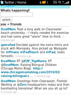
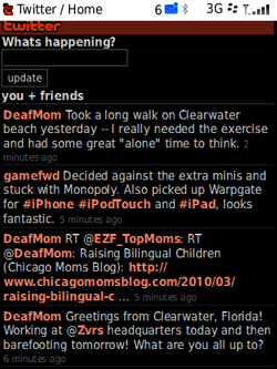
To demonstrate the browser zoom and reverse-contrast features, we have the following three screenshots showing the Mobile Twitter app on a BlackBerry Storm2 smartphone. The first one shows the Mobile Twitter app with default display settings in an 8-point font, and the second shows it in the max 4x zoom setting. The last is the "unzoomed" standard screen in reverse contrast.

Screenshot of the Mobile Twitter app with default display settings in an 8-point font

Caption: Screenshot of the Mobile Twitter app with default display settings in an 8-point font

Screenshot of the Mobile Twitter app in the max 4X zoom setting

Caption: Screenshot of the Mobile Twitter app in the max 4X zoom setting

Screenshot of the “unzoomed” standard screen in reverse contrast

Caption: Screenshot of the "unzoomed" standard screen in reverse contrast

All of the control keys on the BlackBerry Curve 8520 are black with white labels, except for the send key, which has a green label, and the end key, which has a red label. Although the white-on-black contrast is a good thing visually, the buttons are really too small to have labels large enough to accommodate most people with low vision. Most people with low vision will use tactile techniques, possibly along with Oratio, to find the correct keys.

The Bottom Line

The BlackBerry is a solidly built mobile device with plenty of functionality loaded into a small package. Oratio is also a solid product, providing direct access to most of the BlackBerry's many features, and it allows us to use yet another cool gadget that our sighted friends and colleagues are using. Although everything is not quite perfect yet, this is the first version of Oratio, and the people at RIM, HumanWare, and Code Factory seem dedicated to making continued improvements. These companies also promise to make Oratio available on more BlackBerry devices in the near future.

Oratio's $449 price tag may give some AccessWorld readers sticker shock. That is understandable when you consider the VoiceOver screen reader is available on the iPhone at no extra cost. Oratio is also 50 percent more expensive than the TALKS and Mobile Speak screen readers that many of us use. We of course would like to see the price of Oratio come down, but at least we do now have an access solution for the BlackBerry devices. That is certainly good news for people whose job or potential job requires that they use a BlackBerry.

Product Information

Product: BlackBerry Curve 8520.

Price: $349.99 or $99.99 with a 2-year service agreement from AT&T.

Manufacturer: Research In Motion (RIM), 295 Phillip Street, Waterloo, Ontario, Canada N2L 3W8; phone: 519-888-7465; website: www.rim.com or www.blackberry.com. Learn more at BlackBerry.com/accessibility.

Product: Oratio.

Price: $449.

Contributing Developers: RIM, HumanWare, and Code Factory HumanWare Canada: 445 rue du Parc Industriel, Longueuil, Quebec, Canada J4H 3V7; phone: 888-723-7273 or 819-471-4818; e-mail: info@HumanWare.com; website: www.HumanWare.com.

Code Factory, S. L. Rambla d'Egara, 148, 2-2, 08221 Terrassa (Barcelona), Spain; phone: 0049-171-3797470; website: http://www.codefactory.es

You can download Oratio at www.Oratio4BlackBerry.com

For more information about Oratio, visit www.HumanWare.com/oratio

This product evaluation was funded by the Teubert Foundation, Huntington, WV. We would also like to thank Greg Fields of RIM and Michel Pepin of HumanWare for their support throughout this project.

Can an Android Make Your Mobile Phone Accessible?

If you're like me and you watched countless hours of this spring's March Madness NCAA college basketball tournament, you probably heard plenty of promotions for the Droid cell phone. The Droid is one of several new phones using Google's new Android operating system. If you have been wondering what an android can do for you as far as cell phone accessibility, you've come to the right place. Along with my fellow lab rats at AFB TECH, I've been investigating a couple of phones with the Android operating system, and this article will discuss the accessibility that is being developed for this new line of cell phones and provide our initial thoughts on the line's progress.

The Phones

Google launched the Android operating system in 2008. Android is an open-source operating system for cell phones in the smartphone category. Android phones compete with many of the smartphones we have reviewed in AccessWorld that use the Blackberry, iPhone, Windows Mobile, or Symbian OS operating systems. In January 2010, Android had 7.1 percent of the U.S. smartphone market, and its share has been rising steadily.

Several manufacturers are building Android-based smartphones, and they are available from all U.S. carriers. Besides the Droid, which is manufactured by Motorola and available from Verizon Wireless, we also looked at the Nexus One, an unlocked smartphone from Google that can be used on AT&T and T-Mobile networks. The focus of this article is the software, so I don't want to spend a lot of time describing the hardware, but here are the basics. Android-based smartphones all feature touch-screen interfaces with virtual keyboards, and many also have physical QWERTY keyboards that slide or flip out. They each have a track-ball or directional pad (D-pad) type navigational control, as well as a volume toggle, headphone jack, and power button. Some, but not all, also have physical send and end keys for handling phone calls, something I will address later in this article.

The Droid phone showing icons on its touch screen interface.

Caption: The Droid Phone

The Droid phone showing icons on its touch screen interface and its slide-out QWERTY keyboard

Caption: The Droid phone and its QWERTY keyboard

The Nexus One has a track-ball for navigation, but it does not have a physical QWERTY keyboard or send and end keys. It is very similar in size and shape to the iPhone; in fact, my iPhone case fits the Nexus One perfectly. The Droid is similar, but a bit thicker because it has a slide-out QWERTY keyboard with a D-pad on the right side of the keyboard, but it has no physical send or end keys. In addition to all of the virtual buttons that can appear on the touch screen, these phones also have four touch buttons on the touch screen that are always there, and they are labeled "Back," "Menu," "Home," and "Search." The Droid runs Android version 2.0 and the Nexus One runs version 2.1.

What About Accessibility?

For people with vision loss, the interesting work at Google is being done by the Eyes-Free project, led by blind scientist T.V. Raman and his colleagues Charles Chen and Svetoslav Ganov. Working to accommodate people with vision loss, as well as sighted people in situations where they cannot look at their phones, the Eyes-Free project began with a collection of Android applications aimed at making it easier to interact with the phones non-visually. Examples include the Talking Dialer, Talking Caller ID, and Talking Compass applications (apps). Building on this, they announced the TalkBack screen reader in October 2009 to provide spoken feedback when using the various apps available on Android phones and at the Android Market. This is enhanced by the SoundBack and KickBack apps that provide non-spoken feedback, such as beeps and clicks, and haptic/vibratory feedback as you interact with the phone. You will need sighted assistance to go to the menu and choose settings and then accessibility to enable these apps, but they will then stay enabled as long as you don't go back and disable them.

Because the Android Market is a growing source for a wide array of third-party apps for these phones, the Eyes-Free team is also making it possible for designers to make their apps compatible with Eyes-Free functionality. They have resources available on the Google Resources page, and there is another page for developers.

Bringing it all together is the Eyes-Free Shell, which they are calling Marvin, after the paranoid and depressed robot in Douglas Adams' novel The Hitchhiker's Guide to the Galaxy. You can make Marvin your home screen and make it your launching point for Eyes-Free apps. A video available on the Google Resources page notes that Marvin pulls together the various aspects of Eyes-Free for a more consistent and well-integrated interface. These accessibility features come at no extra cost, and they are available out of the box on all phones running Android version 1.6 or later.

How Does It Work?

With TalkBack, KickBack, and SoundBack enabled, you can move around the grid layout of the home screen/desktop of your Android-based phone using the track-ball or D-pad. TalkBack will speak the names of the various items and applications, and SoundBack will emit a ding sound when moving from item to item. You cannot navigate to the touch buttons at the bottom of the screen that I mentioned earlier; these must be touched to activate. KickBack provides a short vibratory burst to indicate you have found the buttons, which also helps in learning how to find them non-visually. If an app has been designed properly, these features will allow a person with vision loss to use them independently.

Marvin, the Eyes-Free Shell, allows you to use these features to more efficiently use your Android phone. With Marvin's home screen up, you can think of the touch screen as a 3 by 3 grid of controls, much like a dialing grid on a standard phone. You can move your finger around the screen and it will speak the action under your finger. You then simply lift up and it activates that action. However, you don't have to know exactly where the buttons are because Eyes-Free employs what they call "relative positioning." Wherever you touch the screen will be the 5 position, and then you can move relative from that position to the other positions in the grid. Moving from 5 in a northwestern direction up to the 1 position, you will hear it say "signal strength," and if you lift your finger, it will tell you how strong your connection is. The 2 position is for time and date and 3 is for battery level. Although it certainly helps to begin as close to the center of the screen as you can, the nice thing is you don't always have to hit a precise position to begin.

I won't get into all of the other controls on Marvin's home screen, but the 6 position is interesting. It is for location information, and Android uses Google Maps along with cell towers and satellites to tell you your general location, usually accurate to within a block.

The 8 position is for launching applications, and when you activate that control, Marvin has a unique way of quickly launching the app you want. Using what they call the "stroke dialer," you can type the first letter of the app you want and then choose from a list of apps starting with that letter. Here's how it works. Starting again near the middle of the screen and moving in a northwestern direction toward the top left corner, you will hear it say the letter A. Moving your finger in a circular clockwise direction, you will hear B, C, D, all the way to the letter H. For I through P, begin by moving straight up in a northern direction. For Q through X, start by going in a northeastern direction to the top right. For Y, Z, a series of punctuation marks, and the backspace key, start by moving in an eastern direction. When you hear the first letter of the app you want, just lift your finger and you can then use the track-ball or D-pad to navigate and choose the app you want. For example, you could go to the letter C and launch contacts and begin scrolling through your contacts. Note: the punctuation marks were not spoken by TalkBack.

How Do You Dial a Phone Number?

Although most of us who use smartphones usually place calls from the contacts list or the call log, we still occasionally have to dial a phone number directly. The Talking Dialer app, which is integrated into Marvin, is activated by touching the button labeled "Search" on the lower right corner of the screen. The KickBack app gives vibrates to indicate you have found the button, and you are now ready to enter the digits. Again, this app uses "relative positioning," so wherever you place your finger is the 5, and the rest of the dialing grid is positioned relative to that spot.

Let's say you want to dial an 800 number. Start by placing your finger in the middle of the screen; slide down one position and lift your finger and you will hear it speak the number 8 and an 8 is placed into the number you are dialing. SoundBack emits a tick sound to indicate when you have passed into the area of the screen for an 8. For the 0, you again place your finger in the middle of the screen and this time move down two ticks and lift your finger to enter a 0. When finished with all the digits, touch the Search button on the bottom right corner and you will hear the digits you have entered. Touch it again to place the call.

You shake the phone once to delete a character you have misdialed, and twice to clear all digits. To end a call, you have to touch a virtual button that appears on the screen about a third of the way up from the bottom. With advice from T.V. Raman of Google's Eyes-Free project, I placed a stick-on dot on the back of the phone to help me orient my fingers to the right spot. That also helps with finding the correct place to swipe your finger to answer or ignore a call. One drawback to the Talking Dialer is that it does not work to enter digits into the interactive phone systems we often encounter, where you have to press 1 for customer service and 2 for sales, etc.

Thoughts from the Lab Rats

After a couple of solid weeks in and out of the lab with the Android phones, we're not ready to tell you to ditch your current phone and run out to get the nearest Android you can find. However, once we figured it all out, there were certainly a lot of positives. If the progress we have seen in Android accessibility over the last year continues, this may be a real force in smartphone accessibility.

First of all, considering the high price we often have to pay for accessible technology, it is certainly refreshing and encouraging to see that Google, as Apple did with the iPhone, is creating this accessibility at no extra cost. We found TalkBack's synthetic speech to be clear and easy to understand. As my intern said, "This android might not be good with a light saber, but it has a better voice than R2D2." We also found it to be very responsive to commands, without any annoying delays.

We used several of the apps that came with the phones and most of them worked well. It was easy to launch and use the contacts app to find a contact and make a call, and with a little practice, we also got used to using the Talking Dialer to make calls. Similarly, the Music, YouTube, and Facebook apps were straightforward and accessible. However, in what could be a deal-breaker for some of you, the Web browser and e-mail apps are not yet accessible. We also found a couple of bugs along the way that will need to be worked out. On the Nexus One, the Talking Caller ID app would often speak the ID of the previous caller rather than the current caller. On both phones we looked at, when pressing the power button to wake it up from its sleep state, it tells you to hit the home button to wake it up, but you actually swipe your finger from left to right across the screen.

The lack of available documentation, such as a user guide, quick start guide, or tutorial did make it difficult for me to learn how to use everything, and I have access to a couple of college intern lab rats to help me out. I can see how the average person could have some trouble getting squared away with an Android phone. However, the Eyes-Free team does have several videos available, and there is an active Eyes-Free Google Groups discussion group where you can find help. See the Resources section of this article to learn how to access the videos and the group.

Which Phone Works Best with Eyes-Free?

It wouldn't do you much good for me to suggest one specific phone model because the pace of change in the Android phone market is so fast that the phone might be gone from the market by the time you read this. However, I can give you some general information to help you make a choice. First, you want to make sure the phone is running Android version 1.6 or later. Second, you want to get a phone with a physical QWERTY keyboard, so I would not recommend Google's Nexus One. The reason for this is that Android's virtual QWERTY keyboards are not yet accessible, and a QWERTY keyboard is necessary for nearly all tasks that require text input, such as text messaging, sending tweets or Facebook updates, or using the interactive phone systems we often encounter where you have to press 1 for customer service and 2 for sales, etc. A physical QWERTY keyboard will also be necessary when browsing and e-mailing are made accessible. The stroke-dialing described for launching applications is fine for a letter or two, but will never be efficient for typing larger amounts of text.

The tactile nature of QWERTY keyboards can also be a problem for some users, as the keys can often be very small or very flat and difficult to differentiate from one another. They also usually don't have easy-to-feel nibs for orientation purposes. You may try adding marks to the keys to help with orientation or, as it is nearly impossible to add a raised mark on a slide-out keyboard, you might try roughing up a key or two with a fingernail file. Although I have never been overly comfortable with the QWERTY keyboard on a cell phone, I know many of you are, and even I can get used to one with a little practice and maybe a little modification.

The Bottom Line

At this point, the accessibility and usability of the Android phones have not reached the levels of we have seen with other smartphones, such as the iPhone or the Symbian, Windows Mobile, or Blackberry phones with their respective screen readers. However, it does provide some real accessibility out of the box and at no extra cost. Our contacts at Google tell us they are committed to improving the accessibility of their products, and the work on the accessibility of Android is not complete. Google's Jonas Klink, who gave a presentation on Google's accessibility efforts at this year's CSUN Conference on Technology and People with Disabilities, told me that even though something might not work perfectly in the beginning, it doesn't mean they are not working on it. If you recall, Google's famous search engine page was not exactly perfect for screen readers in the beginning, but it has now evolved into one of the most accessible and useful tools I use on a daily basis.

Klink and Raman are looking for user feedback, and you can provide that feedback in the Eyes-Free Google Group or at Google's accessibility page.

If you have access to an Android phone belonging to a friend or relative, or you just like to try out new technology, I do recommend you get your hands on one and provide your feedback. You could play a role in making Web browsing and e-mail accessible, or you could share your ideas for creating an accessible virtual keyboard or user guide.

Resources

General Google accessibility page: www.google.com/accessibility

Videos from TV Raman and Charles Chen on Eyes-Free Accessibility: www.google.com/accessibility

Eyes-Free Google Group: http://groups.google.com/group/eyes-free

Christopher Millsap discussing the Droid on Blind Cool Tech: www.BlindCoolTech.com

Resource for app developers: http://Eyes-Free.googlecode.com

This product evaluation was funded by the Teubert Foundation, Huntington, WV.

Announcing AccessWorld's New Editor and Random Observations

I am very pleased to announce we have selected Lee Huffman to serve as AccessWorld editor. Regular readers of this publication are quite familiar with Lee's work in reviewing technology products, especially those designed for people with low vision. Recently, he also produced articles explaining AFB's efforts to improve the usability of visual displays on small devices such as PDAs, cell phones, and personal medical monitoring equipment, such as glucose meters.

Lee has worked at AFB for five years, so he brings a breadth of experience as an author and evaluator to this new position. He also brings a strong passion for accessibility and the interests of people with vision loss, including those with some usable vision. I sometimes believe that this latter group (which makes up the majority of people with vision loss) is too often neglected in accessible design efforts.

Lee has been assisting me for several months now in producing AccessWorld. During that time, I have seen his commitment to delivering a high-quality product and getting it done on time. I can personally vouch for his no-nonsense attitude in "persuading" authors to produce their articles on time.

Please drop Lee a note to let him know your views about AccessWorld. We welcome, and need, your input to expand upon the success of the publication.

Turning to a couple of other thoughts before I surrender this page to Lee, I was pleased to have the opportunity to return to the big technology conference hosted by California State University-Northridge (CSUN) in March. It had been 10 years since I'd been at CSUN. One big change this year was the location—San Diego—as the conference finally outgrew the previous location in Los Angeles. Of course, there were lots of other changes since I'd last attended.

There were numerous sessions on social networking technologies, such as Twitter and Facebook, and many blind and visually impaired people were showing off their iPhones and eagerly awaiting the iPad. Obviously, the era of highly personal technology is underway. As a leading innovator in this space, Apple's commitment to access for people with vision loss bodes well, but what about the prospects for accessibility of mobile applications (apps), the defining force in this era of personal, mobile technology? These apps are relatively easy to produce and mostly cheap to buy, so they are growing at an astonishing rate. We will all need to work overtime to promote and determine app accessibility, and that includes AccessWorld.

Of course, in the 10 years since I'd last attended CSUN, some things, regrettably, had not changed that much. Braille displays are still far too expensive, and as yet, the much-hoped-for technological breakthrough that would lead to low-cost, high-quality braille displays hasn't happened. It wasn't hard to find people with vision loss expressing frustrations with electronic document file formats, especially Adobe's PDF (discussed in the many sessions hosted by Adobe).

I was pleased to see many representatives of mainstream technology companies at CSUN, but another regrettable trend that hasn't changed much during the last several years is the many excuses commercial industry representatives give to explain the lack of progress on accessibility. You've likely heard them, too: "We're not sure that our technology has the (fill in the blank) battery life, memory, power to support text-to-speech and other accessibility strategies."

Worse yet, I also heard several times comments to the effect that consumers with vision loss have conflicting access needs, making it too difficult for industry to incorporate accessibility features to meet those disparate needs. Really? At a time when commercials tout multitasking phones, three-dimensional TV, and mobile devices that enable Internet connectivity from just about everywhere, it is quite amazing how the relatively mundane task of delivering accessible controls, text-to-speech, and screen magnification suddenly makes these talented technology companies go weak in the knees. I've pretty much run out of patience with technology developers who ask some variant of the question: "So, what features do blind people actually want to use in our products?" It shouldn't be a mystery. Generally speaking, the answer is, "All of the features." However, the path and milestones on the way to full access are worth consideration.

I've written before in this space about the incremental and partial access afforded by assistive technology. These "solutions" are often beneficial as they allow people with vision loss to be productive and to pursue personal pastimes. I'm old enough to realize that incremental change is a seemingly immutable fact of life, but I'm also old enough to be running out of patience.

I am fortunate to work for an organization that actively pursues accessibility solutions. Through AccessWorld, we'll do our best to keep you informed about technology access issues, accomplishments, set-backs, and the like, and we'll also keep doing our part to promote both policies and practices that help improve technology access opportunities for people with vision loss. I hope you will keep letting us know what's on your mind. And please join me in warmly welcoming Lee Huffman as he takes over the editor's position.

AccessWorld News

You Are Cordially Invited!

July is convention month, and this year, the AccessWorld team extends our special invitation to attend AFB presentations and activities at the annual conventions of the Association for the Education and Rehabilitation of the Blind and Visually Impaired, the American Counsel of the Blind, and the National Federation of the Blind.

2010 is turning out to be an exciting year for AFB, and you are invited to learn all about the wealth of information we have to offer! Whether it is resources for job seekers and seniors losing vision, information on important advances in accessibility, or the future of AccessWorld as it becomes a monthly publication, we will share information you will want to know. And what fun would a convention be without visiting old friends and making new ones?

Please consult the AER, NFB, and ACB websites for the latest in agendas and information.

www.aer.org
www.nfb.org
www.acb.org

Stem Cells Restore Sight in Mouse Model of Retinitis Pigmentosa

An international research team led by Columbia University Medical Center successfully used mouse embryonic stem cells to replace diseased retinal cells and restore sight in a mouse model of retinitis pigmentosa. The full article was originally published in Science Daily on February 24, 2010.

Resources to Help Pay for Assistive Technology

Assistive technology is often an expensive necessity, but many cannot afford the high prices. A recent blog posting lists several resources that may help you to finance your purchases.

From AFB's home page, you may also find valuable information about services and resources available to people with vision loss and their families.

New Facebook Chat Option Announced by AOL

AOL has announced that its popular and accessible instant messaging client for the PC and Mac now supports Facebook chat. The partnership allows users to chat with Facebook friends in real time. Users of JAWS and VoiceOver have immediate access to the new instant messaging features that are based on AOL's work to ensure out-of-the-box accessibility. AOL hopes that other screen-reading products will soon support the new instant messaging client, including its Facebook chat features.

A podcast demonstration is available from the Freedom Scientific FSCast, episode 40.

Torsten Brand, Nuance Product Manager for Talks and Zooms, Dies at 45

[Originally posted on Blind Bargains on April 13, 2010.]

Torsten Brand, one of the most influential men in the development of accessible cellular phone software, has died of complications from an operation; he was 45. Torsten attended Universität Hannover in Germany from 1984–1991. In 2002, he partnered with Marcus Groeber and founded Brand & Groeber Communications, which began the development of screen-reading technology for Nokia phones. In 2004, the start-up was purchased by Scansoft, which later became Nuance. Brand served as the product manager for mobile applications at Nuance Communications, Inc., until his untimely passing. He had most recently led the release of Talks version 5, supporting 5th-edition Symbian-based cell phones, including touch-screen models. He leaves behind four children. A post on the Handytech North America Twitter page sums up the feelings of many: "You've done so much for the blind community. We will all miss you."

The Touch of Genius Prize for Innovation

National Braille Press would like to invite you to apply for a $20,000 award to honor innovators in the field of tactile literacy. The Touch of Genius Prize for Innovation was developed to inspire innovators tocontinue the promotion of braille literacy for blind and deafblind people worldwide.

The $20,000 Prize will be granted to a group or individual for a new educational method, a new tactile literacy product, or a new technological advance in tactile literacy. The Touch of Genius Prize for Innovation may be awarded for a completed project or anticipated concept that shows viability and will improve opportunities for blind people.

Applications must be received by May 24, 2010. For more information and to download the application, please visit the Touch of Genius website.

The Touch of Genius Prize for Innovation is provided through support from National Braille Press and The Gibney Family Foundation.

A Simple, Basic Cell Phone

Over the years, AccessWorld cell phone articles have focused mainly on high-end smart phones with screen readers, Web browsers, and all the other bells and whistles that are available with today's mobile technology. However, we still often get calls from readers who just want an easy-to-use cell phone with large buttons to perform the basic tasks of placing and receiving phone calls. The Snapfon (pronounced "snap phone") ez One, available from Independent Living Aids, could be that cell phone.

Priced at $99.95 and measuring 2 by 4 by 0.5 inches, the Snapfon ez One is an unlocked phone that works on the GSM network, so inserting a pre-paid SIM card or a SIM card from a GSM network service provider, such as AT&T or T-Mobile, would work.

The half-inch-square dialing keys are arranged in the traditional 3 by 4 grid and have a nib on the 5 key for easy orientation. The send and end keys are a little larger and also easy to distinguish. From a tactile standpoint, it is the most user-friendly mobile phone keypad the AFB TECH lab rats have seen in a long time. The ez One also has a setting called "number voice," which speaks the digits as you dial them, in a somewhat tinny but understandable voice. However, the voice does not speak any display screen information or support any other functions.

Functions on this phone include a phone book, call log, settings, and a text-messaging application. In the settings menu, you can set the clock/alarm, the ringtone, the display contrast, and the "number voice" option.

Although none of those features/settings are supported by speech, it does have an FM radio that can be operated non-visually, and the phone can be set to vibrate mode or speaker phone by touch. The keypad lock is also a tactile switch, as is an integrated flashlight. With a little key press memorization, one could use the phone's three-way conference calling feature. Another feature is the SOS button, which is inset on the back of the phone. Pressing and holding this button emits a loud siren sound, and it immediately dials 911 and goes into hands-free speaker phone mode.

From a low vision perspective, the white labels on the dialing buttons contrast well with the charcoal background, and the numbers are set in 36-point font. The display screen is small, and although some text displayed is as large as 16 point, the black text on a green background does not provide much contrast. An orange backlight that is active while pressing buttons does improve contrast somewhat, but the screen in general would accommodate people with only very mild vision impairments.

The phone comes with a print manual, but the print is in a tiny 7-point font. The manual is also available online in a mostly accessible PDF file.

Large Print Keyboards for People with Low Vision

If you are a person with low vision, you may find a large print keyboard helpful. AiSquared, the maker of ZoomText, is now selling its large-print "classic keyboards" for $50, half of the normal price. You can read about the differences between the classic keyboards and the "second generation" keyboards and you can also check out pictures of both versions by visiting the AiSquared website.

U.S. Access Board Meets to Begin Section 508 Revisions

On March 25, several dozen of the more than 4,000 participants at the annual CSUN Conference on Technology and Persons with Disabilities gathered in a ballroom at the host hotel. They were not watching a demonstration of the latest in access technology, nor was a breakthrough research paper being presented. Still, the topic of discussion is at least as significant to the lives of disabled Americans as any of the dozens of similar-sized gatherings that took place at the conference. The presentations were from the public, not from academicians, and the real audience was gathered on the stage, not in the rows of chairs that filled the room. The event was the first public meeting of the U.S. Access Board at which a set of proposed revisions and updates to Section 508 of the Rehabilitation Act were publically discussed.

Some readers of this publication may have only the vaguest idea of what Section 508 represents. For others, Section 508 isn't even on the radar as part of the technology dictionary. Section 508 of the Rehabilitation Act is a federal requirement that electronic and information technology purchased by the federal government be accessible to persons with disabilities. As you can imagine, the federal government is a huge customer of electronic and information technology. The potential impact reaches far beyond federal purchasing as many states use Section 508 to create statewide accessibility requirements for their own purchases. By requiring accessibility by such large purchasers of technology, it is assumed companies will include accessibility in all technology produced, not just that which is produced for the government.

As elsewhere in federal law, the language of the statute stating the requirement to purchase accessible electronic and information technology is relatively short. Since the actual text of the law cannot include the vastly complex requirements to make this mandate a reality, a set of regulations was created over a decade ago when Section 508 was enacted. However, the rapid pace of progress and phenomenal changes in technology have quickly made the original regulations outdated.

Beginning more than three years ago, AFB participated in a process through which consumers and industry and government agencies prepared recommendations to the U.S. Access Board to update current regulations. The Access Board received this report in April 2009. From the report, and with the assistance of Access Board staff, a set of proposed regulations was published for public comment on March 22, in time for the meeting that took place at CSUN.

The current Section 508 regulations, as well as those that will replace them, reside at the center of a very complex set of governmental and private-sector procedures and activities that combine to create the process for government procurement. The individuals who stood before the Access Board on March 25 reflected the many perspectives that the Board will consider as it moves forward.

The tone of the comments was generally positive. Because the regulations are extensive, occupying three large braille volumes, the common thread that opened most comments was, "I haven't had the chance to look at all of the information in detail, but what I see looks very promising."

Several individuals addressed specific language and requested particular changes. For example, one individual suggested the terms "audio described" and "video described" be clarified and, where necessary, changed. Another was a request by an individual who works in the scientific efforts of an agency that the Board include scientific equipment in examples describing where the regulations must be applied.

It is important to recognize that the regulations for implementing Section 508 can address only the technical characteristics of technology. Despite this limitation, an impassioned plea was made to tighten up a part of the procurement process in which an agency conducts "market research." The purpose of the research is to gain an understanding of the available technology the agency may choose from when making purchases. In the experience of the presenter, this process is often an opportunity for mischief making if the agency wants to exclude a particular brand or model of equipment for a reason that is not essential. An example was later pointed out to me in which an agency purchased laptop computers with a touchpad rather than a pointer, excluding a particular brand and ensuring that only one manufacturer would receive the very large contract. The implications for accessibility are clear; if accessible technology is excluded for trivial reasons, then disabled federal employees and citizens lose out.

Focusing specifically on the first draft of the regulations, it was observed that time is a very tough taskmaster. As we look back on the existing regulations, we see that the regulations did not anticipate several of today's important trends. Thus, we must take very great care to "future proof" the new regulations.

The tremendous inconsistencies observed among federal agencies in procurement was discussed by at least one presenter. In some important respects, this topic cannot be addressed directly by means of technical specifications, yet additional information and supplemental documentation created to assist procurement officials clearly falls within the scope of the Board's mandate.

AccessWorld is committed to covering all aspects of technology and accessibility that impact our readers. "This is the beginning of a process," observed Mark Richert, AFB's director of public policy. "The Board started out by asking some questions. When they have those answers from AFB, the public, and others, they will move on to the next step." He continued, "We're just getting on a ride which may take 24 months. If you're interested in accessibility, it is a good idea to jump in and learn more about these regulations. People need to keep informed and participate."

Home Appliance Update Spring 2010

Bosch Vision 300 and 800

In the November 2009 issue of AccessWorld, we reported that Bosch Vision 500 clothes washers and dryers offer a control design that many readers may find accessible and convenient. Recently, Bosch has expanded the new design to include its Vision 300 and Vision 800 washers and companion dryers. The new control panels have far fewer buttons than is customary in today's high-tech laundry equipment.

The controls on both washers and dryers resemble the traditional controls of yesterday's washing machines in that they use a single rotary control with click settings to select both fabric type and washing temperature. Bosch appliances may not be as widely available as some other brands. In a recent phone conversation, we found the Bosch representative to be very well informed and able to discuss the behavior of the appliance controls in detail. Bosch can be reached at 1-800-944-2904, Monday–Friday from 5 a.m. to 6 p.m. PST.

Bosch 2425SS

Oven, oven in the wall, which is the most accessible of all? While accessibility of free-standing ranges remains elusive, a third option for those who want a wall or under-counter oven may be available. As with the Vision laundry equipment mentioned above and in the November 2009 AccessWorld, Bosch has replaced touch controls with much more traditional rotary controls. In the case of the Bosch oven 2425SS, two very tactile rotary knobs are used to select baking options and temperature. On the upper left face of the oven, an easy-to-feel 13-position turn knob selects among bake, broil, roast, convection, and a number of other "preset" options. A small but very distinct pointer has a contrasting texture. When a specific option is selected, the temperature is set to a default associated with the preset. For example, selecting "bake" results in a 350 degree setting, whereas "broil" is associated with a 475 degree setting. The oven temperature can be adjusted with a similar rotary knob on the right-hand side of the control area. Both controls are very easy to discern, and clicks indicate changes in the control position.

According to Bosch, these temperatures can be reprogrammed by the user if the factory defaults are not to the customer's liking. We plan to test the product at a Bosch showroom to confirm our optimistic assessment. If the oven performs as we hope, it joins the Frigidaire Pro and GE wall ovens at the top of our list for first consideration in this category.

Panasonic NN-SN778S

If a microwave oven is on your shopping list, you may want to consider a new Panasonic offering. The NN-SN778S is a full-featured, 1.6-cubic-foot countertop model. We ran across it at Walmart and were intrigued by the control design.

The microwave's control panel features a combination of easy-to-feel buttons and flat-touch controls. The top-most row of controls includes four buttons, whereas the bottom-most row uses two oblong buttons. In between, a customary touch pad comprises the majority of controls. An interesting feature of this microwave is the three clearly identifiable raised lines that separate the rows of numbers.

The raised lines are molded into the face of the oven and are dipped slightly in the middle, making locating the 2, 5, 8, and 0 buttons quick and easy. The remaining numbers are equally easy to locate at the right or left end of the raised line. Only four touch pad controls are not situated immediately above or below one of the tactile dividers, but they are directly below the four conventional buttons across the top of the control panel, making it possible to reach down from each button to locate a control.

A Panasonic microwave oven that has physical push-button controls has been at the top of our list of first choices for accessibility for some time. Unfortunately, it can be difficult to find. We hope that availability at Walmart will bring the NN-SN778S to a retailer near you. The Panasonic NN-SN778S is available for $139 from Walmart.

Sears HE-6

Not all of the news from the appliance department is good. We must report the departure of the Sears HE-5 clothes washer and its companion dryer from our top picks list. You may recall that these machines, along with the Whirlpool Duet full-size laundry appliances, were the first to include distinct tones to indicate menu selections. For several years, we were able to point to both Whirlpool and Sears Kenmore as the premiere examples of accessible design.

However, in a move that ends a long tradition of partnering with Whirlpool to manufacture its laundry equipment, Sears has switched to the Korean manufacturer LG to provide its current generation of front-loading washers and dryers. We rank most LG-branded equipment in the middle of the pack for accessibility. Sears' Kenmore brand front loaders now rank at the bottom of the list. The new flagship HE-6 is the first washer and dryer we have encountered to employ totally inaccessible flat-panel touch controls. Offering no more accessibility than the typical microwave oven, the smooth control surface is interrupted by only one control that can be identified by touch.

We hope this is not a trend, but given the propensity of the Asian manufacturers to include controls that convey a "high-tech" sensibility to their product design, we may find some of our worst fears confirmed in the next year.

Facebook Chat

What a charmed life we live here at AccessWorld magazine. Believe it or not, it is actually part of my job to spend time on Facebook. I am sure human resources managers around the world are rolling their eyes at that last sentiment, but as a contributing writer for the magazine, I am obligated to investigate all aspects of new technology, including Facebook.

In my debut article, I discussed how Facebook was a brilliant way to keep in touch with family and friends regardless of geographic location. However, one feature I was unable to use on a consistent basis was Facebook Chat. This instant messaging service allows you to see which of your Facebook friends are online and send them real-time messages. In her March 2009 AccessWorld article, Janet Ingber described the method she used to access the Chat feature. Unfortunately, my head almost exploded and my fingers were twisted into a pretzel after that attempt. Obviously, this is a reflection on the complexity involved in putting a robust application like Chat into Facebook and making it accessible to screen reader users.

However, I recently ran across a press release from AOL. The company had worked with Facebook and their new Chat application programming interface to develop a way to integrate Facebook friends with an AOL buddy list. Now, this was starting to get interesting, because I knew AOL's Instant Messenger (AIM) was known to work very well with screen readers. I had not been keeping up on the latest versions of AIM, so I decided to download a fresh copy, create a username and password, and see if I could really chat with my Facebook friends with ease.

Getting Started with AIM

To get started, I opened up my browser. I use Internet Explorer 8 on a Windows XP laptop with Jaws 11. I am sure you'll have very similar results if you use Firefox or Opera with Window Eyes, System Access, or NonVisual Desktop Access. If you are not using the most recent release of your screen reader, you may want to see if there are any scripts available to improve your experience. For all the Mac users out there, it is my understanding that AIM 2.1 for the Mac is accessible with VoiceOver, but I did not try it for this article.

After navigating to the AIM home page, I selected AIM 7.2, the latest version of the software, and installed it to my hard drive. Don't worry, the download is lightning fast and easy to install. From a conversation I had with an AOL guru, I was advised to use the AIM software and not AIM on the Web to chat with my Facebook friends. I believe AIM on the Web will work, but it is not currently optimized for use with a screen reader and it is recommended that screen reader users stick with the desktop version.

Once I finished the download and installation, I launched the application. I tabbed around the screen until I found the button that allowed me to create a screen name. Tabbing through the form was quite simple, with only a couple of exceptions. After entering and confirming my desired password, I tabbed to the next field. However, my screen reader announced "Month Combo Box." I had to arrow up to discover it was actually the form control to enter in my birthday. Perhaps they want to send me presents? A couple of tabs later, as I left the zip code field, I found myself on a link announced as "audio." I arrowed up to discover that the link was actually for an audio CAPTCHA, one of those ubiquitous tests to make sure I am not a robot. The audio CAPTCHA was quite clear, but it sure was fast. After clicking the link for audio, the focus is placed on a play button. Once the button was pressed, there was a series of beeps followed by a string of numbers and letters. Once I passed the test, I was greeted with a congratulatory message and I proceeded to sign in to begin building my buddy list using my existing Web mail contacts.

Step one is to select the radio button next to the Web mail program from which you want to import your contacts. This could be any one of the popular e-mail programs such as Yahoo!, Gmail, AOL, or Hotmail. Use your screen reader to navigate to the edit fields and fill in your username and password. Click the submit button and within minutes you should be ready to go with a list of contacts from your Web mail account who also have AIM accounts. I was pleasantly surprised to learn that my AIM account was filled with more than fifty of my contacts. I guess I am pretty behind the times when it comes to instant messaging!

Integrating Facebook and AIM

My next step was to link my AIM account with my Facebook account. After opening the AIM Buddy list, I used shift plus tab to move backwards one time until I found the button labeled "Add Buddies to Your Buddy List." The next step was to tap the spacebar and arrow down to the selection for Facebook Chat. This was followed by a number of easy-to-navigate screens where I entered my Facebook username and password. And just like that, all of my Facebook friends appeared in my AIM Buddy list.

What's It Like?

AOL Instant Messenger is one of those programs that can run in the background while you attend to other tasks that, according to my boss, are more important, like work. To access your buddy list, you can find the AIM icon on your desktop or use the Windows key plus the letter B to access the system tray. Once in the system tray and on the AIM button, you can tap enter to pull up your buddy list or use the applications key to see a full list of menu options. AIM should work very well without having to make many changes to the settings, but the multipage dialog box is there if you need it.

I disabled many of the features that are visual in nature as I am the only person who uses my computer. If you are signed into AIM, you will hear lots of sound effects, especially the sounds of opening and closing doors. These effects represent your buddies signing into and out of AIM. When you are back in your buddy list, you will notice you have the option of sorting your buddies into categories such as family or co-workers. As you arrow down the list, your screen reader will announce the group name and you can use left arrow or right arrow to open or close the group.

When you find the Facebook friends group, use the right arrow to open the list and down arrow until you find the person you want to chat with. Hit enter on your keyboard. Your screen reader should repeat the name of the person and let you know if they are available or idle. I am not 100 percent sure what idle is, but my guess would be the person is logged into Facebook but perhaps has set their status to idle. They must be so busy with Facebook that they don't want to chat. As soon as you begin chatting, your screen reader will probably pass along certain information, such as the person's screen name, the time stamp of the message, and the message itself. Additionally, you can check your screen reader's help files for the keystrokes to go back and hear the message history. For a complete list of keyboard shortcuts, you can go to AOL's help center.

What It All Means

I must admit I am starting to develop a mild addiction to instant messaging. For the last several days as I wrote this article, I kept AIM on and was greeted by friends I had not "spoken" with in quite a long time. Sometimes e-mail and telephone calls seem to require quite a lot of energy, whereas instant messaging is spontaneous. I don't recommend instant messenger for every type of communication, but it certainly has its time and place. Next up, I am going to combine all of my social networking streams in the AIM Lifestream. This tab on the AIM interface will allow me to view all of my updates from Facebook, MySpace, Twitter, and more all in one place, and of course it is accessible to people with vision loss.

CSUN 2010 Highlights

Just as the annual ritual of setting our clocks ahead by an hour signals the departure of winter and the arrival of spring, for those of us who report on accessibility and technology, the annual California State University-Northridge Center on Disabilities Conference is one of the first signs of warmer weather and at least a few new product announcements. In the past, the annual trip to the Golden State took us to two hotels within shouting distance of the Los Angeles International Airport. While this was convenient if you wanted to get from baggage claim to the hotel quickly, it wasn't necessarily convenient for much more.

The 2010 CSUN conference took place in San Diego at the Manchester Grand Hyatt. By all accounts, this was a welcome move. Within easy walking distance of both the waterfront and some of San Diego's trendy neighborhoods, the Hyatt was well positioned to host conference presentations and the exhibit hall.

The CSUN is generally a good gauge of the assistive technology industry in general. In 2010, the economic downturn took an obvious toll, and several longtime exhibitors were absent. However, most attendees I spoke with agreed that bringing all CSUN activities under one roof was a welcome change.

Despite these uncertain times, several interesting and important product introductions were made. Some are refinements to existing technology, whereas others signal general trends that may be significant.

Notetakers have been a mainstay of assistive technology for more than a quarter century. For the past several years, most product announcements have centered around software updates and modest hardware refinements. This year promises to be a banner year for new notetaker introductions. HumanWare attracted attention with its line of Apex notetakers. Both braille and QWERTY versions of the device include integrated, refreshable braille displays. The design is noticeably thinner than earlier offerings. A unique navigation wheel is included on Apex devices with a braille keyboard. At the GW Micro and HIMS Co. Ltd. booths, the VoiceSense QWERTY received much attention. Following the design cues of other HIMS products, the smooth, white plastic housing is sleek and lightweight. Dan Weirich of GW Micro demonstrated just how rugged the VoiceSense is by dropping it on the floor, picking it back up, and continuing to use it.

Reading technology, whether on a personal computer or a mobile device is another important product category. This year, Freedom Scientific introduced the Pearl, a portable camera to be used with the company's Open Book optical character recognition (OCR) software package. Resembling a high-tech desk lamp, the Pearl unfolds and is placed on a flat surface. The material to be recognized by Open Book is placed under the camera. A setting is available to allow the pages of the book to be turned without interruption, with Pearl capturing images automatically. The model presented was still in the prototype stage. Shadows reduced the OCR accuracy during the exhibit hall demonstrations, although final refinements of the design have yet to be made. While smaller competitor's products have used camera-based document acquisition for several years, this is the first camera to be associated with one of the two dominant players in the specialized OCR market.

Reading technology that is intended to make recorded and other specialized material accessible was also very much in evidence. The most anticipated introduction in this category was the Book Port Plus, the latest product from the American Printing House for the Blind (APH). The APH has created its own software and set of features that operate on an existing hardware platform manufactured by Plextor. The buzz was favorable. The few moments I spent with the product in my hand confirmed the reasons for the excitement. The rather sluggish behavior of the Plextor platform, reported on in AccessWorld, was replaced by a very responsive and high-quality interface. Back at GW Micro, a prototype of a second BookSense product was on display. This version includes a small, high-quality visual display. All functions are controlled on the front of the unit. Individual buttons replace the contiguous button design of the existing BookSense.

Olympus America is a familiar name in the electronics industry. Its listing in the exhibiter guide promised "[a]udio recording devices that offer DAISY firmware allowing for text to speech as well as voice guidance when using the device." Unfortunately, the prototype we saw fell substantially short of that goal. We do understand the latest model is still under development and we hope the features that have been announced make it to market in the final version. I was surprised by the uninformed Olympus representatives staffing the booth, and Olympus denied a request to allow the device to be heard in one of the podcasts that covered the event.

The larger universe of digital readers or "eBooks" receives a good deal of attention both in this publication and elsewhere. In mid-winter, Ray Kurzweil announced the pending availability of Blio, a software eBook reader. If the product were able to deliver on the features promised in press coverage, an unprecedented era of equal access to the printed word was only months away. Now that winter has turned into spring, Blio is still a prototype product. James Gashel, vice president for business development at K-NFB Reading Technology demonstrated a version of Blio on a computer. A link to an audio presentation entitled "#csun10 Audio: Extended Hands-On with Blio" is available on the Blind Bargains website. Please note that some examples of eBooks used in the demonstration contain adult language that may not be suitable for all readers. K-NFB Reading Technology still intends to release the product later this spring, according to statements made in the presentation by Gashel.

Braille production requires specialized equipment, much of which was on display at CSUN 2010. Enabling Technologies has introduced a computer-driven braille label embosser. The company has also updated a product called Transcend, which supports the production of materials in print and braille. Schools and other education consumers find this particularly important. American Thermoform continues to import and sell embossers from Index. Several Index models were on display, as was the Brailleo 200, a $45,000 high-speed production embosser.

Tactile graphics are often associated with braille production. ViewPlus Technologies has, for many years, been the leader in designing and manufacturing embossers that can create both tactile and visual images. An exciting and very ambitious prototype device was demonstrated at this year's CSUN. The system combines an OKI Color Solutions color laser production printer with a free-standing specialized ViewPlus embosser. The results were very impressive, producing an 11 by 17 inch print and braille tactile graphic in a matter of seconds. As a braille reader, I was astonished by the quality of the braille characters, which can be slightly non-standard in size because of the graphics technology.

Serotek Corporation featured a hardware device that makes visual presentations, such as PowerPoint slideshows, accessible during a meeting, in real time. The device connects to the system, which provides speaker support and creates an HTML version of screen images. Any browser running on a WiFi-equipped device can be used to access the presentation, including notebooks, notetakers with WiFi, as well as cell phones and even the iPhone/iPod.

Other organizations that received attention included the Sendero Group, which announced a free application (app) for the iPhone. The app, to be released later this spring, will provide current location information, direction of travel, as well as the nearest five points of interest. A product to allow virtual exploration of an area and trip and route planning was announced as well. The product will be released for both the PC and Mac later this summer. The demise of Way Finder Access was also a topic of conversation; however, no definitive plans were announced by any organization regarding this cell phone-based global positioning system (GPS) product.

En-Vision America introduced the i.d. mate Summit, the latest version of this popular barcode reader and labeling system. ScripTalk was also demonstrated at the company's booth.

Nippon Telesoft unveiled several new braille displays. These relatively low-cost displays will be marketed in the United States by Perkins Products. Other Perkins offerings include both 1- and 2-gigabyte National Library Service cartridges and the special connector cable to connect them to a USB computer port.

Independent Living Aids is selling talking watches with a new and easier-to-understand choice of male or female voices. Priced at around $40, these watches didn't generate the same interest as a new notetaker, but the technology is still very important to those who rely on them.

Beyond these specific venders, a notable absence in the exhibit hall was the iPhone/iPod and Mac OS computer operating platforms for new assistive products. With the exception of the Sendero release mentioned above, and a communications product for people with limited speech ability, no Apple-based products made their way into my notebook. That isn't to say interest in Apple was lacking. To the contrary, the Apple presentations were fully attended and excitement continues to run high for VoiceOver in all its variations.

These CSUN exhibit hall impressions are purely my own. For full CSUN coverage, I invite you to explore the wealth of material that is available online. Several organizations have devoted substantial time and their very limited financial resources to bring you hours of interviews with company representatives and developers. These archived presentations can bring CSUN from the San Diego Manchester Grand Hyatt directly into your home or office. For example, visit www.serotalk.com or www.blindbargains.com, and search for "CSUN 2010." I encourage you to take advantage of these resources.