Full Issue: AccessWorld December 2013

Audio Description in Theaters: Making Theaters More Accessible

As a totally blind adult, my experiences in going to movie theaters have been quite limited. Generally, I would either need to go with someone else who was willing to provide some context for the visual scenes, or pick a film that was heavy on dialogue, which would likely be easier to follow. Neither of these was an ideal situation to me. And even with the verbal cues from a friend or my own imagination, I assumed I was likely missing out on key moments in the film.

Thanks to recent technology developments and changing market conditions, this reality is starting to shift in a big way. I recently visited two Chicago-area theaters to try out some of the technology available and to get a better grasp of the current state of audio description in movie theaters.

The Beginnings of Descriptive Video

The beginnings of audio description in theaters can be traced back to research and projects performed by the Media Access Group at WGBH, a Boston nonprofit media company that also produces a variety of PBS programs. Some of you may remember the catalogs of VHS tapes with Descriptive Video Service (DVS) tracks sold by WGBH in the 90s, which included a growing listing of described movies, PBS specials, and other titles. Generally, movies would be available several months after their initial video release. Due to the limitations of the VHS format, purchasing a movie with audio description meant that anyone who watched the video would hear the description. There was no way to turn it on or off.

During this time, many of the modern techniques used for describing scenes and visual effects were perfected. Audio description is generally given in between spoken dialogue and includes anything from descriptions of the characters or the room to messages or subtitles displayed on the screen. When creating an audio description track, describers first listen to the movie to understand how a blind or low-vision person may perceive the film. They then will write a script to fill in the missing information that was not provided by the spoken dialog. The best descriptive tracks will give enough information about the movie to add value without taking away from the aesthetics of the movie experience. And, unlike your friend who has to see the action first and then try to describe it, you are informed of the events of the movie in real-time as they unfold.

Moving Description to the Theater

In the late 90s, WGBH and others undertook efforts to create a similar experience for theater patrons. While described movies at home were a welcome addition, the time it took to go from a theater release to a described videotape was a year or more. The goal was to improve upon this limitation and create an experience where moviegoers with visual impairments could enjoy new-release films at the same time as their peers.

Their research resulted in the birth of the Motion Picture Access Project, commonly referred to as MoPix, which aims to provide both audio description and closed captioning to theater guests. Early renditions of the technology were quite expensive at roughly $12,000 per theater screen due to the need for a specialized audio server and the screen for the rear-window captioning system for those who are hard of hearing. For this reason, the limited number of theaters that did install the technology mostly provided it for just one screen, meaning that a visually impaired moviegoer would not have a choice of which movie to see when visiting the theater.

Making Audio Description Affordable

Recently, technology developments have helped to further the development of affordable audio description for theaters. First, the movie industry's move from analog to digital meant that the descriptive audio track for a movie could be encoded along with the rest of the film. This eliminated the need for an expensive specialized piece of hardware, saving about $5,000 per screen.

Another major development came from Sony, who created glasses that superimpose closed captions over the movie for the viewer who is deaf or hard of hearing. As it turns out, this technology has had residual benefits for the blind and visually impaired as well, as these glasses have eliminated the cost for the large rear-window captioning systems that needed to be installed. According to a Los Angeles Times story, the cost for a set of Sony's Entertainment Glasses is about $1,750.

Modern systems also give another advantage over their predecessors, as the same hardware can be reprogrammed for use on multiple screens. So essentially, an employee needs to set up the receiver for the movie you are planning to see and then the appropriate track will be heard. This flexibility has allowed for the installation of systems that will allow for audio description or closed captioning for any screen in the theater.

Putting it to the Test

Several major theater chains have begun to add audio description technology to their theaters across the United States. For example, Regal Entertainment Group has installed the aforementioned Sony technology in roughly 6,000 screens or over 80 percent of their nearly 600 theater locations. Similar efforts have been launched by Cinemark, Alamo Drafthouse, and AMC Theaters among others. I visited two Chicago-area theaters to try out the technology and see how or if it would work.

I began by visiting a Regal theater to try out Sony's system. Before I went, I consulted a rather accessible movie listing site, The Big Screen Cinema Guide for show times. Impressively, 10 out of the 11 listed movies included audio description so I had plenty to choose from. I opted for the popular science fiction thriller Gravity, a movie with several action scenes devoid of much audio.

Generally, the headset for audio is requested from the guest services counter. For modern systems, the headset needs to be programmed to the movie in question, and once this was complete, I was handed a pair along with a small receiver box. Once entering the theater, a bit of anticipation set in, not only for the start of the movie, but also about whether or not the receiver would work. During the previews, commercials, and other pre-movie entertainment, nothing is heard through the headset. You will likely not know if the equipment is working until the movie begins.

Once the movie started, I started hearing the movie track through my headset. Eventually, I realized this was a bad thing, as my receiver had been programmed for assistive listening. Upon returning to guest services, I eventually talked to a manager who tried to tell me that only assistive listening and closed captions for the deaf were available in the theater. He was unaware of the availability of audio description in the very theater he managed. I was confident he was wrong. After a few minutes of tinkering and some good work by an assistant, the audio track was programmed and I was able to enjoy the movie, minus the first ten minutes. At least I was given a refund.

As for the receiver and headset itself, it performed as expected. The receiver is a small box that includes volume controls, the headset jack, and a belt clip. The description track was heard through the headset. I found myself adjusting the volume on the receiver to match the volume level of the movie as scenes transitioned from quiet to very loud. I was able to increase the volume on the receiver loud enough to overpower the loudest parts of the movie. The headset was a simple, behind-the-ear style that provided a comfortable fit. Since a standard headphone jack is used, you could bring your own headset or earbuds if you desired. I wouldn't recommend closed-ear headphones however as this would muffle the sound from the movie itself.

My experience at an AMC theater across town was quite similar. It took several minutes and a couple of employees to program my receiver for the desired movie. Luckily, I did have audio description for the opening credits. This theater used the Fidelio audio description system from Doremi Cinemas, which featured a very similar design to Sony's offering. The receiver included a single volume rocker and a pair of on-ear headphones was provided. Once again, the equipment worked as expected and I was able to independently enjoy the movie.

For a blind or visually impaired moviegoer, the type of system available is quite inconsequential, as long as it works as expected. The receivers allow a patron to sit anywhere in the theater without loss of audio quality. It is worth noting that not all systems allow for both audio description and closed captions at the same time, so if you require both, you may need to request two receivers.

Tips for Going to the Movies

The availability of audio description at hundreds of new theaters is a potential game changer, and gives blind and visually impaired patrons a chance to experience the theater in an entirely new way. Here are a few tips and tricks I've learned along the way for maximizing your experience.

Find out which theaters and movies have audio description available. Unfortunately, this information is not as easy to find as it should be. The Big Screen Cinema Guide denotes descriptive video and closed captions where it's available, but not all theater chains include this information in their listings. Another site to try is Captionfish, a site designed primarily for closed caption users but that also includes many listings for descriptive audio. Some theater websites may also include information for the movies at their locations. If all else fails, calling the theater is an option, though the person who answers may or may not know what you are talking about.

Arrive at the theater a few minutes early, especially if it's a location you have not visited before. You may need to educate a manager or employee on the technology or convince them it is available. Politely ask for a receiver and headset for video description and remind them you do not want an assistive listening device.

Remember, you will generally not hear anything through your headset until the opening credits. At this time, you should hear description. If you don't, then your unit is likely programmed incorrectly or there may be a short in the wire. Also, ensure your receiver is not set to a low volume. If you hear audio from the movie itself, then your receiver was likely programmed for assistive listening and it will need to be reset.

Consider bringing your own headset for comfort and cleanliness, or using some disinfectant wipes on the headset provided to you. The headsets have been likely worn and touched by many others, so proper sanitary precautions should be observed.

Some theaters may make you present a photo ID when checking out a receiver to prevent against theft, so be sure to bring one with you.

Improving the Experience

As I found out, attending a theater, especially a location I had not visited before, can provide some minor complications. The current challenges largely come down to a lack of education of theater employees. As more visually impaired people visit their local theaters and employees become accustomed to the technology, this issue will likely fix itself.

The lack of a centralized database of all movies and theaters with audio description is also problematic. Several websites provide incomplete or out-of-date lists, or include only theaters using a particular technology. A simple way to find any movie with description in your area would be an ideal solution.

Audio Description on your Phone

A company called Parlamo is tackling audio description from a different angle. According to its website, the Parlamo iPhone or Android app will be able to sync an audio description track to the movie you are currently watching. If the company is successful in launching this app, it has the potential to make audio description available for any theater in the country. It will take the cooperation of movie studios to provide description tracks to Parlamo and also would rely on a data connection to download the content to your device, but the system is certainly an intriguing option.

Solo-DX has recently introduced audio description to an iOS app called MovieReading. The app also allows you to listen to audio description while in the theater, and will automatically sync the track to the movie's audio. The first film to use the technology was "Philomena," which opened in November. More movies are planned. An Android version of the MovieReading app is forthcoming.

The Bottom Line

I've always tried to become a casual movie fan, but many genres are often difficult to enjoy without some additional audio description. As this technology becomes more widely available, relying on a friend or family member or imagining what might be happening in the film is no longer necessary. It's now possible to become completely immersed in the theater experience and enjoy films on an entirely new level. So sit back, grab some popcorn, turn off those cell phones, and enjoy the show.
Comment on this article.

Lainey Feingold: The Power of Structured Negotiations

When Lainey Feingold went to law school, she wasn't planning to fight for the rights of those who are visually impaired or any other particular minority. She did have a natural inclination toward believing in social justice and human rights. Early in her career, she found herself in what she assumed to be a temporary job at the Disability Rights Education and Defense Fund (DREDF). Here, she became eager to learn about disability issues.

As it turned out, Lainey Feingold was with the Berkeley, California organization from 1992 to 1996, and by the time she left to build a home-based law practice enabling her to be more fully involved in the lives of her two young daughters, she was thoroughly in touch with people with disabilities and their countless encounters with discrimination.

She wound up working on behalf of some wheelchair users who were weary of the second-class citizenship afforded them when they couldn't reach the height of gas pumps to fuel their own vehicles or enter the convenience stores commonly affiliated with gas stations. In an effort that Feingold and her collaborator, Linda Dardarian, would eventually refer to as "structured negotiation," Feingold orchestrated a settlement netting the results those wheelchair users desired and deserved, and no one ever went to court.

First Foray into Information Access for People Who Are Blind

The first case involving blindness that she recalls came in 1993 or 1994 when a particular Californian who was blind became exasperated with the failure of Bay Area bus drivers to announce stops.

"The ADA had passed in 1990 and regulations were in place," Feingold recalls, "so the rules were there, but people weren't following them."

Rather than filing a lawsuit, Feingold wrote letters, made phone calls, reached an agreement, and solved the problem with the active participation of her clients.

By the mid-1990s, word of her abilities had begun to spread, at least in the blind community in California, and Feingold became engaged in a major struggle for information access that is today a significant access milestone. Obtaining your own financial information and accessing your own cash are conveniences most of us now take for granted, but in the 1990s, a blind person could not use a simple ATM to get cash, deposit checks, get balances, or transfer money from one account to another. Similarly, accessing your own information independently, despite state and federal laws, was not something people who are blind could do.

A few individuals and the California Council of the Blind brought the problem to Linda Dardarian's office, Linda got Lainey involved, and again, the letter writing and negotiating began. It didn't happen overnight but by early 2000, Wells Fargo, CitiBank, and Bank of America throughout California had committed to providing information to customers who are blind or visually impaired in alternate formats, and the widespread installation of accessible "talking" ATMs was launched.

The approach was friendly, collaborative, and took inordinate patience. As with all cases that would follow, Feingold stresses that blind individuals and organizations as claimants were actively engaged in the process every step of the way. The gist of the initiative was to assist these major financial institutions in providing accessible information to their blind customers, collaborate with them to avoid the hostility and expense of litigation and, of course, to guide them through the process of just plain doing the right thing. The results of that first major settlement, talking ATMs at banks throughout California and statements mailed to blind customers in braille and large print, was a clear win-win for everyone.

Kelly Pierce and Anne Byrnes, two Bank One (later Chase) customers who are blind in Chicago heard about Feingold's success in California, and enlisted her help in launching a similar negotiation in Illinois. Again, patience and persistence in what Feingold was now calling structured negotiation earned the positive outcome of talking ATMs and financial information in alternate formats to all Bank One customers who were blind.

Beyond Banking

In the nearly two decades and 50 settlements that Feingold and Dardarian have negotiated, the broader picture of information access has reached far beyond the banking industry. Structured negotiations have resulted in obtaining accessible information for blind customers of such institutions as American Express and Charles Schwab, for example, and in the successful installation of accessible point of sale devices in tens of thousands of stores in such retail chains as Wal-Mart, CVS, Best Buy, Target, and a half dozen others.

In San Francisco, pedestrians who are blind worked with Feingold and Dardarian for the installation of practical, accessible audible traffic signals, so that where there were once just a handful of such pedestrian informational signals, there are now about a thousand.

As the result of one little girl's mom (Helen Popper, mom of then six-year-old Rio) looking forward to a time when her daughter would want to go to any movie and enjoy it independently with her friends, a structured negotiation was begun with a national movie theater chain, Cinemark, resulting in the installation of audio description equipment in every theater in that chain nationwide.

The work has expanded to include information access in medical environments as well. Hospitals in Massachusetts and California now provide patient information in alternate formats due to the structured negotiations initiated by Feingold and Dardarian, (and in Massachusetts by attorney Dan Manning of the Greater Boston Legal Services) along with a number of blind individuals, the Bay State Council of the Blind, California Council of the Blind, and others.

Online Access

Dating back to that first settlement with the three California banks, Bank of America is credited with having included online accessibility as part of the equal access afforded blind customers. Today, online and mobile accessibility are recognized as vital parts of every structured negotiation Feingold initiates.

Two recent successful settlements were focused primarily on web and mobile accessibility. The web sites for Weight Watchers and Major League Baseball are both interactive sites, and both were brought to the attention of Feingold and Dardarian by individuals who are blind and were frustrated by inaccessibility and the desire to use these services. The involvement of individuals who are blind is essential to every case, Feingold says, in part because it makes it clear to the company invited to the negotiation that here are customers who are interested in the product but unable to use it.

How It Works

Feingold emphasizes that every case in which she has been involved has been initiated by individuals who are blind or visually impaired. There is first a documented effort on behalf of those individuals to encourage a company to provide the information access requested. When lawyers enter the equation, she says, rather than taking the approach of filing a lawsuit, letters are written and phone calls made inviting the company to engage in the negotiating process. "It takes patience, optimism, and perseverance," she says. The advantage of negotiation, rather than litigation, is that the relationship involves two parties working together toward desirable outcome, rather than a plaintiff and a defendant struggling with one another. Obviously, the cost of depositions and court appearances is eliminated, so complying with what is actually law is less expensive if the institution cooperates.

And how are the lawyers paid for their time and effort? Feingold explains that when a situation is identified as discriminatory, whether the victims of that discrimination are women, racial minorities, people with disabilities, or another group, the law requires what is called "fee shifting." In other words, the burden of paying lawyers' fees shifts to the offending organization, so that in addition to providing the accessible information required in the settlement, the offending organization is also obligated to pay attorneys' fees.

Since most of the settlements to date have involved individual members or affiliates of the American Council of the Blind (ACB), Feingold was asked about the distinctly different approach taken by the National Federation of the Blind (NFB). She spoke with immense respect for NFB's attorneys, both external and internal, and is actively involved in an information-sharing organization called the Disability Rights Bar Association, in which attorneys working on behalf of both NFB and ACB are involved. Litigation works, too, Feingold believes, but she and Dardarian have chosen a different path with structured negotiations. One particularly interesting circumstance in which legal efforts have mirrored one another on behalf of both ACB and NFB has been in the airline industry. To have a negotiation, the invited party obviously has to agree to the process. Only once has a company refused Feingold's invitation: Jet Blue, whose blatant disregard for building accessibility into either its website or onsite kiosks resulted in a lawsuit filed by Feingold and Dardarian. A similar suit was filed against United Airlines by NFB attorneys. Both cases are currently under appeal.

Lainey Feingold is a talented lawyer who cares passionately about the rights of those who are blind or visually impaired to have independent access to information, whether financial, educational, entertainment, medical, or in any other aspect of living life in America. She is in the process of writing a book about her experiences with structured negotiations, a book that she says wouldn't be possible without the many individuals who are blind and have brought each case to her attention.

"I've been lucky," she says. "The work has been great and the story needs to be told."

To read more about settlements that have occurred, how to address a discriminatory situation in your own region, structured negotiations, and the work Lainey Feingold herself, visit her law firm's website.

Comment on this article.

A Comparative Review of iPhone Magnifier Apps

The all-too-familiar phrase "there's an app for that" suggests that when we encounter an obstacle, technology is right around the corner to solve it. As we all know, well marketed, and even well-meaning, products don't always translate into meaningful solutions. The same holds true for magnifier apps targeted toward people with low vision. With active baby boomers experiencing reduced vision as they grow older, and the general population living longer, this target audience has become a substantial, and lucrative, demographic. The National Institutes of Health (NIS) estimates that approximately 2.9 million Americans are living with low vision. This number represents nearly 10% of the entire American population and that number is only expected to grow. Not surprisingly, there are an ever-increasing number of magnifier apps being marketed today.

A dedicated illuminated or electronic magnifier can be an effective and portable solution to accessing printed materials if you have low vision. The downside to these devices is that they tend to be costly, they require batteries or charging, and they are not always on-hand when you need them most. Depending on the size and portability of the magnification device being used, they may not be very convenient to carry with you. A magnifier app installed on a smartphone is therefore an alternative worth considering, especially since we typically have our smartphones with us. It's important to keep in mind that magnifier apps, at their very best, are simply used for spot reading, and not for extensive reading of any kind. Some magnifier apps are clearly more effective than others.

A number of magnification solutions exist for the Android platform, as well as tablet products from both Android and Apple. This article will examine some of the inherent limitations associated with an iPhone and magnifier app combination, as well as a comparative review of six magnifier apps, including the iPhone's built-in camera app. There are several dozen magnifier apps available in the App Store. The magnifier apps reviewed here have been specifically selected to vary considerably from one another in order to emphasize what to look for, and what to avoid, when considering a magnifier app.

Consider the Hardware

The processing power and hardware specifications of the iPhone itself can be as important as the specific magnifier app being used. The iPhone 4S is equipped with a 3.5-inch screen and a 5-megapixel camera. The iPhone 5 and iPhone 5C both contain a 4-inch display, and a 5-megapixel camera. The recently released iPhone 5S offers the same screen size as the 5C, but boasts an 8-megapixel camera and improved flash design that provides better image quality in low-lit environments. For optimal performance, the processing speed of the iPhone 5 and above is better suited for these apps.

Screen Size and Font Size

To put things in perspective, the four-inch screen of the iPhone 5 displays approximately eight characters in portrait mode using 36-point font. Approximately twelve characters are displayed with 22-point font. This equates to anywhere from one to three words being displayed on the screen at any given time, which is not conducive for any extended reading. Magnifier apps become increasingly impractical as larger levels of magnification are required, since the four-inch screen size of an iPhone is so limiting.

Camera Placement and Panning

The optimal distance between the print material and the camera ranges between approximately four and eight inches, depending on the print size of the material and the desired text size. Varying the distance will also vary the print size and viewable area being displayed on the iPhone screen. Suspending the camera above the printed material while locating the desired text can be challenging. This is especially true if you have difficulties with hand-eye coordination or tremors. Because the iPhone camera is offset to the top right corner as it faces away from you, aligning this part of the phone over the printed material rather than the center of the phone can seem counterintuitive. Panning the print material with the iPhone while maintaining the correct height, while viewing the display at the same time, adds another layer of difficulty. This is certainly achievable for many people, but not for everyone. One of the strengths of illuminated stand magnifiers, and some electronic magnifiers, is that they provide a fixed focal point and rest on the surface to aid in stabilization and maneuverability when accessing printed material.

Putting the Apps to the Test

The six magnifier apps being reviewed all provide two essential features: range in magnification and access to the LED light for illumination. Since lighting is such an essential component to image quality, apps without the ability to access the LED light on the iPhone were not considered. The six apps are being rated in the following categories:

  • Ease of Use
  • Additional Features
  • Cost

Super Vision+

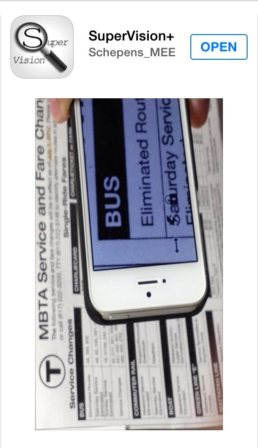
Screenshot of SuperVision+ app

Caption: Screenshot of SuperVision+ app

Ease of Use:

The controls within this app are displayed along the bottom left-hand corner and right-hand side. They are solid black in color with a white border. Effort has clearly been made to make these controls more pronounced for people with low vision. Increasing and decreasing the size of the viewable area is easily achieved using the pinch and reverse-pinch gestures, or by vertically moving the pronounced white slider to the right side of the display. Enabling the LED feature within the app is achieved by pressing the lightning bolt-shaped control on the bottom-left corner, which is tightly clustered in the middle of two other controls. The zigzag design of this control may be difficult for some people to associate with the LED light.

Additional Features

To the right of the LED control is a control resembling a lock. This control allows you to freeze and unfreeze the viewable image. This is a common, and very important, feature among magnifier apps. This feature is especially useful because it prevents you from having to hover the phone over the desired text for an extended period. You are able to freeze the viewable image, then view the captured image at a comfortable distance and angle, and zoom in or out using the pinch and reverse-pinch gestures.

On the bottom left of the display is a control that resembles a thumb tack. This feature is designed to stabilize the viewable image to be displayed. Pressing the thumb tack control changes it to a symbol that appears as two arrows pointing in opposite directions. This control is designed to stabilize the image while panning the text horizontally. There was only a minor improvement in image stabilization using these controls. Effective hand-eye coordination and panning techniques are likely to play a more significant role for image stabilization.

Cost

Free

See It Video Magnifier

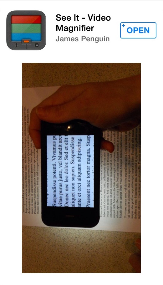
Screenshot of See It Video Magnifier app

Caption: Screenshot of See It Video Magnifier app

Ease of Use

At $5.99, this app is touted by its distributors as the world's only portable CCTV. Granted, it does come loaded with some extra bells and whistles that you won't find in many other magnifier apps, but it also has its share of shortcomings. Enabling and disabling the LED light of the iPhone is accomplished easily enough by pressing the bright green control on the top right corner. However, the app does not give you the options to adjust the level of magnification using the pinch and reverse-pinch gestures, an extremely useful feature for quick and easy magnification. A horizontal bar with a slider located near the bottom of the screen allows you to adjust the level of magnification, but it isn't nearly as user-friendly as the pinch and reverse-pinch gestures. The print size within these controls is displayed at approximately 7-point font. Font size this small that is used within an app designed specifically for people with low vision is unacceptable.

Additional Features

One of the features that make this app stand out among most apps is its wide selection of color schemes. Unfortunately, all of the selections are made via the extremely small controls on the bottom row of the display. The color selections can be made using the controls labeled as Normal, Gray, Color, and Invert. Within the Color control are six color filters to choose from, including red, green blue, cyan, magenta, and yellow. When the app is closed and re-opened, the last color scheme that was selected is loaded. However, the ability to quickly and easily change the color schemes as needed is essential.

At the bottom right corner is a button labeled "Pause" which freezes the image being displayed, similar to the aforementioned Super Vision App that allows you to freeze and unfreeze the displayed image. Unfortunately this control is also labeled with the same 7-point font.

Cost: $5.99

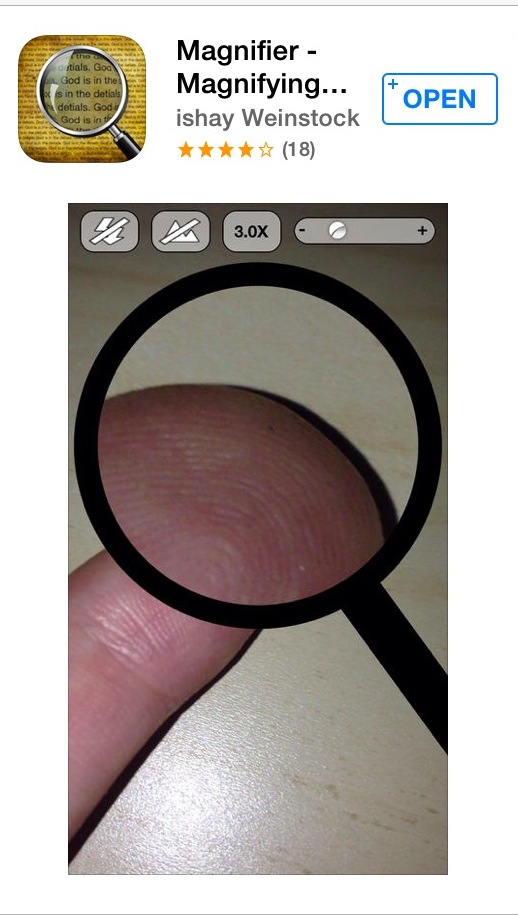
Magnifier Magnifying Glass

Screenshot of Magnifier Magnifying Glass app

Caption: Screenshot of Magnifier Magnifying Glass app

Ease of Use

The free version of this app displays ads at the top of the screen, which can be removed with an in-app purchase for 0.99. What is most striking about this app is the limited viewable area it offers on the iPhone display. It was designed to actually appear as a magnifying glass on the screen, handle and all, and the only functional viewing area is the portion within the onscreen magnifying lens itself. The app accesses less than 50% off an already small iPhone screen to display the magnified image. All of the controls are located near the top of the screen, and are displayed as a white-and-black foreground against a gray background. The color combination equates to a very weak level of contrast. The pinch and reverse-pinch gestures allow you to increase and decrease the level of magnification, but this in itself is challenging, since the viewable area of the magnified image is so small that it is difficult to execute these gestures.

Additional Features

There are few additional features to speak of with this app. The one feature that sets this app apart from the others is an option that allows you to view the non-magnified image outside of the onscreen magnification lens. This feature is limited at best, since no magnification is provided. It creates additional busyness on the iPhone display, and takes up valuable screen real estate which could otherwise be used for screen magnification.

The app does not provide the ability to freeze the viewable image. It would be difficult to justify spending even $0.99 for this app. The strongest feature appears to be its marketable name, which has presumably succeeded in convincing many people to download it.

Cost: $0.99

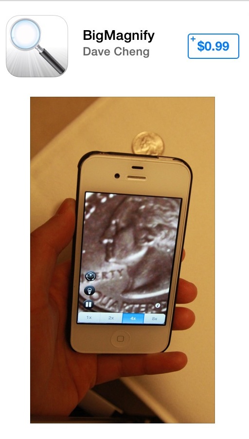
BigMagnify

Screenshot of BigMagnify app

Caption: Screenshot of BigMagnify app

Ease of Use:

This app can also be downloaded for free, which includes ads running along the top. An in-app purchase can be made for $0.99 which removes the ads. The bottom row lists a series of four controls that allow you to adjust the level of magnification ranging from one to eight times magnification. Although the numbers on these controls are displayed as a high-contrast black text on white background, the 10-point font they are labeled with will undoubtedly be difficult for many people with low vision to identify. The pinch and reverse-pinch gestures do not allow you to adjust the level of magnification, which creates an even greater level of dependence on these poorly labeled controls.

Along the bottom right edge of the display are an additional four controls clustered closely together. The controls are labeled using a high contrast white icon on a black foreground, which provides high contrast, but once again, the icons themselves are very small and hard to distinguish. The all-important control to turn the LED light on or off is not only difficult to identify, but also takes a steady hand since it is located so closely to the controls above and below it. Immediately below the LED light controls is the Freeze Image control. Unfortunately this control is small, and is located in close proximity to other controls.

Additional Features:

A single tap on the screen hides all the controls so entire iPhone display is used for magnification. The BigMagnify app takes advantage of the iPhone's front-facing camera, which is accessed via the Reverse Camera button near the bottom-right corner. This app also offers a Focus Lock/Focus Auto button. In some cases this feature can be more of a hindrance than a help, since the button to enable and disable it is so small, and inadvertently disabling the auto-focus could potentially make an otherwise clear image discernible.

Cost: $0.99

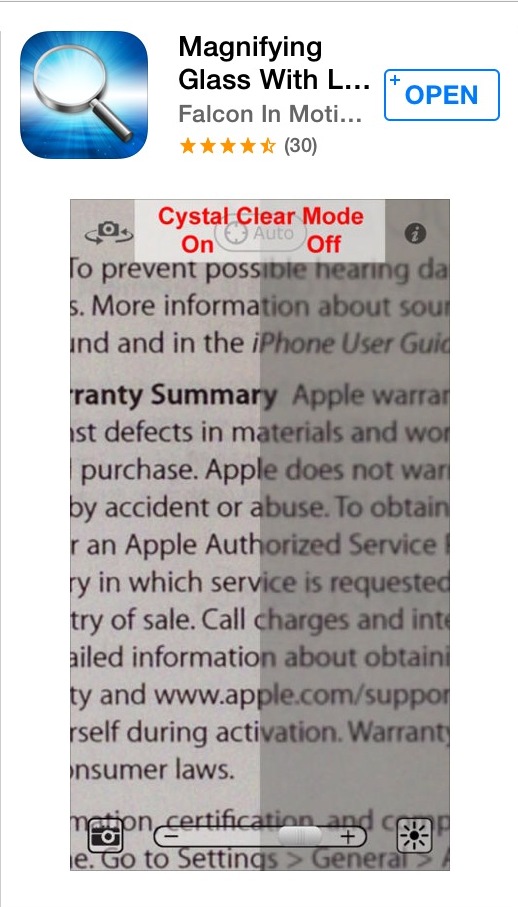
Magnifying Glass with Light Pro

Screenshot of Magnifying Glass with Light Pro app

Caption: Screenshot of Magnifying Glass with Light Pro app

Ease of Use

The free version of this app, simply called Magnifying Glass with Light, provides an interface that is very user-friendly. An in-app purchase for $1.99 gives you access to the Pro version, which is loaded with features, but also intuitive and easy to use. The uncluttered user interface maximizes the viewable iPhone display with easy-to-use sliders located on the bottom and right side of the screen for controlling the magnification size and LED light. The app integrates the pinch and reverse-pinch gestures for varying magnification. It will automatically turn the LED light on in low-lit and dark environments. This is also one of the only magnifier apps that allows you to vary the brightness of the LED light itself. A single tap initiates the freeze image feature. This is also the only app in this review that allows you to resize a captured image, which is easily carried out using the pinch and reverse-pinch gestures. Disabling the free image feature is accomplished by simply single-tapping the screen again.

Additional Features

This app allows you to hide or unhide the controls on the display by simply shaking the iPhone. This is both user-friendly, and very practical, since it maximizes the viewing area in a quick and easy manner. The app also provides an inversion option that it refers to as High Contrast. Located near the top of the screen are controls for the front-facing camera, the auto-lock feature, and access to additional options within the app. Although the pros far outweigh the cons with this app, one of its downsides is the lack of contrast and visibility of these three controls. They are displayed as small, gray icons with no contrasting background.

Cost: $1.99

The iPhone Camera App

Screenshot of iPhone Camera app

Caption: Screenshot of iPhone Camera app

Ease of Use

The iPhone Camera App is certainly an option worth considering, specifically with iPhone 4S and above. There are obvious advantages to this app. It is deeply integrated into the operating system, which allows you to quickly and easily access it even while the screen is still locked. The pinch and reverse-pinch gestures can be used to modify the level of magnification. The biggest downside to this app is the fact that the LED light is only activated when a photo is taken. This app is therefore only useful in environments with adequate lighting. You can take a photo of print materials like a menu, which will presumably give you an image of the printed material with sufficient lighting. The challenge is to know whether or not you have the desired print in view as you take the photo. The equivalent to the freeze image feature can be achieved by accessing the photo that was taken via the control located on the bottom left corner. After the photo is retrieved, the pinch and reverse-pinch gestures will allow you to resize the image to your preference.

Additional Features

The app for the front-facing camera is located on the top right corner when the Camera app is open. However, it does not provide any magnification options via the pinch and reverse-pinch option like the rear-facing camera does. IOS 7 provides several camera filters to choose from when viewing images or taking photos. The value of these filters is designed more for aesthetics than functionality for low-vision users. That being said, the filter labeled "Mono" displays images and photos in grey tones, which may provide more contrast for some people than the default colors available.

Cost: Free

The Bottom Line

Magnifier apps are not for everyone with low vision. If you require a higher power hand-held or stand magnifier (anything above four times magnification), and have difficulties reading text, a magnifier app will most likely be equally or more challenging to use. At their very best, magnifier apps are useful for spot reading, not for extended reading. Poor hand-eye coordination and hand tremors will also interfere with the success rate associated with using any of these apps.

The six apps reviewed in this article provide a broad cross-section of what to look for, and what to avoid. The pinch and reverse-pinch gestures are very useful when adjusting the level of magnification. The ability to freeze the image is also extremely useful, since it removes the need to keep the iPhone suspended above the page.

An especially useful feature, which was only available with the Magnifying Glass with Light Pro and the iPhone Camera app, is the ability to increase the image size in the freeze frame or photo mode. This allows you to resize a static image that has been taken without having to simultaneously align the iPhone camera over the desired text. The Achilles' heel for the iPhone in this scenario is the fact that the app is unable to activate the LED light until an actual photo is taken.

Although various color themes can be valuable to many people who are glare sensitive, or have a specific preference for enhancing contrast, these themes are of less importance when using a magnifier app for short periods of time such as spot-reading. If you happen to be glare sensitive, and this is a feature that is of significant importance, the See It Video Magnifier app or the Magnifying Glass with Light Pro would be worth considering.

Having access to controls and features that are well labeled and easy-to-access is very important. The Magnifier Magnifying Glass provides a good example of what not to look for in a magnifier app. The controls are labeled using poor contrast, and the labels that are used make it difficult to understand the purpose of the controls themselves. This app also wastes an already small viewable area by utilizing less than 50% of the display for magnification purposes.

Although there are advantages to magnifier apps when it comes to portability and price, they are clearly not for everyone. The superior image quality, fixed focal point, color preferences, and larger displays of illuminated or electronic magnifiers designed for people with low vision may very well succeed where magnifier apps fail.

Product information

Apps are available through the Apple App Store.

Super Vision+
Cost: Free

See It Video Magnifier
Cost: $5.99

Magnifier Magnifying Glass
Cost: $0.99

BigMagnify
Cost: $0.99

Magnifying Glass with Light Pro
Cost: $1.99

The iPhone Camera App
Cost: Free (built-in)

Comment on this article.

Leveling the Android Playing Field with the EqualEyes Launcher and Suite of Accessible Smartphone Apps

In my November 2013 AccessWorldreview of the Sprint Optimus F3 smartphone, I mentioned that the Sprint Accessibility ID Pack was an excellent way for a novice Android user to get up and running with its useful collection of accessible apps. Unfortunately, this Accessibility ID Pack is only available to Sprint and Virgin Mobile customers. In this article I will discuss a different collection of accessible apps that can also improve your Android experience. Called EqualEyes, the collection is available from the Google Play Store with a 30-day free trial; $60 for a two-year license.

EqualEyes runs on any phone running Android OS version 2.2 Gingerbread or later. The developers have been extremely responsive and release frequent updates with bug fixes, new features, and other changes, so the version you download may not function precisely as described below. For this review, I installed EqualEyes version 1.0.6 on an LG Optimus F3 running Jellybean 4.1.2 and the latest version of Talkback.

What EqualEyes Does

EqualEyes works as both an Android launcher and a suite of accessible Android apps. What this means is that, if you wish, you can replace the standard Android home screen layout with a simpler, potentially more accessible EqualEyes interface. You can open and run any of the included suites of accessible apps from these new home screens. You can also add other apps to the EqualEyes layout and launch them from there. EqualEyes does not include a screen reader, but it is optimized to run with Talkback, the built-in Android screen reader.

The EqualEyes Interface

EqualEyes boasts a clean, simple, and high-contrast interface. Each of the three default home screens includes two columns of five icons each. It was very easy for me to find and touch the icon I wanted, nearly always on the very first try. I was also able to use the Talkback flick gesture to move from icon to icon. Most of the icons launch programs that we will discuss below. But let's start with the icon at the bottom of each column. The bottom left icon is the Back button, the bottom right icon is the Next button. Find and activate either of these to navigate forward and backward through the three default home screens. It's the only way to go, since EqualEyes disables the two-finger flick gesture to change screens.

At the extreme bottom right of the EqualEyes screen there is a control labeled info box. Activating this control causes EqualEyes to speak a brief tutorial for whichever app is currently running. Slide your finger upward from this control and you discover the EqualEyes status bar. Continue moving up along the right edge of the screen, or perform a one-finger flick up or left, and EqualEyes will announce in turn the time and date, your phone and Wi-Fi connection status, your battery charge, and any missed calls or messages. Beyond that there is also a "Shortcut to All Apps" button that allows you to open any app on your phone, even if it's not on an EqualEyes home screen.

The final control is the "Expand Status Bar" button. By default, EqualEyes disables the Talkback gesture to summon the Android status bar, but you can get to it at any time to access other information, such as GPS, Bluetooth, screen brightness, app updates, etc. The EqualEyes status bar does not have a voicemail icon, which I found disappointing and more than a little inconvenient.

At the far right of the Status Bar there is a button to return to the EqualEyes home screen. However, when I ventured off the Status Bar to check my voicemail, the EqualEyes icon was no longer on the Status Bar list. Performing a "back" Talkback gesture returned me to the stock Android launcher, but when I pressed my phone's Home button I was offered the opportunity to make EqualEyes my default launcher, which I did. Overall I found the EqualEyes home screens extremely easy to navigate and use. The EqualEyes Status Bar was handy and easy enough to access.

EqualEyes Data Entry

The EqualEyes keyboard works only in landscape mode. This creates a more spacious work area, which is easier to use for most, but there are times when I would prefer to hold the phone and type in portrait mode. Fortunately, there is a way to toggle back and forth between the EqualEyes and the Android keyboard. I'll discuss this in the Settings section, below.

The EqualEyes keyboard does not offer word completion or spell check, but it does implement a number of extremely useful accessibility features. After a double tap, the "Speech Input" button announces, "Start Speaking," then beeps when it's time to begin dictation, so there is no speech announcement or partial recognition interfering with dictation. EqualEyes waits until after you have stopped speaking to announce the recognition results, then offers four controls: "Speak Recognized Text," which you can use as often as you like to repeat the dictation results, "Retry," which removes the dictation and lets you try again, "Clear," which clears the dictation if you decide you would rather enter the characters manually, and "Close," which places you back on the EqualEyes keyboard with the dictated text in the text entry field.

The current EqualEyes keyboard does not offer touch typing, a definite disappointment. You have to touch or flick to find the character you want, and then double tap to enter it. The keyboard does feature a "Read All" button that allows you to review what you have entered thus far. There are also two delete controls: a "Delete One" button that acts like a standard backspace key, and a "Delete All" button that does just that: clears the text so you can start fresh.

The "Close" button near the bottom right of the screen returns you to the edit field populated by your text. This "Close" button appears in all EqualEyes apps. It's an easy way to go back a screen or exit any app and return to the EqualEyes home screen, but you can also use your phone's Back or Home buttons, if you prefer, or the appropriate Talkback gestures.

The dialer keypad features a similar command set, in this case labeled "Read Number," "Delete One" "Clear Entry," "Call," and "Close." There is no voice dialing option, nor is there a touch-typing option. Entering a phone number requires you to find the digit you want, then double tap. This is probably the way most novice smartphone users will feel the most comfortable entering numbers and text, and indeed, novice users are the very market EqualEyes is designed to accommodate.

Phone and Messaging

The shortcuts to start the Phone, Call Log, Phone Book, and Messaging apps occupy the top two slots on the two columns of the first home screen.

The Phone app calls up the dialer keypad described above. The interface is clean and easy to use. However, as soon as you press Call, the phone's default phone interface pops up, with which you may or may not experience accessibility issues, depending on the make and model of your Android phone. Received calls also bypass the EqualEyes interface and use the phone's default layout.

The Call Log allows you to display incoming, outgoing, missed, or all calls. Double tapping any of the numbers summons a second screen, where you can delete the entry, return the call, send a message, or create a contact in the Phonebook app from the number and caller ID information.

The Phonebook includes fields for two phone numbers, and an e-mail address. There are options to Call and Send a text message to your contact, and another useful option labeled Add to Home screen. Activating this button causes EqualEyes to create a Quick Call icon on the home screen. Double tapping this icon initiates a phone call with no further user intervention. This is a very handy feature for novice users who primarily want to use their new smartphones to make and receive calls.

By default, the Message app sorts messages by conversation so they are easy to follow. Unfortunately, the New Message screen does not offer a link to your contact list. If you want to send a message to a contact with whom you have not yet exchanged messages you have to return to the phone book, or enter the phone number manually. Also, even though I had read my messages and the EqualEyes Status Bar said I had no unread messages, my phone's messaging app kept playing alerts that I had unread messages, and I had to open my phone's stock message app and clear them before the alerts would stop.

Alerts, Alarms, and How's the Weather?

The Alarm App

You can set five different reminder alarms for today, tomorrow, every day, or a custom date. Edit the alarm title to include your reminder info and pick an alarm tone. There are many to choose from, and if you slide a finger down the screen you will hear a sample of each as your finger touches the icon.

Schedule List

This is the EqualEyes appointments calendar. You can set the appointment description, date, time, and alarm tone. In the version I tested you could only set one alarm, and you could not set the advanced warning time when it would sound. I am told the next version will include the ability to set two different alarms for different times. For an all-day event, for example, I could set a primary alert for the day before the event, and then a secondary alert for the morning of the event.

Weather

I included the Weather app in this section because one of its features is the ability to set up to five alerts to sound off when the forecast shows clear, cloudy, rain, snow, or storm. Set the alarm sound you like, then choose a time. Set a snow alert for 12 hours before the weather condition and you'll have plenty of warning about tomorrow's snowstorm.

Of course the EqualEyes Weather app also provides local weather information, using your phone's GPS. It displays the current temperature and condition—clear, light rain, etc. Moving down the screen you will find the weather outlook for today and tomorrow, followed by a brief, day-by-day forecast for the next six days. Double tapping the Current listing calls up a detailed look, including such information as humidity, wind speed, barometric pressure, and dew point. Invoking the "Today" or "Tomorrow" fields provides the same information forecasted for your choice of morning, afternoon, evening, or night. The remaining days also offer detailed forecasts, including sunrise and sunset information.

Utilities

EqualEyes includes a shortcut to all of its tutorials, along with a collection of accessible utilities to help with everyday tasks and activities. Let's review them one by one.

Where am I?

This app uses your phone's GPS to pinpoint your current location. It did a great job, even inside my house, and when I took it for a walk I merely had to double tap the "Last Known Location" listing to update my current location.

Most people will wish to have a few more advanced GPS apps on their phone. You'll learn how to obtain these and other useful apps in the "What's Missing?" section of this review.

Light Detector

This app snaps a quick photo and returns one of three results: Daylight, Light place, or Dark place. Especially these days when many light bulbs don't radiate much heat, this app is a handy way to quickly determine if someone left the lights on. I particularly appreciated that all you had to do was start the app. It snaps a photo, announces the light status, and then closes, with no further user intervention required.

OCR

I did not have much luck with this app, which is supposed to take a picture and recognize the text. I've read on various lists that others are also having difficulties. My phone only sports a 5-megapixel camera however. Perhaps a higher resolution camera and future updates to the OCR engine will improve this much-needed app's performance.

Dictaphone

This app is handy for recording quick voice memos to yourself. You can give each recording a name, but when I was done recording a quick double tap did not end the recording. Instead, I had to seek out the "Stop Recording" button, which meant I wound up with a lot of extra chatter at the end of each voice memo.

Calculator

This is a basic four-function calculator: add, subtract, multiply, and divide. There are open and close bracket buttons, so you can do nested calculations, but there is no advanced math or scientific calculations. I would suggest the company at least add a percent button, which would turn this app into a handy tip calculator.

Settings

The EqualEyes Settings app not only lets you change EqualEyes settings, but Android settings as well. I found this very helpful and convenient.

Here's a quick rundown of the EqualEyes settings you can change.

  • Theme and Colors. Use this setting to toggle your device from black and white (white letters and icons on a black background) to green, which uses green text and icons on the same black background.
  • Back and Menu Keys: Use this setting to disable these keys and rely exclusively on the EqualEyes Next, Previous, and Close buttons. This setting is particularly handy if your phone has touch activated Back and Menu keys that engage the instant you touch them, often by accident.
  • Keyboard Type: Toggles the keyboard from the EqualEyes landscape keyboard to a portrait Android keyboard with haptic feedback and touch typing. EqualEyes adds this keyboard automatically on installation.
  • Notification Area: Defaults to disabled, but you can re-enable the standard Android Notification Bar.
  • Remove Shortcuts: We'll discuss this setting in the Customizing the EqualEyes Experience section, below.
  • Clear Interface: Removes EqualEyes as your default launcher.
  • Lock Screen: Use this setting to stop your phone from locking. This is an all or nothing setting. If you would prefer to merely extend the time before your screen auto locks, you'll need to go to Android Settings and adjust the Lock Screen menu.
  • Scrolling in Lists: You can set EqualEyes to use the Volume rocker or buttons to move up and down through any EqualEyes app list. Of course with this setting enabled you will have to return to the main home screen to change your phone's volume.
  • Wireless: This is a quick way to check your Wi-Fi settings and join or change a network.
  • Messages View Type: Use this to switch from conversation to list view for your text messages.
  • ZoomText: This setting will allow you to magnify screen text with a press of a button. You can choose to use your device's Back, Menu, or Search key. You can also increase the zoom font size to up to 130 points.
  • EqualEyes Mode: Advanced or Standard: The Advanced mode allows you to add other app shortcuts to your home screen and add more home screens if necessary. We'll discuss this in more detail in the next section.

What's Missing?

EqualEyes by no means includes all the apps you will need to enjoy a complete Android experience. It does not offer a web browser, for one thing, or an e-mail program. The included GPS app lacks the ability to plan routes or offer turn-by-turn directions. Browsers, e-mail and GPS apps are extensive software packages, and I am confident the EqualEyes staff does not have the resources to create special versions of these and other must-have apps. That's why they included a direct link to the Google Play Store on the second home screen where you can find these and countless other apps.

The novice user may feel intimidated by the hundreds of thousands of apps available. Happily, EqualEyes developers have also included a home screen shortcut that calls up a curated list of apps that are known to work well with Android accessibility. There is also a shortcut that will auto-load and play several Android Accessibility podcasts, where users of all levels can enjoy informative discussions and product demonstrations. Currently, the podcast selection is rather thin, but hopefully others will be added soon. There is also another issue the developers should address immediately. In the version I am reviewing, activating the Accessibility Podcasts icon causes EqualEyes to warn: "Podcasts use mobile data. Are you sure you want to open Podcasts?" This warning pops up even if you are logged into a Wi-Fi network where data charges do not apply. I can easily envision many first time users quickly double tapping "No," and then never returning to this treasure-trove of information. Perhaps the message should read something like: "Would you like to…" with check boxes: Listen to podcasts anytime? (data charges may apply), or, Only listen to podcasts using Wi-Fi?

Customizing the EqualEyes Experience

After you download an app via either Google Play or the Accessibility Apps listing, it does not automatically show up on your EqualEyes Home screen. You will need to add it to a home screen manually. Start by double tapping one of the "Application Does Not Exist" icons on Home Screen 3. This will prompt you to "Create an Application Shortcut," or "Create a Quick Call Shortcut." Choosing the applications option brings up a list of every app on your device, and you can select the one you'd like to add to the EqualEyes Home screen. The Quick Call shortcut option summons up your EqualEyes phonebook. As previously described, select a contact and a shortcut will appear on your Home screen that will auto-dial that number with a simple double tap. If necessary, EqualEyes will create additional home screens to contain all of your app and quick call icons.

You can delete shortcuts you created via the Remove Shortcuts option in the EqualEyes Settings menu. However you cannot remove any EqualEyes apps or shortcuts. Unfortunately, you also cannot rearrange icons. If, say, you download a mail app, an accessible browser, and an advanced GPS app, they will be stuck on Home Screen three, while the Tutorial app continues to occupy valuable page one space long after a novice user will need it. Many novice users who only wish to use their phone to make and receive calls may also prefer to group quick call icons to their spouse and children together on the first Home screen.

The Bottom Line

When Android users are asked why they prefer Android phones over iPhones, many state they enjoy the enhanced customization capabilities of the Android OS. They also prefer not to be constrained by Apple's "walled garden" approach where the company makes the final decision as to what software can and cannot be installed on their devices. Unfortunately, these are the very aspects that can lead many novice smartphone users to feel overwhelmed and steepen their learning curve.

For these users, I believe that EqualEyes is an excellent way to dip a toe into the Android world. The very first Home screen offers up everything you need to make and receive phone calls and text messages, which may be all the novice user plans to do with his or her new smartphone. The suite's roster of utilities can't help but encourage exploration and practice, however, and as the user's skills and confidence grows, the podcasts and accessible apps shortcuts will lead to an even richer Android experience.

Product Information:

EqualEyes Solutions Ltd.
Address: 2-10 Capper Street 6, London, WC1E 6JA, United Kingdom
Phone: +44 75 261 762 31

Comment on the article.

An Overview of OS X Mavericks, the New Apple Operating System for Macs

On October 22, 2013, Apple released OS X 10.9, Mavericks. This is the upgrade to the operating system for Mac computers including the MacBook Air and MacBook Pro. Apple chose to make this a free upgrade no matter which older operating system Mac users are running.

This article will discuss installation and changes that can be important to VoiceOver users. According to the Apple website, Mavericks has more than 200 new features. Many of these upgrades are related to extending battery life, conserving memory and improving speed. There are, of course, many new features having to do with graphics and other visual content such as photos. There are also some new keyboard commands, which will be presented here. If you'd like to learn more, you can read a detailed article about the new features in Mavericks.

Installation

Before beginning the installation process, be sure to back up your computer. The importance of this step cannot be overstated. If you are presently running Mountain Lion or a previous Mac operating system, you should receive notification that Mavericks is available. If not, open the App Store. If update information isn't already presented, search for and select the update button to install Mavericks.

Mavericks can take several hours to download. Once the download is started, the download button will be dimmed. After completing download, the software needs to be installed. You enter the ID name for your computer and the password. The name is not the same as the Apple ID. Once correct information is entered, the software will install.

VoiceOver Changes

There have been several changes to VoiceOver. According to Apple, one change is that help tags of images will give a brief image description.

Voices

There are now many more voices from which to choose. The list of voices is located in the VoiceOver Utility. Type VO (Control + Option) + F8 to open the utility. Go to the Speech category in the utilities table and select the Voices tab. Then in the Voice pop-up menu, select Customize, and then VO + Right-Arrow to the table of voices.

Audio Ducking

This allows VoiceOver to speak over the system volume by lowering the system volume until VoiceOver is finished speaking. The checkbox to enable or disable audio ducking is located in the Sound category of the VoiceOver Utility.

E-mail

When Mavericks was initially released there was a lot of e-mail list chatter about Mavericks not working with Gmail and other IMAP accounts. I had no difficulty with my Gmail account, but some people did have a problem. Apple released a software update to fix this problem. If you already use Mavericks and you have your apps set to update automatically, then there's no need to do anything. If your apps don't update automatically, go to the Apple menu and choose Software Update. Before making the upgrade, I checked with many people, both visually impaired and sighted, and no one had a problem with their Gmail accounts.

iBooks

iBooks, which was previously available only on iOS devices, has finally come to the Mac, but only with the Mavericks operating system. However the Mac version is not as accessible as the iOS version. At this time some of the buttons are not labeled and the book will not read continuously. The app can be used if you're willing to deal with these accessibility issues.

Dictation

The dictation feature was first introduced in Mountain Lion and could be used in applications such as Mail and TextEdit. In Mountain Lion you could only record for 30 seconds at a time. If you wanted to continue dictation the program had to be re-started; in Mavericks there is no time limit.

Another useful feature in Mavericks, called Enhanced Dictation, has the ability to dictate without an Internet connection. Previously, dictated material was transmitted to the Apple website and then back to the Mac.

In order to use Enhanced Dictation, an approximately 800 megabyte program needs to be downloaded. In System Preferences, go to Dictation & Speech and activate the Dictation tab. Make sure that dictation is turned on. Check Use Enhanced Dictation. Once the program downloads, you'll no longer need to be online to use dictation. Press the Function key (lower left on MacBooks) twice to begin the dictation process. Press twice again when you're done.

Using the Power Button

In Mavericks, pressing the power button once for less than a half second will put your Mac to sleep. This works with all Macs. Pressing the power button again for less than a half second will wake it up.

The shut-down dialog can be accessed by holding down the power button for about 1.5 seconds. If your Mac has a media eject key, hold down the control key and press the media eject key to bring up the dialogue. If your computer doesn't have a media eject key, hold down the control key and press the power button to access the dialogue. If the computer is not responding, hold down the power button for 5 seconds. This will force the computer to turn off. You may lose unsaved data. Of course, all sleep and shut down options can still be accessed through the Apple menu.

Short Cuts

Short cuts created on your iOS device will now sync with your Mac and vice versa. To create short cuts on the Mac go to System preferences/Keyboard/Text. Activate the Add button and fill in the short cut and the expanded text. When the short cut is typed followed by the spacebar, the expanded text will automatically be added.

iCloud Keychain

iCloud Keychain is a new feature in Mavericks and iOS 7 which lets you have login information, passwords, and credit card information automatically entered when you land on a website where you have previously created an account. The activation information for Keychain is in the iCloud pane in System Preferences on the Mac and in the iCloud category in iOS 7. When using a Mac and another Apple device, the information entered in the Keychain will sync throughout all your Mac and iOS devices. According to Apple all your information is encrypted and security measures are in place. You can add to security by having a pass code on your locked screen. If you decide to have Keychain remember your credit card information for a website, you will still need to enter the card's security code.

The set up for Keychain is a bit lengthy. An article on set up will be listed in the resources at the end of this article. On the Mac, begin by going to System Preferences/iCloud and check the Keychain option on the iCloud services table. It is necessary to insure that Safari is checked on the table. To begin on an iOS device, go to Settings/iCloud/Keychain. Safari needs to be checked on the iOS device as well.

App Store

The App store will now automatically update apps purchased from the App Store. You can manually update apps through the App Store's pane in system preferences as well. Uncheck the box that says to automatically check for updates.

Safari

There have been a few reports that Safari isn't reading links or repeating phrases but I haven't experienced these problems. A new feature in Safari lets you share links with friends on social networks such as Facebook and Twitter. Activate the "Share" button and then choose the social network you want to use. Read all the information carefully before deciding to use this feature. You'll have to log into your account and give your consent.

Battery Usage

It is now possible to determine if a particular app is using a significant amount of battery power. Bring up the menu extras with VO + MM and navigate to the Battery menu. Open the menu and arrow down. VoiceOver will speak the names of any app currently using a significant amount of battery power.

The Dock

When Mavericks is downloaded, there will be two new applications on the dock: iBooks and Maps. When reading apps on the dock, VoiceOver will now say the word "open" if you land on an open app. The key combination has changed for adding items to the dock. It is now Command + Control + Shift + T. The key combination to remove items from the dock has not changed.

Finder

It's now possible to open multiple tabs in the finder window. This feature is similar to tabs in Safari. Type Command + T to open a new tab. When you land on the tab you want to view, type VO + Spacebar.

iWork

There is now improved accessibility in Apple's iWork suite consisting of a publishing program called Pages, a spreadsheet program called Numbers and a program similar to PowerPoint called Keynote.

Actions Menu

On any item, typing VO + Command + Spacebar will bring up an actions menu if there are options available for interacting with the item. If there isn't anything to be done with the item, VoiceOver will not say anything and a sound will play.

Conclusion

On the Mac, the Keychain feature, Safari sharing links, Maps, Finder tabs, and iBooks are only available in Mavericks. If you are hesitant to upgrade to Mavericks and are happy with Mountain Lion you might consider waiting until Apple releases a Mavericks software update. If you don't need these features then there's no harm in waiting.

Before doing the update, make sure that all the applications you use, including those not purchased from the Mac App Store, are compatible with Mavericks.

Resources

Tech Support
Phone: 877-204-3930
E-mail: accessibility@apple.com
Apple has specially trained tech support staff familiar with VoiceOver. If you have upgraded to Mavericks and are having an accessibility issue with an app or a problem with the system, you can contact them.

AppleVis
The site has podcasts, app recommendations, and a user forum. There is information on all Apple products.

How To Be Blind
Check this site for podcasts, brief tutorials, and app recommendations.
Get to Know Mavericks: System Preferences
How-to: Setup and use iCloud Keychain for Mavericks and iOS7

Comment in this article.

Ending the Year on a High Note!

Lee Huffman

Dear AccessWorld readers,

Last month AccessWorld served up its best holiday gift-giving ideas for people with vision loss. In the November issue, Janet Ingber gave some great ideas in the 2013 Holiday Gift Ideas for Children and Adults with Vision Loss, and she provided information on popular shopping websites in her article, AccessWorld's 2013 Online Shopping Guide: It's Time for Holiday Shopping. There is still time to get the shopping done, so if you missed these articles, you can follow these links or, as always, you can select the "Back Issues" button to check out any past online issue of AccessWorld.

If you happen to be doing some cooking this time of year, you may want to take a look back at Deborah Kendrick's November 2010 review of the Directions for Me website, Website Evaluation: Directions for Me, a Gift to People Who Can't Read the Box. This article may help take the guesswork out of preparing those holiday meals by having package directions available at your fingertips.

If you find yourself needing a break from all the pre- or post-holiday festivities, you may want to consider a stop at the local movie theater. As you can read in this month's article from J.J. Meddaugh, audio description technology in movie theaters is becoming more widely available. Relying on a friend or family member or imagining what might be happening in the film is no longer necessary. It's now possible to become completely immersed in the theater experience and enjoy films on an entirely new level. So sit back, relax, and take a break from the holiday rush.

To end the year on a high note, so to speak, the American Foundation for the Blind (AFB) is proud to announce that its note-taking app for the iOS platform, AccessNote, has been updated to version 1.2. AccessNote retails for $19.99 and can be found in the Apple App Store.

AccessNote version 1.2 includes many bug fixes and several enhancements. The Find function has been completely redesigned to be more streamlined, and by popular request, it's now possible to import BRF files without changing the extension. To learn about all the changes and enhancements in AccessNote version 1.2, visit the complete change log.

The AccessWorld team wishes you a happy and healthy holiday season. We look forward to bringing you the latest in tech news in the coming year!

Best regards,
Lee Huffman, AccessWorld Editor-in-Chief
American Foundation for the Blind

Comments and Questions

Dear AccessWorld Editor,

Reading Janet Ingber's November article, AccessWorld's 2013 Online Shopping Guide: It's Time for Holiday Shopping, inspired me to share some of my online shopping tips with fellow AccessWorld readers.

Below are a few tips that help me shop more successfully online, and I hope others will find them helpful as well.

  1. Some sites, like Walmart, don't have a "Shopping Cart" button. But there's a link near the top of the page with a number in parenthesis. That turns out to be the link to go to your cart, and the parenthesized digits are the number of items it contains. It's worth spending some time carefully exploring, opening links in new windows or tabs if you don't want to lose your place.
  2. Make sure to try different views for displaying items. Many sites offer list and grid views, and sometimes one is easier to navigate than the other. Some views show only graphics, while others show longer descriptions of items.
  3. Don't forget about your screen reader's lesser-used navigation keys. For example, in JAWS, the "D" key jumps you to the next different element, the "S" key to the next same element, the "G" key to the next graphic, and the "I" key to the next list item. Even if you find a page has no headings, regions, or useful frames, and even if all the form fields are irrelevant to what you're trying to do, these lesser-used keys are often just what you need to quickly peruse choices. I like to have a site display the largest list, say 100 items on a single page, then attempt to traverse that list using these various keys. Usually, I find one that works best.
  4. Try the mobile version of a site. Optimized for smaller screens, you'll often find greater accessibility in its less complex layout.
  5. Go window shopping, or should I say "Windows" shopping. If you wait until the week before someone's birthday, the experience of struggling with an inaccessible site can be stressful. Six months before your deadline, exploring a new site becomes a joyful adventure.
  6. Learn to use your screen reader's configuration abilities. In JAWS, for example, there are six different ways to identify a button. JAWS can give you its title, associated screen text, its value, or its alt attribute. It can also choose the longest of these elements and there's even a custom setting. On one site I frequently use, changing this setting to read the associated screen text, rather than the title or longest element works best.
  7. Try a different browser. With NVDA, Firefox often works much better than Internet Explorer. I've even had sites that work best with Chrome.
  8. Lastly, if your screen reader has OCR features, try maximizing the screen and checking out what they can see.

Deborah Armstrong

Dear AccessWorld Editor,

I just read the November article by Larry Lewis, Seeing Eye GPS: Three Organizations, One Stellar Effort!, and I am wondering if it is possible to get the Seeing Eye GPS app in the UK?

Thanks,

Jeff Clark

Response from AccessWorld Author Larry Lewis:

Hello Jeff,

The Seeing Eye GPS app is only available in the US at this time.

Dear AccessWorld Editor,

As always, Deborah Kendrick has done a masterful job for Access World in her November article, Dr. Abraham Nemeth: The Louis Braille of Mathematics Dies at Age 94. This eulogy is touching and meaningful and I hope will serve as enticement to all Access World readers to devour Ms. Kendrick's forthcoming biography of Dr. Nemeth.

Well done!

Dave Thomas

Dear AccessWorld Editor,

I read the November article by Larry Lewis, Seeing Eye GPS: Three Organizations, One Stellar Effort! I am glad that the author is having such success with Seeing Eye GPS. However, I have not had such success. When asking for directions on how to create routes and how to dictate commands such as a specific destination to Seeing Eye, I get no response from the lists I am on or from the main developer's site.

I would love to have a tutorial that covers:

  1. Where is that dictation button?
  2. How to set up a route using dictation or from entering data.
  3. How to virtually review a route before traveling it.
  4. How to save a route and recall it.

I bought the three-year subscription and really haven't been able to get it to work well yet. When visiting my son in Austin, TX, Seeing Eye could not find the airport I was in, or anything I asked the app to find by entering [ … ] addresses of places to eat [that] I knew existed close by.

I want to end by saying, I look forward to using this app, and I am sure it does have awesome features to use. However, so far, I have not found a good tutorial.

Thanks,

Dan Thompson

Dear AccessWorld Editor,

I wish to comment on The World of Audio Games: A Crash Course, by Aaron Preece, which appeared in the November issue. I have played audio games off and on for several years. I think these types of games are really great, both in terms of sound quality and plot, or lack thereof, as is the case with some of them. I've mainly stuck to the freebies up to this point, but I have also played some of the audio game demos that are currently available. I recently registered for an account on the Audio Games website mentioned in this article. I can't agree more with the author. Not only is their site an excellent starting point at which to begin learning about everything that's available, but the site is also very easy to navigate for screen reader users. I'm assuming it's easy to navigate for low-vision users as well, based on posts made in the forums. In addition, it's always great to get international perspectives on things and this site does a good job with that.

Sincerely,

Jake Joehl

AccessWorld News

Mark Your Calendars for the 2014 AFB Leadership Conference in New York City

The 2014 American Foundation for the Blind Leadership Conference (AFBLC) is scheduled for February 27–March 1 at the Brooklyn Bridge Marriott. Conference attendees can take advantage of a low group rate at the centrally-located hotel and join colleagues new and old for three days of informative and thought-provoking sessions led by leaders in the field. Visit the American Foundation for the Blind Leadership Conference page for the latest information on this conference, which draws hundreds of professionals from across the country and around the world.

VisionAware Introduces Getting Started Kit for Those Newly Diagnosed with Vision Loss

With over 21.2 million Americans reporting trouble seeing, VisionAware has created a Getting Started kit for adults experiencing vision loss for the first time. VisionAware.org is a free online resource for the millions of people who have difficulty seeing, offering dynamic social networking and customized guidance with rich content and practical tips on living with vision loss. The Getting Started kit is intended to provide hope and help to handle the challenges of vision loss, and to connect users with the resources they need. Many people are unaware of specialized services and products available to them. The kit is composed of 10 "tip sheets," with each sheet addressing practical solutions to everyday tasks such as reading, cooking, using computers and other technology, helping friends and family understand what they can do, and more.

"These tip sheets represent just a small sample of the wealth of information visitors can find on VisionAware, including the latest news on vision loss and specific eye conditions, a community of peers and professionals, in-depth articles, and coping tips," said Priscilla Rogers, VisionAware Program Manager. "We hope anyone experiencing vision loss, as well as their loved ones, will use the tip sheets and then explore VisionAware.org."

The Getting Started kit's tip sheets contain the following helpful information:

  • Steps to Take to Get Help, including who to see about vision loss and your roadmap to VisionAware
  • Questions to Ask Your Doctor about your eye condition
  • Bathroom Safety Tips
  • Kitchen Safety Tips
  • Tips for Making Print More Readable
  • Your Home Office (how to manage correspondence, finances, and other personal business)
  • Technology Tips, including an overview of access technology that can be helpful in everyday life
  • Keeping Fit
  • Having Fun, including options for continuing to enjoy leisure time activities or starting new ones
  • Dos and Don'ts When Meeting a Person with Vision Loss (for friends and family members)
  • A diagnosis of vision loss can be frightening, but armed with the right information, individuals who are losing their sight can learn how to best cope with vision loss. Visit VisionAware.org.

The 3rd Annual M-Enabling Summit to be Held June 9-10, 2014, in Washington, DC

The only global conference and showcase exclusively dedicated to accessible and assistive mobile solutions for seniors and users of all abilities, the fastest growing user group in the mobile market place.

The Summit provides an opportunity to network with over 600 high-level government and industry leaders in an environment dedicated to cutting edge technology, solutions, and the sharing of innovative ideas.

Held in cooperation with the Federal Communications Commission (FCC), the 2014 Summit is a must-attend event for anyone participating in this fast expanding market

In the spotlight at the 2014 Summit:

  • Mobile and social media leap forward in accessibility
  • Mobile at the center of smarthomes development
  • The next generation of wearable gear
  • Opportunities for users of all abilities with BYOD (bring your own device)
  • Adaptive user interfaces
  • Market opportunities for new services for seniors and persons with disabilities
  • How leading corporations promote consumer apps for users of all abilities

Third Anniversary of the Twenty-First Century Communications and Video Accessibility Act (CVAA)

The FCC recently released a Public Notice noting that October 8, 2013, marked the third anniversary of the Twenty-First Century Communications and Video Accessibility Act (CVAA) and the start of new procedures for consumers to file requests for dispute assistance and informal complaints about the accessibility of the following technologies used for communication:

  • Advanced communications services and equipment (such as cellphones, smartphones, computers, laptops, and tablets used for text messaging, e-mail, or instant messaging)
  • Internet web browsers built into mobile phones
  • Telecommunications services and equipment (such as telephones)

Resources

An overview of the new communications accessibility informal complaint procedures

This information is also available through the FCC complaints system.

Learn more about the FCC accessibility requirements for communications and video programming services and equipment.

View the Public Notice in Word format.

Looking at the New Microsoft Accessibility Answer Desk

If you had technical issues with Windows or MS Office you didn't call Microsoft, you reached out to Dell, HP, or one of the many other original equipment manufacturers (OEMs) that built and sold you the computer. PCs have been rapidly becoming more similar to each other and with company profits shrinking almost daily, these days OEM technical support simply isn't what it used to be.

With the release of Windows 8, Microsoft decided it was in their best interest to provide more customer support and they started with their new Answer Desk, through which consumers can get full in-warrantee service for Microsoft products and a complimentary 15-minute consultation for out-of-warrantee issues.

As part of this support restructuring, Microsoft also took a fresh look at their accessibility initiatives. "In Windows 8 we added a lot of new functionality to Narrator and the other services in the Ease of Access Center," says Denise Rundle, General Manager, Microsoft Advertising and Consumer Services. "Unfortunately, our research showed that many individuals who could benefit from these improvements weren't aware they existed, or [of] how to use them to their fullest potential."

Microsoft has accepted the lion's share of the responsibility for this lack of awareness. "Our support specialists weren't always as knowledgeable as they needed to be when it came to the special needs of people with disabilities, and the accessibility resources we have to offer," Rundle says. "About two years ago we began looking for some outside training. We couldn't find anything that was appropriate for our call centers, so we developed it in house."

Today, all Microsoft support specialists are given training in disability awareness, etiquette, and sensitivity. "When someone self-identifies as having disabilities, we want our support specialists to be able to ask the right questions and not trip up over language and wind up saying something stupid or offensive," Rundle told me, and I had to smile because just hours before I had experienced that very problem when I called a support line for a different company.

"You need to press the green button near the top," the support technician instructed me, and when I explained that I was blind and using a screen reader he replied, "OK, I understand. So then let's start out by going to the top and pressing the green button." In his defense, this second time he did speak extra slowly and clearly.

According to Rundle, this in-house training was phase one of a two-part accessibility initiative. "We needed to not only recognize the technology requirements of people with disabilities, our support workers also needed to be able to help people learn how to use Microsoft's accessibility features, and help long-time users solve issues that are causing them problems."

In August of 2012 the accessibility team commenced a pilot project with the goal of offering personalized, one-on-one assistance to individuals with disabilities using Microsoft's accessibility features. "The response exceeded our expectations," says Rundle. In February of 2013 the Accessibility Answer Desk was made available to the public throughout North America.

My Triple Test Run

According to Jenny Lay-Flurrie, Senior Director, Accessibility Customer Experiences, "We took the cream of the crop of our Windows and Office support technicians and gave them several months of accessibility training." I decided to see for myself, so over a two-week period I called the Accessibility Answer Desk three times with three different issues that affected my ability to use my PCs. Here's what happened.

Sounding Off

One of my computers is an old notebook I have connected to an external keyboard and USB sound card. Window-Eyes worked fine on this setup, but for some reason none of my Windows system sounds were playing. I tried setting the system sounds to use the external USB card and the notebook's internal speaker by turn: no luck.

After explaining the problem to the accessibility support worker he asked me a few questions that did not begin with "Have you tried turning the computer off and back on again?" He asked me to try playing some streaming video, and when there was no audio for this, either, he set to work.

After leading me through the steps to initiate a support.me remote session the technician took control of my PC. The very first thing he did was create a Windows Restore point. I was impressed and more than a little grateful. The last time I had had trouble with a sound card was when I updated a Dell computer from Windows Vista to Windows 7 and the sound card refused to work. After paying through the nose for out-of-warrantee support and three hours on the phone with a technician, he had fouled up my system so hopelessly, I finally pulled the plug on the session, demanded my money back, and used it to buy a USB sound card, which worked perfectly.

Window-Eyes and Vocalizer Karen Standard kept me apprised as the technician poked around various system settings, winding up in the Control Panel. After a few more seconds the streaming video began playing audio through my notebook's speakers, and when I asked the technician if he could move the audio to the sound card, which has higher-fidelity stereo speakers, he obliged quickly.

Throughout the ten-minute session the technician neither talked down to me nor tried to go over my head with a lot of high-tech jargon. When I asked what the problem had been, he took me step by step through what he had done. I had Window-Eyes set to use the USB sound card, and I had also set the system sounds to use that device. But there were three devices in my sound card list, the notebook's speakers, the USB sound card, and the notebook's headset jack. Even though I had set Windows to play system sounds through the USB sound card, the headphone jack was the default device. Windows wants very badly to play system sounds through the default device, and once the technician had changed that one setting all was well again.

We'll score that one a big "oops" for me and a definite "way to go" for Microsoft.

No Swiping

Narrator for Windows 8 includes an extensive set of touch screen command gestures. For example, a one-finger swipe left or right moves one screen element to the left or right in that direction. To select the screen element, character, word, link, etc., you swipe either up or down with one finger. I was practicing these gestures when at one point the swipe up and down gestures stopped working and began giving me strange results. Time to call Microsoft.

Again the support technician was welcoming and friendly, but when I explained my problem she stated unequivocally, "Narrator doesn't have any touch commands." I suggested that it actually did, and when the technician did not offer to check I decided it was time to end this call and try again.

A different technician solved my problem almost instantly. Narrator has two navigation modes, normal and advanced, and I had inadvertently toggled this setting to advanced by pressing Caps lock + A. When I toggled back to normal mode the up and down swipe gestures functioned again as advertised.

The rep also told me that in Windows 8.1, which I have subsequently installed, this function has been moved so I am not likely to make this mistake again. We'll score this one "fat fingers" on my part, and "mixed results" for Microsoft.

An Outlook Issue

Finally, I decided to consult the Accessibility Answer Desk on a long-standing problem I have had with Outlook 2010. Occasionally, after deleting an e-mail, or pressing Enter to open one, my speech would lock up for up to a minute. Other times Outlook would close and then restart all on its own. I used to attribute most of these problems to the fact that, in my previous job, I had to keep thousands of e-mails with very large attachments readily available in various accounts, resulting in Outlook .PST data files that often exceeded 12 gigabytes. I no longer need to keep these e-mails on hand, so I pruned my mailboxes back to a more reasonable few hundred messages per account. The problems persist, however, and GW Micro can offer little help since these problems only happen occasionally and they cannot duplicate them in house.

I decided to give the Accessibility Answer Desk a try. I explained the problem and outlined the steps I had taken to try to solve it. When I mentioned the previous size of my .PST data files the Answer Desk representative suggested that even though I had reduced their size, there may still be some leftover settings that were problematic and causing my troubles.

The tech suggested I create a new Outlook identity, reestablish my e-mail accounts and then delete the original identity. This was something no one had ever suggested before, and it was definitely worth a try. The tech offered to do this for me, so I sat back, followed along as he took control of my computer, and a half-hour later the deed was done.

I cannot report this solved the problem, but I am now more convinced than ever my Outlook fits and restarts are a screen reader issue, not an Outlook bug. I was encouraged to call back if the change of identities did not help, but for now let's score this one "still frustrated," on my part, and for Microsoft, "a commendable effort."

Summing Up

For now Microsoft's accessibility support team is focused on assisting with Windows and MS Office, but they plan to add additional Microsoft consumer products in the near future. They also hope to begin serving other areas outside of North America. In the meantime, if users have problems with products other than Windows or MS Office the Accessibility Answer Desk reps can consult and collaborate with support reps from other product teams to guide you through their use with accessibility services and help solve setup and configuration problems.

I was also told by Lay-Flurrie that the accessibility customers' reps have all received orientation training in the most popular screen readers. This does not mean they are ready to help you create a Window-Eyes hyperactive window, or debug a Jaws script. What it does mean, I suspect, is that callers are a lot less likely to get caught in that all-too-familiar situation where the screen reader vendor insists your problem is with the third party application, while the application support rep assures you that your screen reader that he doesn't know anything about must be interfering with the application's ability to do its job.

Microsoft's Accessibility Answer Desk appears to be casting a very wide net when it comes to defining accessibility issues. Along with the sorts of issues I described above, they will apparently also assist users of accessibility services—even third-party access software users—with tasks as varied as setting up an Outlook.com e-mail account, changing default Word fonts and margin settings, learning to control a Windows PC with speech, and setting up virtual keyboards, head mice and other non-traditional input devices.

Apple has offered a similar accessibility resource for the past few years. They learned early that true accessibility involves more than simply supplying the tools—you also have to educate users and offer support when needed. It's heartening to see Microsoft has finally "seen the light," so to speak, and I look forward to other major players tossing their hats into the ring.

Contact Information

Microsoft's Accessibility Answer Desk is available in North America from 5am to 9pm PST during the week, and 6am to 3pm on the weekends. English language only.
Phone: 800-936-5900
Web contact form
Online chat will be supported in the near future.

Comment on the article.